Benchmark It Yourself (BIY): Preparing a Dataset and Benchmarking AI Models for Scatterplot-Related Tasks
When we need to visualize and interact with millions, or even just thousands, of individual points while analyzing data, we typically resort to rendering them in the browser using a canvas. The other common approach for the web, SVG, doesn’t scale when the number of individual elements increases to such quantities. However, while solving one problem, canvas charts introduce a new challenge: accessibility.
Although SVG charts are not accessible by default, they can be by design. Each part of an SVG chart has a corresponding element on the web page, allowing for a programmable, accessible experience for screen reader users. We can simply think of SVG as HTML. On the other hand, a canvas chart is just like a PNG image. If a screen reader user tries to learn more about a canvas chart, unless the developer has prepared a detailed description of it, they will just hear the word “image”. There’s no way to get an idea of what one of these charts represents, let alone extract any insights.
For static charts, the solution can be as simple as preparing a description and integrating it into the rendered chart. However, for platforms leveraging dynamic, large datasets, automatically generating these descriptions is not a simple task, especially for charts like scatterplots where data distributions can assume countless forms.
At Feedzai, we started exploring ways to generate data distribution-aware descriptions for scatterplots from their respective images using recent multimodal AI models. When the raw data is not available, or the datasets are composed of several thousand or million instances, relying on chart images and these models becomes tempting. This combination has the potential to generate such descriptions and serve them alongside their respective charts, significantly improving the accessibility of canvas charts.
That said, we focused on two main directions: using AI models to directly generate the descriptions, and using AI models to extract structured data (imagine a list of clusters and their respective center coordinates, for example) that will populate a predefined description template. The initial results, however, were mixed, and it wasn’t clear if we were on the right track to ensure adequate descriptions.
So, before moving on to further testing, we carefully reviewed the literature. Although benchmarks and other interesting findings are scattered all over the place, they rarely cover scatterplots and their related tasks. We therefore changed the plot and designed a dataset + benchmark to expand the general understanding of AI models when applied to charts, specifically scatterplots. We focused on evaluating the baseline performance of these models in identifying clusters and outliers at scale — both, if present, should be described properly.
The work culminated in the “Benchmark It Yourself (BIY): Preparing a Dataset and Benchmarking AI Models for Scatterplot-Related Tasks” paper, presented at the GenAI, Agents, and the Future of VIS workshop during IEEE VIS 2025. This blog post covers the main results and conclusions after running the benchmark in question.
Dataset and Benchmark

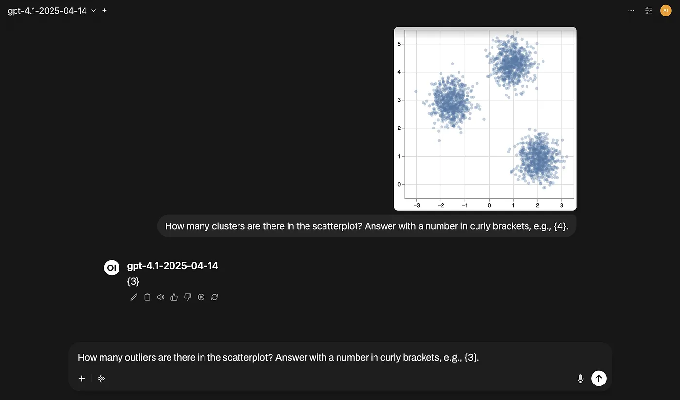
The dataset consists of 18,921 synthetic scatterplot images created from 6 data generators (371 different data samples), 17 chart designs, and 3 image sizes. The number of clusters varies between 0 and 6, while the contamination level, when there are outliers, varies between 0.001 and 0.01. We chose to inject a relatively small number of outliers, keeping them well-distanced from the clusters to evaluate the detection of points that are clearly anomalous and relevant to report. In the end, each scatterplot was automatically annotated for clusters and outliers after converting the respective bounding box and point coordinates to screen coordinates (pixels).

The benchmark was run on a stratified sample of 1,725 scatterplots and for 5 tasks, each defined by a prompt composed of an instruction and a response format:
- Cluster counting for the number of clusters.
- Cluster detection for the bounding boxes of each cluster.
- Cluster identification for the point coordinates of each cluster center.
- Outlier counting for the number of outliers.
- Outlier identification for the point coordinates of each outlier.
In addition to the different tasks, 10 proprietary models from Google and OpenAI were evaluated, along with 3 different prompting strategies: zero-shot, one-shot (prompt + 1 example), and few-shot (prompt + 6 examples).
For the counting tasks, two performance metrics were computed: Accuracy and Mean Absolute Error (MAE). For the remaining tasks, Precision and Recall were considered with specific thresholds: an Intersection over Union (IoU) of 0.75 for bounding boxes and a Euclidean distance of 10px for point coordinates.
Results
The overall results for each task are summarized in the charts below. Each is accompanied by its main highlight. Feel free to explore each chart or jump straight to the next section for the key takeaways.


Takeaways
Based on the results, the main considerations when combining scatterplot images and AI models are as follows:
- Give priority to few-shot prompting. This prompting strategy consistently outperformed zero-shot prompting across all models and tasks (top models achieved over 90% Accuracy in counting tasks). It is also useful for handling zero-answer scatterplots.
- Avoid localization tasks. OpenAI and low-cost Google models prompted with strategies similar to those evaluated are unreliable for localization tasks (e.g., detecting clusters) involving scatterplots.
- Invest in other components first, not chart design (page 4 for more details). Chart design is fundamental for humans, but it’s a secondary factor when fed into AI models. Nevertheless, it can be beneficial to avoid chart designs with wide aspect ratios (16:9 and 21:9) or seemingly random colors.
Further Reading
Since this blog post doesn’t cover all the relevant aspects of the dataset and benchmark, feel free to read the paper, check out the associated GitHub repository, or watch a short presentation about it.
If you have any questions or feedback, let us know in the comments section.
Diogo Duarte, Pedro Bizarro, Rita Costa, and Sanjay Salomon: thank you so much for your thoughtful feedback that helped me shape this blog post!


