AIGA Detroit Poster (1999)
There’s certainly a reason why Stefan Sagmeister is one of the most well known graphic designers in recent history, having typography carved into your own body with an X-ACTO knife all for the sake of a poster is sure to bring you some attention.
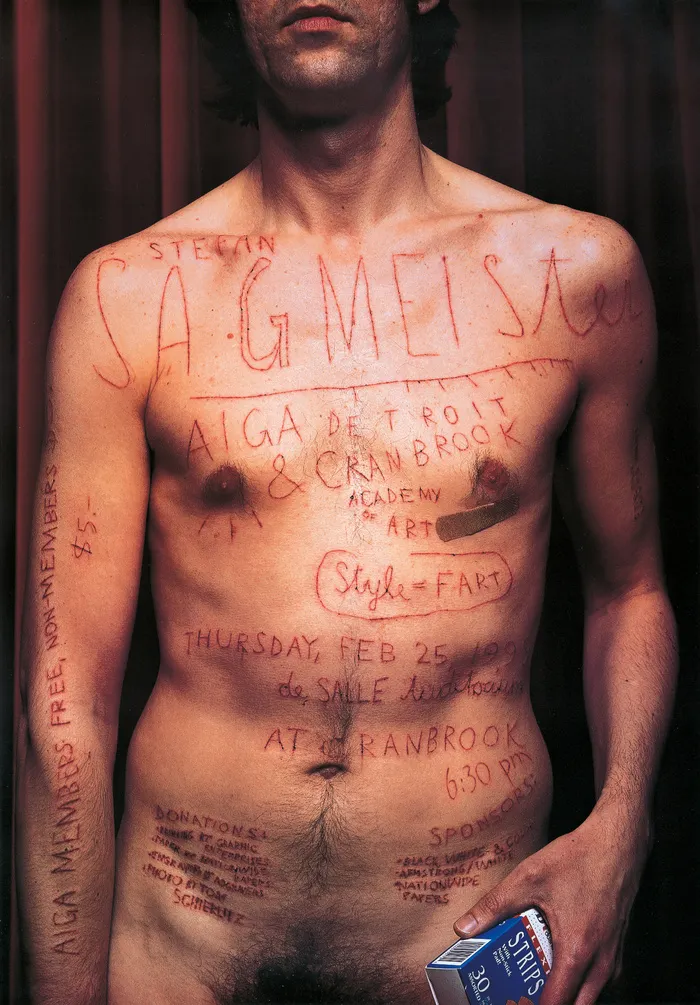
In 1999 the Austrain born came up with the concept for this poster for an AIGA conference in Cranbrook. The poster features all of the details for the event carved over his torso, holding a box of plasters. He instructed his assistant to carve the text into his skin using a X-ACTO knife (craft scalpel commonly used by artists and designers). When asked about why he would do such a thing to himself, Sagmeister said; “We probably could have Photoshoped that AIGA Detroit poster, rather than cutting the type in my skin. I think the results are more authentic and the process more interesting (and painful)”. The result was then photographed by Tom Schierlitz, paying partical attention to highlighting the blood and sweat effect caused by the blade on Sagmeister. He wanted to literally show the blood, sweat and tears which go into the creative process.

The immediate shock factor of this image is extreme. It’s something which Sagmeister has employed a lot throughout the years, often using nudity to cause conroversy and gain attention. Despite being told he would lose his only clients, Sagmeister chose to announce the creation of his own studio with a naked greetings card of himself. Luckily, the bold statement worked and propelled his career. This was then recreated in the more recent launch of his new partnership — Sagmeister & Walsh. Looking at his work you see the fascination for the human body he has, often using it as a canvas for typography to convey a deeper, personal meaning to the text.

He rose to fame in the 90s, the time of the Young British Arists such as Damien Hurst and Sarah Lucas. Like the YBA’s he rebelled and pushed experimental work, focusing on shock factor as a tool. Throwing away perfect, pristine design popularised by the advancements of technology and instead focusing on a more messy and hand made style. His dark sense of humour regularly finds it’s way into his designs, usually through his “imappropriate” imagery and experimental typography.

One observation about the text in the poster is the inclusion of the “style = fart”. Sagmeister had this quote up outside his studio as a sign and was a firm believer that styles are pointless and they should be avoided. He has since reversed his stance on this as he matured and has come to the conclusion that good content can require a form and style to fully express it. Regardless of this, the quote was added to uplift the mood and add some signature humour to the piece.
The poster, like a lot of Sagmeister’s work looks at himself and what it means to be a designer. His work serves as a reminder that design is a very human thing, created by people not computers and therefore has personality and imperfections. This is conveyed through the carved typeface which is very irregular and naive looking. But one of the largest controversies of this poster was the process itself, as it runs with the tortured artist narrative you might associate more with Van Gogh.The image is said to glamourize self-harm and widened the love/ loathe opinion people had of Sagmeister.
But love him, loathe him or feel indifferent; Stefan Sagmeister is an influentual part of the graphic design community and will continue to inspire others with his shocking nudity and dark humour. Self obsessed and attention seeking he may be to some, his work still explores what graphic design can mean.