Object extraction from Mobile LiDAR point clouds with Machine Learning
Authors: Dmitry Kudinov, Nick Giner.
Today we are going to talk about mobile point clouds, i.e. 3D points collected by LiDAR sensors mounted on a moving vehicle, and a practical workflow of extracting accurate representation of higher-level classes of objects (vector features), like tree polygons or traffic light points, from this type of data.
We talked previously about using deep learning with point clouds collected by airborne LiDAR sensors, e.g. 3d building models reconstruction with Mask R-CNN, then detecting and labeling overhead conductors with PointCNN, but the mobile point clouds collected from the “street-level” have their peculiarities which complicate classification and data extraction. On the other hand, with the number of semi-autonomous and autonomous vehicles growing, this type of data acquisition becomes increasingly more scalable and affordable.
For these experiments, we joined our forces with the CycloMedia team, who provided mobile point clouds, oriented imagery, and 2D semantic masks for labeling the point cloud data.
Toward useful “Digital Twin”
Timely and cost-effective surveys are the cornerstone of any efficient local government. The question is how to collect detailed information about city assets periodically and at a minimum cost? In other words, is there a way to bring the cost of a “digital twin” down, and have it updated often enough so it remains useful in daily operations?
An answer may be in the LiDAR sensors mounted on the vehicles driving around the city collecting the point cloud data, and machine learning techniques applied to the collected points to extract accurately georeferenced vector features, which can be consequently used in traditional GIS analysis and systems of record.
An alternative to mobile LiDAR is oriented street-level imagery, which is another affordable way of collecting massive amounts of data, and we talked about a detailed workflow in recent “Road Feature Detection & GeoTagging with Deep Learning” post.
The main disadvantages of mobile LiDAR data are irregular point density, high levels of noise in urban environments, and complexity of data labeling. On the bright side — LiDAR data has precise XYZ coordinates allowing for a high-fidelity georeferenced vector feature extraction.
The main disadvantage of oriented imagery is in the lack of depth information, which affects the accuracy of translation of object detections from pixel space into real-world coordinates and complicates the extraction of polygonal objects like trees or linear objects like wires. The advantages are the lowest cost and ease of creating labeled data to train object detectors (you can even use pretrained neural network models to start experimenting: TensorFlow or PyTorch). Another unbeatable advantage of the imagery-based feature extraction is that it allows for efficient metadata capturing through Optical Character Recognition, e.g. providing the image resolution is high enough, we can automate the process of collecting not only the location and types of road signs, but also what’s written on them.
The best of both worlds may be in combination of LiDAR and oriented imagery: for example, by calculating so-called raster depth maps from mobile LiDAR point clouds and then combining them with the imagery. This will result in RGB+D(depth) 4-channel rasters which could be used with traditional convolutional object detectors and have a higher accuracy on both object detection and pixel-to-world coordinates translation.
This is where CycloMedia comes into the picture. Their street level capture vehicles are equipped with high resolution cameras and LiDAR. This data is then post processed to provide that unique combination of LiDAR and imagery that was used in this experiment.
In this post, we are going to rely on mobile point clouds as the source of high-fidelity and accurately georeferenced vector features and will make use of the synchronized oriented imagery to demonstrate an efficient technique of labeling massive amounts of mobile point clouds needed to train deep neural networks.
The Workflow
In general, the object extraction workflow looks simple:
- Segment (Classify) point cloud into classes of objects of interest with a deep neural network, i.e. assign a class value to each point of the point cloud,
- Use one of two GIS processing pipelines — one raster-based and one machine learning-based — to extract vector features and their attributes.
…but, as it often happens, the devil is in detail. The process becomes more intricate depending on the classes of objects we are trying to extract: what is the typical size of the objects of interest? What type of vector geometry we are going to use to represent the extracted features — points, lines, polygons, or 3D multipatches, etc.?
Mobile Point Cloud Segmentation
Let us look into the first part, segmentation of a mobile LiDAR point cloud, i.e. assigning each point in the cloud a class value like Building, Tree, Pole, etc..
Traditionally, with deep learning, the first thing to worry about is getting a sufficient number of good quality samples to train the neural network on. In this case, we are talking about classified (labeled) point clouds, where the points belonging to, say, buildings have corresponding Building classification value assigned.
CycloMedia data, which we are using in these experiments, comes in two forms: the (unlabeled) mobile point cloud itself and, synchronized with it, 360-degree oriented imagery.


Because the acquisition of the imagery and the point cloud happens simultaneously, the viewsheds of both the camera and the LiDAR sensor are identical, the RGB pixel values from the raster can be projected onto the points, enriching the semantics of the point cloud even more: after this, each 3D point also has RGB values populated.


The data quality looks good and CycloMedia has a significant coverage in multiple countries and environments. This time we focus on urban Netherlands, particularly, a set of 500 mobile point clouds from the city of Schiedam. For thorough testing also are going to use point clouds from Los Angeles, Chicago, and Amsterdam.
Now, the training data: somehow we needed to label the point clouds with classes of interest, e.g. Road, Curb, Building, Tree, TrafficLight, etc., and to train a neural network, plenty of such examples are required. The unfortunate thing is that manual labeling of a point cloud in true 3D space is a daunting task… But there may be a different option and this is, again, where the oriented imagery may help.
The idea is simple: we already know how to project RGB colors from the imagery to the point cloud, right? Therefore, let us draw semantic masks on top of the imagery, and then project these masks as the classification codes onto the point cloud, that’s it! (In the following experiments, the 2D semantic masks were drawn manually, but it is theoretically possible to generate semantic masks with the help of traditional instance or semantic segmentation convolutional neural networks like Mask R-CNN or UNet from the original oriented imagery, which will reduce the amount of manual labor even more.)


The resulting point classification is not perfect and has many misassigned labels, e.g. take a look at the tree “halos” on the building behind them in the right part of the image. Hmm… is such a point cloud classification method even usable for training segmentation neural networks, and if it is, what are the limitations?
Buildings
Once the entire dataset of 500 individual mobile point clouds was labeled (80 various object classes were used), we got to about 1.8B of labeled points overall — a good size to start experimenting with.


No surprises, we started with one of the most ubiquitous classes we had in the training set — Buildings, which accounted for ~362M points or ~20% of the entire dataset.
Here, and in the following experiments, we used the PointCNN neural network architecture (TensorFlow-based implementation), which we already had successfully experimented with, applying it to classify airborne point clouds.
Previously, we talked about the way in which PointCNN expects the input point cloud be divided into voxels, but that was working with an airborne LiDAR data, witch from the quality standpoint is far more superior.
And here comes the first problem with the mobile point clouds: the point density fluctuations here are huge: from 30K+ per square meter (!) near the sensor, to barely a few points / sq.m. in just ~100 meters away from the sensor. Typically, under such conditions, we would need a much bigger training set to train a model be density-invariant, and since we do not have one here, we decided to limit the training voxels only to those with point densities above 4 points / sq.m., with the 2,500 sq.m. XY cross-section of each voxel.
Another option could be training the network on a consolidated point cloud (where all the 360-degree LiDAR snapshots are merged into a single point cloud and then retiled for training and testing), but early experiments showed that under the adopted data labeling approach the level of noise in classification values in the consolidated point cloud leads to a poorer model convergence. Therefore, we decided to stay with the original mobile point clouds for both training and inferencing.

Another step we took to keep the number of independent variables low was to merge all the other classes into a single class, i.e. the model was trained on two classes only: Building and Other.
Since the Building point neighborhoods tend to be fairly large, we modified the PointCNN architecture to have a significantly larger first layer, so it has a bigger receptive field (in convolutional network terms), as well as tuned the data augmentation settings a bit from the original proposed by the PointCNN authors:
Training for batch_size of 12 with such a big receptive field requires a significant amount of memory on GPU: in our case we used NVIDIA Quadro GV100 card with 32GB VRAM.
After training PointCNN for 150,000 iterations, we got to respectable results on the test set:


Trees


The next class we wanted to experiment with was Trees. The Trees (vegetation_high) class was also well represented by almost 16% of the labeled points, but many of them were misclassified because of the halos, which were cast onto whatever other objects behind them. Moreover, trees have a higher variability and more complex geometrical properties of point neighborhoods than buildings.
Again, for simplicity, we trained a PointCNN model to discriminate between two classes, this time: the Trees and the Other.
Similarly to the PointCNN architecture used to detect buildings, the sample_num configuration parameter used for defining the size of the neighborhood for analysis in each pass, was set to 12,288 points.
After training the model for 100K iterations, we, once again, achieved good results:

We decided to test the Tree-trained model on the point clouds from two US-locations: Los Angeles and Chicago. For Los Angeles, the results were quite good, including labeling of palm trees (not so many palms grow in Netherlands on which data the model was trained):

In Chicago, trees were also identified but the quality was somewhat lower — a plausible explanation is that the Chicago point cloud was recorded at winter months when leaves were either brown, covered by snow or even gone. With different RGB values on the tree points, the model was having a harder time to match them to the learnt patterns, resulting in a lower precision than in Los Angeles:

The good news is that to deal with seasons, as it almost always happens in deep learning, we just needed more data to train the model on a more comprehensive variation of canopy colors.
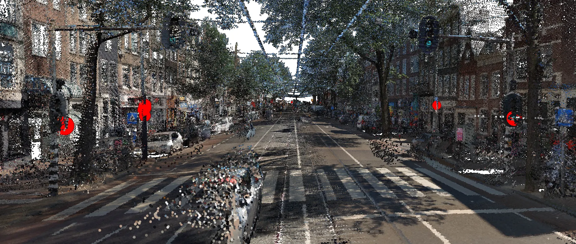
Traffic Lights
It looks like trees, similar to buildings, are a relatively easy class of objects to label in mobile point clouds... and creating training sets by projecting 2D semantic masks onto the point cloud also works here. But trees and buildings are large objects, so the question now is — can we detect and label smaller size objects in a noisy urban environment, say traffic lights?
Traffic lights in Netherlands vary in shape and size, they can be attached to vertical or horizontal poles, or hung on suspension cables.


This already looks like a complicated case, but before we dive into training another PointCNN model, let us check first what we have in the training set for the traffic lights.
The number of points classified as the TrafficLight is ~580,000, which is just 0.032% of the entire dataset — a disproportionately small amount and a huge class imbalance, if we are talking about traditional classification tasks. As an additional measure, in order to compensate for the class imbalance, at the stage of dividing the point clouds into voxels, we decided to discard any voxels that do not contain at least 30 points of the TrafficLight class (the XY voxel cross-section remained the same here — 2,500 sq.m.).
Another modification we made was to the PointCNN architecture, where we defaulted to the original ShapeNet-Parts(E) architecture which has a smaller receptive field, but an additional layer with skip-connector on the decoder side:
We trained the model for over 300K iterations, but without getting any significant F1-score improvements on the test set shortly after 100K — with so much noise in the training, validation and test sets, F1-score was not the best indicator.

As you can see, the values suggest a need for improvement, but the visualization of the test predictions looks acceptable:

This looks like a workable dataset which can, with a help of the two GIS processing pipelines detailed below, be converted into traditional vector features for further GIS analysis.
But there is an issue— since the traffic lights are represented by a modest amount of LiDAR points in the original labeled dataset, the train — test split actually has a significant spatial overlap. This happened because we were training on individual mobile point clouds, which had been collected by CycloMedia at every 5m intervals along the vehicle trajectory and which resulted in the same traffic lights being captured in both training and test sets, but just from different points of view. Not very good for an accurate quality evaluation.
To have a better way to evaluate the quality of trained model, we took a few mobile point clouds from another location — Amsterdam’s Rijnstraat neighborhood. Rijnstraat’s data was not classified though, so, in order to calculate the metrics here, we visually identified all the traffic lights in the area and ran the inference. The resulting labeled LiDAR points then were converted into the GIS point features — one GIS point feature for each cluster of LiDAR points labeled as TrafficLight. Now, by comparing the extracted point features against the visually identified traffic lights, we can calculate the quality metrics:

As you can see from above, 21 out of 31 traffic lights were correctly extracted from the Rijnstraat test set — the recall of ~68%. Still, the precision remains low as from the total of 52 traffic lights identified, only 21 match the ground truth.
Traffic Lights Trained on Relabeled Point Clouds
So, what are the reasons for needing to improve the performance of the traffic light classification and what can we do to make things work better? The very first thing, of course, is adding more training data. But, what if this is not an option, what else can be done?
One idea, which we are currently exploring, is to clean up the training data with the help of PointCNN models themselves: remember the aforementioned “tree halo” effect? To learn the nature and reproduce such halos is a much more complex task than learning typical geometric properties of building point neighborhoods, as the former comes from the classification algorithm projecting 2D semantic masks onto mobile point clouds and takes at least four things into account: LiDAR sensor position, forefront object, background position, and typical imperfections of semantic masks of the forefront object class. Thus, one could expect that for PointCNN too it would be much easier to learn how a typical building looks and much harder to replicate the halo effect on it, right? And a quick experiment actually confirms this assumption:

Similarly, we can relabel the training set with another PointCNN model, which was previously trained on trees, reducing the number of misclassified tree points even further.

We are hoping that applying PointCNN models as low-pass filters to the original training set will improve the classification quality, particularly for smaller size objects such as traffic lights. The experiments in this direction are underway and the first tests in the Rijnstraat already show a significantly better performance compared to the model trained on the original point clouds:

This concludes the first part of the workflow designated to point cloud classification. Let us talk now about the extraction of vector features from the classified point clouds…
Vector Feature Extraction using raster analysis and machine learning pipelines
For the second part of the workflow, we’ll use ArcGIS Pro to experiment with two GIS processing pipelines that input the labeled point clouds for trees in Los Angeles, and traffic lights in sections of Schiedam and Amsterdam, Netherlands. The goals of these processing pipelines are as follows:
- Extract vector polygons for tree canopies in Los Angeles, including canopy location, square footage, height, and radius attributes.
- Extract vector points for traffic lights in Schiedam and Amsterdam, Netherlands.
The first processing pipeline rasterizes, then vectorizes the labeled point clouds, and a series of GIS processing tools are used to clean up the vector polygons. The second processing pipeline vectorizes the labeled point clouds, then uses the unsupervised machine learning algorithm DBSCAN to distinguish point clusters from noise. Both approaches are discussed in detail below, using the tree canopy data in suburban Los Angeles.
Raster pipeline
The labeled point clouds (LAS format) are first organized into a LAS dataset, which is a file format that references LAS files on disk and allows for efficient display, visualization, and QA/QC of LiDAR point cloud data. The LiDAR data is then filtered to include only the class of interest (e.g. “Trees” or “Traffic lights”, then these filtered points are converted to raster, with the cell size approximately 4 times the average point spacing.


The raster is then converted to vector polygon format, and a series of processing steps are performed to clean up the data and derive attributes. These include:
- Removing small polygons and holes based on specified square footages. It is up to the user to determine this criteria based on their specific analysis problem and data characteristics.
- Adding attribute fields to calculate Perimeter/Area ratio and Radius
- Perimeter/Area ratio = Polygon Length / Polygon Area
- Radius = Polygon Length (proxy for circumference) / 2*π
3. Removing slivers or any polygons with high perimeter/area ratios. The more compact and circular a polygon is, the smaller the perimeter/area ratio. Again, it is up to the user to determine the criteria most appropriate for their case study.


Machine learning pipeline
In this second processing pipeline, the tree-classified points in the labeled point clouds are first converted to multipoints, which is a vector geometry format where each feature (multipoint) is made up of one or more points. To perform the following steps, the multipoint geometry was exploded into single points, such that each feature represented one vector point.

Due to the sheer volume of single vector points (e.g. ~4.5M points for the Los Angeles data), steps were taken to reduce the dataset size such that the subsequent GIS processing was efficient. One method of dataset size reduction we tried was to randomly remove a percentage of the points, which was executed using the following steps:
- Add a new attribute field to the point dataset
- Calculate a random, floating-point number ranging from 0–1 in the new attribute field
- Query random numbers greater than a specified value (e.g. 0.90), which would select 10% of the data points to use in further processing. Note that it is up to the user to determine how much data to remove based on their analysis question and data characteristics.
Using our randomly selected data subset, the next step in the processing pipeline was the machine learning step. For this, we used ArcGIS Pro’s Density-based Clustering tool, which implements unsupervised machine learning algorithms for detecting clustered point patterns and separating them from point patterns that are empty or sparse. These algorithms identify clusters based solely on the spatial location of the points and the distance to their neighbors, and produce an output where each point is labeled as being either a member of a cluster, or noise.
The Density-based Clustering tool includes three algorithms for detecting point clusters: Defined distance (DBSCAN), Self-adjusting (HDBSCAN), and Multi-scale (OPTICS). For more information on how each of these algorithms work and how they compare to one another, please see the ArcGIS Pro help article How Density-based Clustering works.
Though we experimented with all three of these algorithms, we achieved the best performance and results with DBSCAN. DBSCAN requires two user-specified parameters. The Minimum Features per Cluster parameter specifies the minimum number of points required to make up a meaningful cluster. All groupings of points less than this size are considered noise. Best practice is to set this value based on your specific analysis question, and may involve the user determining the smallest grouping of points that represents the clusters of interest. The second required parameter for DBSCAN is Search Distance, which is essentially a search cut-off distance within which the specified minimum number of features have to be located to be considered part of a cluster.
DBSCAN is the fastest of the three algorithms implemented in Density-based Clustering, and is most useful when the user has an idea of what the ideal search distance might be. Like the Minimum Features per Cluster parameter, it is up to the user to determine the optimal value for their specific case study and data characteristics.

The output of Density-based Clustering assigns each point a Cluster ID, where Cluster ID’s of -1 indicate noise. As such, we performed an attribute query to select all points not equal to -1, then generated minimum bounding polygons around each cluster. The geometry type specified is a convex hull, which creates the smallest convex polygon that encloses each cluster. The ArcGIS Pro Minimum Bounding Geometry tool has a Group Option parameter that allows the user to specify an attribute field to group the resulting polygons by, effectively creating one bounding polygon for each cluster.

The final steps in the machine learning pipeline include adding attribute fields, calculating attributes such as Perimeter/Area ratio and radius, and cleaning up small, non-compact polygons. The specific criteria for the polygon clean up steps are dependent on the specific analysis question and data characteristics. Details on these steps can be referenced in the raster pipeline section of this article.


What about the tree heights?
As noted in the beginning of this section of the article, one of the main goals of the vector feature extraction workflow is to generate useful attributes for each tree canopy. In the previous steps, we have already generated the attributes for tree canopy square footage and radius, but we now move onto generating the tree heights.
LiDAR point clouds not only offer attributes about the point classification (as used in the above pipelines for extracting tree polygons), but also include information about the height of each point in the cloud relative to mean sea level , which can be used to create high-quality elevation rasters. There are several well-known workflows for creating these elevation surfaces from LiDAR. The following steps detail the processing pipeline for creating bare earth Digital Elevation Models (DEM), Digital Surface Models (DSM), and normalized Digital Surface Models (nDSM).
In each of the PointCNN experiments detailed earlier in this article, the neural network models were trained to discriminate between two classes: the class of interest such as trees or traffic lights (class code 1), and the “other” class representing all other landscape features (class code 0). To create the bare earth DEMs, however, we are missing an important point cloud attribute — ground. We’ll make use of the ArcGIS Pro Classify LAS Ground tool to add the ground classification to the point clouds.
The Classify LAS Ground tool considers all LiDAR points (except those flagged as withheld or overlap) when differentiating between ground and non-ground, however only points with classifications of 0, 1, or 2 can be assigned as ground. As a result, our first step is to reassign all classes of interest to another class code. In the case of trees, we used the ArcGIS Pro Change LAS Class Codes tool to reassign the class of interest (trees — class code 1) to class code 5, which is the industry-standard LiDAR classification code for high vegetation.
The Classify LAS Ground tool offers three methods of ground detection, and the decision of which one to use is based on the variability of the topography on the area of interest. We experimented with only the STANDARD and CONSERVATIVE methods, as the AGGRESSIVE method is not well suited for heterogeneous urban areas. In the Los Angeles study area, both the STANDARD and CONSERVATIVE methods classified roughly 62% and 60% of the non-vegetation points as ground, respectively. Because the differences between the two methods we negligible, all following steps use ground classification from the STANDARD method.
Now that the point cloud has a ground attribute, we filtered out all other class codes and input it into the ArcGIS Pro LAS Dataset to Raster tool. The key parameter in this tool is the Interpolation type. When creating bare earth DEMs, it is recommended to use the Triangulation Interpolation Type and the Natural Neighbor Interpolation Method, as this combination of parameters performs a true interpolation of the ground heights and creates a smooth output surface. True interpolation is the best way to fill numerous voids in ground left by trees, buildings, and other non-ground features.

The next surface we need to create is the Digital Surface Model (DSM), which is a raster that represents the heights of surface features such as tree canopies and buildings. It is important to note here that by “heights of surface features” we are referring to the actual height of the tops of features plus the height of the ground on which they are located. In other words, a tree canopy height value of 510 feet does not mean that the tree is 510 feet tall; it could mean that the height above mean sea level is 500 feet, and the tree is 10 feet tall.
The processing steps to create the DSM are similar to those of the DEM, however we do not apply any filters to the classification codes. We input the point cloud into the LAS Dataset to Raster tool, but use different Interpolation Type parameters for the DSM. When creating DSMs, it is recommended to use the Binning Interpolation Type with the Maximum Cell Assignment, as this combination of parameters biases the resulting raster in favor of higher elevations. Unlike the DEM, we don’t need to perform true interpolation here because trees and buildings are included in DSMs, and therefore voids are not as much of an issue.

With both the DEM and DSM created, the final step is to perform simple image differencing to create the Normalized Digital Surface Model (nDSM). This step alleviates the issue of DSM height values being the actual surface feature heights plus the bare earth elevation height. The DEM is subtracted from the DSM, which effectively zeroes out the ground elevation and maintains only the elevation of surface features relative to the ground.


The final step in this part of the pipeline is to extract the nDSM elevation values into the tree polygons generated by the raster and machine learning pipelines detailed above. This is achieved by overlaying the tree canopy polygons on the nDSM, and using ArcGIS Pro’s Zonal Statistics as Table to extract summary statistics of the raster cells that fall within each polygon. For our purposes, we extracted the minimum, maximum, and mean tree canopy heights within each polygon. Because this tool outputs a table, it must be joined back to the tree canopy polygons and optionally converted to points for further visualization and analysis.


Results: Tree canopies
For the Los Angeles tree canopy example, we tested both the raster and machine learning pipelines. The raster pipeline resulted in the extraction of 73 individual tree locations, while the machine learning pipeline yielded 102 individual tree locations. The Minimum Features per Cluster and Search Distance parameters for DBSCAN were specified at 100 features per cluster and 5 feet, respectively, and were selected based on visual exploration of the data to identify the smallest cluster of points that represented a meaningful tree or shrub.
In comparing the pipelines, 52 of the 73 (~70%) individual tree locations were an exact match between the two pipelines. There were 10 instances where the raster pipeline identified one tree canopy and the machine learning method identified two or three trees at the same location. There were also 10 instances where the raster pipeline identified two separate tree canopies at a location, while only one was identified using the machine learning pipeline at the same location. There was one instance where the raster pipeline identified a tree canopy and the machine learning pipeline did not, and 22 instances where the machine learning pipeline identified a tree canopy and the raster pipeline did not.


Overall, both pipelines produced promising and comparable initial results for identifying individual tree canopy locations and their heights from mobile LiDAR point cloud data. However, the raster pipeline produced more realistic representations of the actual shapes of the tree canopies, and is therefore the recommended pipeline for extracting objects with these size and shape characteristics.
Results: Traffic lights
We also tested both pipelines on traffic light-labeled mobile point clouds in a few cities in the Netherlands. As mentioned in the data description section at the beginning of this article, there is significant class imbalance in the traffic light point clouds, highlighted for three separate locations in the table below:
                              Number of     Traffic
        Study area          LiDAR points  light points  Percentage
--------------------------  ------------  ------------  ----------Schiedam, NL                  42,205,232        70,060       0.17%
Amsterdam, NL                136,682,054           401     0.0003%
Rijnstraat (Amsterdam), NL   188,645,529         1,620     0.0009%
As a result of this class imbalance, the raster pipeline was not effective for extracting individual traffic points. There were cases where three or four LiDAR points represented a traffic light, and, when rasterizing these points, created individual pixels that were simply too small and noisy to work with. Therefore, we focused the traffic light extraction on the machine learning pipeline with DBSCAN.
The parameters chosen for DBSCAN were again based on a visual examination of the data, where we found the smallest clusters of points that represented a traffic light. For the Schiedam study area, we chose a Minimum Features per Cluster value of 10, while both study areas in Amsterdam used a Minimum Features per Cluster value of 2. The Search Distance parameter for all three Netherlands study areas was 2 meters.
Though the steps in the machine learning pipeline were essentially the same as used in the Los Angeles tree canopy analysis, we did not have to perform the data reduction steps. Unlike the Los Angeles tree multipoint dataset (which contained over 4.5M exploded vector points), neither of the three Netherlands study areas contained over ~70,000 exploded vector points.
An initial 3D visual inspection of the results suggests promising results. The yellow spherical points in the graphics below are locations where PointCNN labeled LiDAR points as traffic lights, and the machine learning pipeline extracted a traffic light point feature.

There were also several interesting examples where PointCNN labeled LiDAR points as traffic lights, however the machine learning pipeline actually separated out these areas as noise. This allowed us to delineate actual traffic lights from other tall, thin features such as street signs, trees, and light poles.

Discussion
The two GIS processing pipelines above were our initial experiments with using out-of-the box GIS tools and workflows to extract meaningful vector features from PointCNN-labeled mobile LiDAR point clouds. Both pipelines were automated using ArcGIS Pro Tasks, and were consequently repeatable in different study areas and for different objects of interest. It is important to note that although these pipelines are automated and can leverage data-driven algorithms, we cannot completely discount the human element. The analyst still has to consider their analysis question and the characteristics of their data when making decisions, particularly in the data cleanup steps and the parameterization of the DBSCAN algorithm.
The decision of which pipeline to use is also dependent on the analysis question and the characteristics of the data. In our case, the size and shape of the tree canopies in Los Angeles lended itself nicely to the raster pipeline, as rasterizing the tree canopy LiDAR points created a good initial footprint of each tree location. On the other hand, the class imbalance and extremely small spatial footprint of the traffic light LiDAR points was more conducive to the machine learning workflow, especially because of DBSCAN’s ability to work directly with vector point data, and to set the minimum number of points required to be a part of a cluster.
Before we conclude this article, there are a few big picture items related to the end product that we’d like to leave as food for thought. In both the raster and machine learning pipelines, the inputs were true 3D geospatial data in the form of mobile LiDAR point clouds, while the outputs were 2D vector points or polygons. We have no doubt that there are many GIS use cases that can leverage these 2D datasets and their attributes to do additional spatial analysis and visualization. However, there may also be use cases and customers interested in a true 3D output form, which can take advantage of the extremely high level of detail and granularity in 3-dimensional point clouds. In future work, we’d like to explore this question of the “end product” in more detail, and adjust the processing pipelines accordingly.
Conclusion
In this post we have covered an interesting experiment of extracting various classes of objects from raw point clouds using deep neural networks and machine learning: discussed a simple way to quickly classify point clouds with the help of 2D semantic masks and in-sync oriented imagery to create large training sets, settings and training PointCNN models, Raster-based extraction and DBScan clustering algorithm, denoising.
Surprisingly even to us, the above experiments with training sets created off semantic masks show that this method of mobile point cloud labeling is suitable to teach PointCNN models to pick up even small size objects like traffic lights.
We think that the above workflow shows a great potential for bringing down the cost and time to collect high-fidelity 2D and 3D vector features suitable for full-fledged GIS analysis, and, ultimately, getting us and our users much closer to usable “digital twin” models.