A Sustainable Collaborative Atomic Design System for Products and Teams at Scale
Using Sketch Symbols Libraries + Abstract
According to Leo Sansonovicz, this is my Neil Gaiman long title 😛

Design System is a known term in the UX Design community and there’s been a lot of discussions around what defines it. Before I start to describe how we create and maintain our Design Systems here at Ambush/DeepX, I want to quote François Hoang on the article he wrote for Abduzeedo:
“I don’t personally think there are any right or wrong ways of creating a DS (Short of Design System). I believe that it all depends on what is the scale of the company you are working for whatever that is small or big. This is where the difference should be more affected by.”
— François Hoang, Editor and one of the writers on Abduzeedo
I agree with him in the sense that the definition of a Design System depends on the context of your project, not all projects will have AI models or bot scripts if those are required to call it a Design System, as I saw a couple of months ago in a Twitter thread.
“A design system is a collection of reusable components, guided by clear standards, that can be assembled together to build any number of applications.” — Will Fanguy, Digital content wrangler at InVision
Moving away from the definition of it, I do believe there are three main benefits of building one for your project. A good Design System allows us to design better, faster and collaboratively. Better because we maintain consistency throughout the experience by standardizing interactions and reducing a user’s learning curve. Faster because we can reuse the components (whether the components are visual designs, code, interaction standards, ontologies, customer experience principles, etc.) without having to recreate them every time. Collaboratively because components can easily be shared and improved, in a structured/centralized way, with any designers working on the same project.
That said, keep in mind that I will be focusing on the visual components library of our Design System as it relates to how we organize, maintain, and collaborate using Sketch combined with Abstract.
Atomic Design
Brad Frost’s metaphor for creating and maintaining Design Systems is what guides our framework for organizing symbols in Sketch.
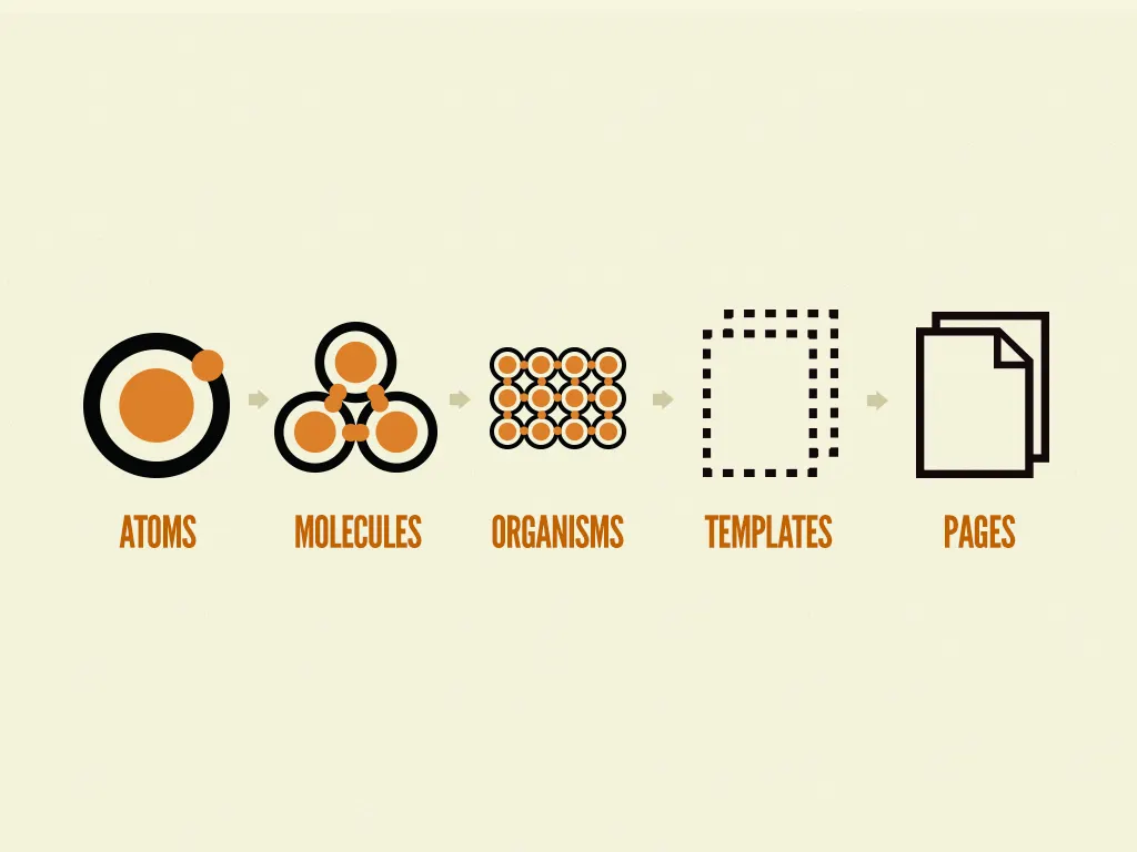
In the natural world, atomic elements combine together to form molecules. These molecules can combine further to form relatively complex organisms. To expound a bit further:
Atoms are the basic building blocks of all matter. Each chemical element has distinct properties, and they can’t be broken down further without losing their meaning. (Yes, it’s true atoms are composed of even smaller bits like protons, electrons, and neutrons, but atoms are the smallest functional unit.)
Molecules are groups of two or more atoms held together by chemical bonds. These combinations of atoms take on their own unique properties, and become more tangible and operational than atoms.
Organisms are assemblies of molecules functioning together as a unit. These relatively complex structures can range from single-celled organisms all the way up to incredibly sophisticated organisms like human beings.
— Atomic Design by Brad Frost, 2016
To make it more intuitive for us to create and find the symbols we need, we are using a correlation between the Atomic Design metaphor and the first group separator of our Sketch symbols:
Atoms
Typography, Colors, Icons, and Elements
Molecules
Components
Organisms
Navigation, Widgets, and Pages
Organizing symbols
But what is the core characteristic behind these groupings? How do we know what group to assign a symbol to? To help in categorizing these, we must first create clear definitions of each one.
Atoms
Typography
These are the global text styles, e.g. Headings, Paragraphs, Links, etc.

Colors
Each color in our color pallet is also a symbol in Sketch. Now there’s quite a bit we can do with colors in Sketch, but to keep things high-level, and focused on the purpose of this article, we will save a deep-dive into using colors in Sketch for a future article. There's also a bunch of good articles already about colors in Sketch here at Medium.

Icons
All system icons used in the projects, e.g. arrows, check mark, social icons, etc.

Elements
The basic building blocks of any UI, they are the most simple symbols we can create. E.g. Buttons, labels, badges, etc.

Molecules
Components
More complex symbols, usually a combination of a few elements. E.g. Dropdowns, Input Fields, Button Groups, Growl Messages, etc.

Organisms
Navigation
Everything related to the project’s navigation. Usually a combination of symbols and its instances. E.g. Header, Footer, Menu, Sidebar, etc.

Widgets
Specific symbols that can be applied into multiple pages, exactly as they are, without the need of changing its content for other contexts. E.g. Floating chats, weather, birthdays, scores, etc.

Pages
Specific symbols that only make sense in that particular page/context, but you’ll need to apply to other variations of that page. E.g. Tables, charts, specific cards, etc.
Those categories are what differentiates the purpose of use of the various symbols in the library, they are the building blocks of the UI (Dropdowns, Buttons, Tables, Paragraphs, Header, etc.).

Group Separators
Inside those groups we need to specify its type. Buttons might be flat or raised style, switches might be ON or OFF, button groups might have 2 items, 3 items or 4 items. We use nesting to override those states and types.
Symbol Groups Structure
We use a generic structure to guide symbol grouping:
Atomic Category / Main Group / Group Separator
A few examples of basic symbol group separators:
Icons / Chevron / Left
Icons / Chevron / Right
Elements / Buttons / Flat
Elements / Buttons / Raised
Elements / Switch / On
Elements / Switch / Off
Components / Button Group / 2 Items
Components / Button Group / 3 Items
Components / Tooltip / Bottom
Components / Tooltip / Top
Group separators can go as many levels as it needs:
Components / Button Group / Large / 2 Items
Components / Button Group / Regular / 2 Items
Components / Button Group / Small / 2 Items
Components / Button Group / Extra Small / 2 Items
Principles to create a shared symbol
We have a short set of principles to guide us on why and how to add a new symbol to our libraries, it helps us to keep them clean and meaningful.
Don’t Repeat Yourself (DRY)
An expression borrowed from the development world, we use this principle to help decide whether to create a symbol or not. We don’t want to create symbols just for the sake of it, it needs to have a purpose. So, if we start to duplicate the same design over and over, it means that when we need to update it, we’ll have to do it everywhere it is duplicated. So, don’t repeat yourself and create a symbol to make it reusable (by you or anybody else on the team).
Think Generic
Grouping symbols is one critical piece of the process. Their hierarchy needs to make sense in an agnostic way. We try to think about the intrinsic characteristics of each symbol.
Let’s say we are working with an email/messaging platform and we need to create the list item to display the messages preview. We think about that symbol’s anatomy and if it could be applied in different contexts (e.g. store item), and use the overrides to change its context.

But consider the context
Sometimes we need to swap just a part of a symbol with another instance. Maybe instead of that “Info” on the right side of the ‘List Item’, we need an icon. Instead of creating a whole new symbol for it, we use the overrides panel. And because, most often, symbols within symbols only make sense in that context, we use a prefix, a “_” (underline) to determine that it belongs to another symbol.

In the beginning, we only added the “_” (e.g. Components / List Item / _Info), then we switched to “_Accessories” (e.g. Components / List Item / _Accessories / Info), and now I’m proposing to use “_Overrides” (e.g. Components / List Item / _Overrides / Info) because I think it’s what makes more sense since is how Sketch calls this feature.
Making collaboratively shared libraries
If you haven’t used Abstract yet, it’s a collaborative version control/design workflow software for Sketch files, pretty much a Github for design.
There are two ways of working with libraries in Abstract depending on the nature of your company’s business and how your projects are organized: Sketch Library in the same project and Linked Sketch Library from another project.


Evolve your Design System collaboratively
Now that everybody knows how to add new atoms/molecules/organisms to the system, how do you ensure that all team members are still applying those concepts and not making a mess in the library files?
One thing I love from the development process is pull requests. This practice ensures that another person, other than the developer writing the code, is reviewing the changes and together they can discuss potential modifications.
Thanks to Abstract, there’s now a pull request concept for design files, it’s the request review feature.

Request review allows you to select a reviewer for your branch and the design updates you’ve made in it. The purpose (or at least the way we use) is not to review the design (look & feel), but rather that the principles are being applied consistently. It creates a protection network for the Design System and prevents designers from working on it in a silo. The idea is to promote constructive discussions about the evolution of the system.
It also helps prevent files from getting messy. For a collaborative Design System to be sustainable, the files need to be neatly organized so everybody on the team can work on it without having to spend time figuring out how those files work.
Reviews are valuable even if you work on a small team (like we do) and have solo designers on projects. If you are the reviewer, think about if the file is organized in a way you'd like to work on. Designers switch projects quite often (especially in consulting) and so you might have to jump into a project that you were not responsible for creating the UI style, but now you’ll need to understand and evolve it. Additionally, once a project is completed, this process will leave high quality, well-organized legacy files for the organization.
Next steps
Now we need to translate those Sketch symbols into actual reusable modular code. We already started creating the atomic components for a client but there’s still a long road to have everything we need to put together templates and then pages.
Design Systems are a living thing, it should always be evolving. Maybe it’s their nature to be incomplete, maybe they will never be finished, if they do, at some point they will get outdated, we should always be revisiting.
As the tools (and our mindsets) evolves, we find new ways of working with libraries so that it has less symbols variations, making our system smarter, easier to maintain and to collaborate.
A Design System
Below is the initial Design System guide we did for one of the projects. Thanks to Thiago H. Dalcin for putting this together.


This article was intended to provide a starting point for organizations and designers who wish to use design tools to help create, organize and maintain Design Systems, and I wanted to share our current experience.
Thanks to Eduardo Javier, Leo Sansonovicz, Thiago H. Dalcin and Michael Schramm for the support to make this possible.
