Library Brutalist
The Library of Congress is the largest library in the world, with millions of books, recordings, photographs, newspapers, maps and manuscripts in its collections. The Library is the main research arm of the U.S. Congress and the home of the U.S. Copyright Office. The Library preserves and provides access to a rich, diverse and enduring source of knowledge to inform, inspire and engage you in your intellectual and creative endeavors.
Clever and well crafted logos are not easily done and even harder to come by. Those elite pieces of design are revered by those of us who appreciate that sort of thing, but effortless for anyone to see the beauty and wit within.
It’s not enough to be aesthetically pleasing though, a logo of elite craftsmanship must also communicate a certain desired message about what it represents, most notably as it is applied to it’s destined “living space”. It’s not so much about what it is in the corner of a business card, but what happens when its brought to life in the place it represents. Would you say it comes alive? Does it look at home? Does it look as if it could have been placed there years ago and will be there years ahead?…Does it just feel right?

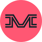
The wit and timeless symbolism of the book-flag logo designed in 2010 by Chermayeff & Geismar & Haviv for the Library of Congress is one of those exceptionally rare logos. Perfectly suited for what is a modern day Library of Alexandria. Both an open book and waving flag inviting you to explore the depths of knowledge within, patriotic, and built as a square so it has a sense of strength and gravitas— in my opinion, this is what perfection in logo design looks like.
Turning The Page
Reflective of the American political climate today, something which was created in the last 10 years has been replaced by something far lesser than. Enter the new logo and identity system for the LOC, a lifeless, Brutalist wordmark from the design house Pentagram.

The new logo itself is tone-deaf, lacking any hint of gravitas the library deserves. It’s redundant, reading as “Library Library Of Congress”. It lacks symbolism (which the previous logo had in spades) because it is only text. It’s emphasis is on the wrong idea as the LOC is not just a library, but the library of the United States.
“What makes the Library of Congress impressive is not the fact that it’s a library but that it’s the library of the United States. I can go to a library any day of the week I want but the library OF CONGRESS, that’s another story.” — Armin Vit, Brand New


Visual branding for a library built on typography is an interesting concept, though. It deserves to be explored, because what could be more logical than a text driven identity for a place that is primarily books? However, I believe in practice the lack of a symbol, or even a monogram, will be difficult to deal with.
Identities today need to be more flexible than ever due to the many different applications required of it. Yes, this system is built on flexibility in variation and there’s opportunity for endless things to be placed inside the “Library” mark, but it’s not flexible in application—what goes into all of those smaller spaces on a website and social media? They will miss the book-flag symbol especially for this reason.
“Our view here at the Library of Congress is the image of a treasure chest, filled with limitless information and services, ready to explore and amaze if you open it up.”
The irony is that was really well captured in the previous logo.
In wanting a new identity that says “things are changing here”, the baby has been thrown out with the bath water and what was really needed was likely not a new logo or branding, but a good marketing campaign which Pentagram’s designs are more appropriate for.
“What is a library? There is no right or wrong answer.” — Carla Hayden, loc.gov
You would hope the Library Of Congress has an idea of what their library should be and what it stands for, but that comment reflects the new branding pretty well. It’s just… whatever.
From what I’ve gathered from the statements from LOC and Pentagram, there was no good reason to abandon the previous book-flag logo. That is a decision made by the LOC themselves and I wonder because that logo was created during Obama’s term in office, did that influence the decision to change now? #conspiracytheory
“In its friendliness, accessibility, and cultural bent perhaps it has lost its status as an authority and as one of the few branches of the government that celebrates the knowledge and output of the people.” — Armin Vit, Brand New
Final Thoughts
Graphic design is communication and what all this says to me is it’s a personal, disorganized book shelf rather than the world’s most esteemed library. Knowing Pentagram designers and their affinity for all things typography, I wonder if a personal quest for a cute idea got in the way of actually creating a good branding system for the library? Were they more concerned with disrupting visuals of standard library identity than the appropriate communication of the place that was given? I’m all for breaking status quo, but you have to do it with reason.
Pentagram’s design philosophy and my own collide, certainly on this project. I believe a strong symbol cannot be beat, but they might tell you all you need is a good font, then type out the name and work on the kerning for a week. It would be hard for me to praise any work created as such, but the bigger issue is the client themselves. I see no reason to change the branding. There is a reason to create new marketing campaigns, offerings, and to attract attention to the LOC. I believe that should have been the focus of this project rather than giving it a new logo that could not possibly have been made better.
Overall, this is fairly standard executed work with that one interesting idea— its’ all just misplaced in how it should be used. I would love to see the book-flag come back as the primary mark and Pentagram’s work used as a 2018 marketing campaign.