Inspiring creatives with inspiring creativity
Another collaborative creativity project by Happykamping

ADCN is the Advertising Design Creativity Netherlands, representing creatives in the field of commercial communication. Every year advertising, design agencies and freelancers enter advertising and design work produced during the preceding year. These materials are judged by various juries and by the jury of members according to the aims of the ADCN. The principal criteria are creativity and originality. Each jury grants in its respective category (needless to say only with good reason), awards and honourable mentions. These are included in the Annual of Dutch Advertising. With these Annuals the ADCN endeavours to create a bit of historiography from which people in the advertising and design business can take example.
It is an ‘honorary mission’ to be invited to make the book. Every year, for the past 49 years, after careful consideration, an agency, a designer, creative talent gets the opportunity to create something special. This year, it was different. Dinesh Sonak, the new managing director of ADCN, is not the typical commercial communication creativity person. He is more of a design thinker than an ad guy. He is also a firm believer that true creativity is found where different disciplines collide, and this thinking he is also applying to ADCN, transforming ADCN from the board to the award. He has a clear understanding that it’s not about the timely matters, short term gains, answering questions, but that the true value lies in the timelessness of things, long term relations and questioning questions.
During a meeting between Dinesh and Arjan Postma of Freedomlab, the books came up. The idea was to give all 1,000 copies a 3D printed cover. To make them into physical reminder of the fact that today anything is possible. Arjan shared Dinesh’ question at Freedomlab, where Marieke suggested to contact me. Yay!

After a great conversation with Dinesh, it soon became clear what it actually should be. Since time and money were restricted, ideas could be outrageous, but reality always limits those dreams.
We decided that it should be about this transition, this change. The idea that when you bring different disciplines together to create something, new things will come from that. And, that it’s difficult to have ideas with what you don’t know. So, we should provide high inspiration, showing new and other ways to create things to inspire other creatives to create. That’s when I decided that it could not just be one cover. It needed to be more. And that it should be the absolute maximum we could make happen within the limiting contraints of time and money. Exciting.
We decided to take a ‘fashion approach’ to create these books: create a catwalk moment and to create a prêt-à-porter (ready-to-wear) collection of books. To not only have a vernissage where the books would be revealed, but to also have an exhibition where the original works are presented. And to make that somewhat interesting, 12 unique pieces would be great. Which is three times the letters ADCN. This simple thought of a letter per book, the basic A4 size and a somewhat restricted height, where the only limiting factors for the contributing designers. For the rest, we would just need their rough and uncut creativity to show possibility and opportunity for new creativity. And so it happened.
Making this happen would require extreme flexibility. I knew that I could only make this happen with the help of Marieke and Joost. Marieke has a background in building an airplane while flying and making them safely land projects. Joost is a print producer that can make any idea happen within the same limiting restrictions, who fluently blends digital and traditional production techniques into high quality print productions, and still delivers on time. We needed to create as much time as possible in print production, if we wanted to have high quality covers where potential contributors could be proud of. And just as importantly, finish them in time for photography, pre-press and eventually print production. We needed to have the books ready and available for presentation end of Januari 2015.
To inspire creatives with book covers?
Yes. Creative people have a massive impact on the world as we know it, experience it, live it. They help us solve the challenges we face: to find smarter ways to get attention, get people moving, create new products and services. Creativity shapes our new ideas. It leads the way to explore new worlds, new possibilities. Fundamental new ways of thinking and doing. And this is amplified by today’s technological possibilities, which creates endless possibilities. Technology works as a massive multiplying magnifier. It allows us to discover spaces and places we have never been before. It gives the masses direct access to these spaces. Not only as visitors, but as participants. Architects. Explorers. This changes e-ve-ry-thing: rules, roles, laws, knowledge, access, ownership, distribution and relations. We need creativity to help us shape these new possibilities. But to do that, creatives need to be well-informed of possibilities.
The work that commercial communication creatives make is everywhere around us. From the commercials that interrupt the movie you are watching, the banners on websites, the posters at train stations, highways, the embedded messages in tv shows, the flickerings signs during a football game, the symbols on your shoes and clothing, your phone… They massively impact how we see the world, meanwhile communicating and defining culture and nationality. That does not make them important bunch of people, but they do carry a massive responsibility. Because they influence what we buy, what we like, what is ‘good taste’, etc.
They have the power to surround us with anything, including ugly, careless, unconsidered visual garbage to make you want buy stuff, to make you do things. These creatives create work that works as the mediator between people and brands. Brands that represent products and services that fulfil a role in people’s daily lives. Their work hopefully helps people to make better informed decisions. ADCN wants to take this responsibility seriously.
A book as a change agent
The book, the Annual, plays an important role in this community of people, for already 49 years. It’s an important artefact that holds and celebrates the best work. This makes it the perfect platform to communicate with that community. The book is published in 2015, with work that got recognition in 2014, but was made in 2013. So, the 2014 books should nurture and celebrate the past, meanwhile inspiring the future. As a perfect marriage of the two. Creativity can change the world. We have to find smarter ways to get attention. We have to get people into motion. We have to come up with fundamental new ways of thinking and doing. We have to create new products and services. The books could help to inspire, show new ways to give shape to our new ideas. They could show ways to come to new things, to explore new worlds, to show new possibilities.
The ADCN book covers cover this. We used the covers to show diffent ways to create impact, to tell a story. We wanted to push that as far as we could, showing new approaches and new ways to make things, by either people that do not necessarily live in the commercial communication space or people that do, but were challenged to make something really out of their comfort zone. Not obstructed by limiting factors that usually come into play with work for clients. Together, their work could potentially show what’s possible by trying out something new, new materials, new thoughts, new technologies, new combinations. The result: twelve unique covers that cover more than just being a cover.

ByBorre
covers tactile technology


‘It will be more than a layer’
Cotton, polyester, conducting yarn and a solder machine.
Borre is driven by the idea that the textiles that surround us every moment of our lives, could and should be more than just a functional layer to only keep us warm and dry. It could also be an interface that helps people to communicate with each other. In our daily lives we always wear textiles ànd personal communication devices, like phones. Just imagine what would happen if these two will merge, allowing person to person communication without visible, but noticeable technology. To accomplish this vision of fully merged technology with textiles, Borre works from the yarn and literally stands next to the machine to see what options are available in the weaving process of a substance.
Borre told me that he was triggered to participate in the project because he too believes that something needs to be done to show what is possible, using technology, remixing disciplines to come to better and more meaningful products and solutions.
More information
ByBorre
Maria Walnut
covers playful simplicity


‘What you nurture grows’
Acrylic on paper, wood, chance and happy mistakes.
Maria likes simple shapes that carry higher meanings. With the cover she wanted to create a reminder, that in life and in our work we have to put our hearts into what we do.
I stumbled upon the work of Maria at an exhibition titled In boca al lupo in Bergen (NL), that consisted of a massive amount of really simple but cleaver drawings, made by Maria and visitors to the exhibition. I was instantly in love with them because of their simplicity and their truthful, authentic, pure and sincere style. They put a smile on my face.


When I met Maria in Amsterdam a couple of weeks later, I just learned that I was going to work on the ADCN covers. I just felt that she needed to be a part of it, to show her way to tell a story next to some technology enabled covers.
More information
Maria Walnut | graphic design and illustration
De Culinaire Werkplaats
covers art & food


‘Think orange — the essence of NL’
Carrot in 12 different ways (powder, dried, fried, raw slices, puree, jelly, paper, 2 types of foam, ice, pearls, cracker), agar agar, pro espuma, tapioca, lecite, orange paper.
‘De Culinaire Werkplaats’ explores and addresses all kinds of societal issues, themes, matters by creating playful edible communication triggers. For their book cover with the letter N, they applied their techniques and materials: various textures of an orange carrot showcase the variety, the talents, the DNA of the Dutch society and dutch way of thinking and creating. Every technique results in another texture, every texture reveals another taste and/or aspect of a carrot.
The work created in commercial communication is usually very audio-visually focussed. It’s the industry of creating meaningful and activating symbolism for clients where people can interact with. But a lot of senses are usually not included, like touch, smell and taste. This cover is a nice reminder of that.
More information
de culinaire werkplaats, Marjolein Wintjes & Eric Meursing
Marcel Kampman
covers monumental moments


‘A subjective representation of the sky’
CNC cut and UV printed PVC plastic.
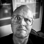
I wanted to create something as a constant reminder that nothing is what it seems. This subjective representation of the sky over 84 Kingsland Road (London E2 8DP on Friday 2 January 2015, recorded in 30 minute steps during 24 hours) is a reminder of the fact that nothing what you see must be taken for granted and that you should always be fully and continuous context conscious. Why? In the industry I’m in (working as a creative strategist and strategic creative) there is a tendency to use models and methods as truths, not as handy tools. Because we want to better understand things we like simplifications, summaries of the bigger, longer story. Over time, we tend to forget evething we stripped from the whole story and because of that, meanings and interpretations change.
For this cover, I made pictures at a particular place, with a particular camera, with a particular lens, at an particular angle — all affecting the colour of the original picture. Then it was reproduced with particular software, making particular decisions which colour to pick as the most representing colour of that half hour, it was printed using a particular technique with a printer of a particular brand… Resulting in something that in a way echo’s a specific moment at a certain place, but is completely artificial.
The 48 layers were cut from 1 mm thick PVC plastic using a CNC cutter and then printed using a high resolution UV printer and manually piled up to create the pile of colour for the cover.
More information
Marcel Kampman, happykamping.com
Alfons Dolsma, Dolsma Special Projects
Merijn Tinga
covers plastic soup


‘The indestructibles’
Caps and lids found during the Boskalis Beach Clean up this august, epoxy.
Multidisciplinary artist Merijn Tinga is active in the public space. His projects are characterized by a great diversity of materials and techniques. Accessibility, provocation and interaction with the audience are important aspects of its projects. In the sculptures of artist Merijn Tinga man is the primary subject. Merijn got a lot of attention last year for his project Plastic Soup Surfer. In the summer of 2014, he sailed with his homemade board of plastic debris found in the North Sea beach from Belgium to Germany. Goal of this trip was to draw attention to the plastic waste problem in the North Sea, and oceans worldwide.
For his contribution, Merijn used caps of plastic bottles found on the North Sea beach. The bottles belonging to these caps have all sunk. Together, the caps used for the cover equal the weight in trash that is spoiled into our North Sea every 5 seconds. Obviously, this is a topic that needs our immediate attention. But Merijn’s project also shows that there is plenty of opportunity to connect a societal topic to create attention, potentially for brands as well, like for example G-Star Raw does with its RAW for the Oceans project. This is a collaborative project that takes plastic from the world’s oceans and transforms it into innovative denim and apparel.
More information
PlasticSoupSurfer.nl
AtelierTinga.nl
RJW Elsinga
covers inspiration blooming


‘Inspiration Blooming’
3D printed polyamide.
RJW, or Roel, has a truly playful mind. And because of that, everything he creates has a childlike playfulness mixed with mature craftsmanship. I had the pleasure of working together in 2013, collaborating on the Dutch Pavilion at the Beijing Design Week. Roel is fascinated by chairs, and that’s why he has designed, I think, the biggest collection of chairs by one designer — ever. If I remember correctly, last year he completed over 200 designs and he is keen to find a partner, label or any other way to bring them into the world. Until then, this collection exists as The Unexisting Collection and you can buy pieces from this growing collection as miniature 3D-printed designer-furniture. Just like the Vitra Miniatures Collection, but better; you can choose your own colour and they will be future classics. Hopefully at least some of them might yet be produced full scale one day in proper & comfortable materials. I think, they will.
For his contribution to the cover project, Roel decoratively visualised the Dutch creative landscape as a blooming meadow and interconnected ecosystem: grow & bloom, give & receive, shine & spark. In which the iconic ADCN light bulbs highlight the most inspiring flowers.
More information
RJW Elsinga interiors, graphics, products
Roel’s cover was printed at Shapeways
buurmen
covers sculpting data


‘Refreshing Book Cover’
RGB LED Matrix, Arduino microcontrollers, acrylic sheet, internet.
buurmen is an artist-run studio specialized in internet-based projects. The stuff they make has to look good, feel good and work even better. They offer services from idea to execution, including creative direction, graphic & web design and development. I know David and Tom for quite some time already. They my students at the department Interactive/Media/Design at the Royal Academy of Art in The Hague. We kept in contact ever since. Both David and Tom always had a different approach to subjects that fascinated me. I think the cover they made is again refreshing. It is based on the idea that as soon as a book is printed, it is no longer in the now on a material level but becomes part of the cloud of data surrounding it. By capturing the now a social sculpture is constructed that’s always in motion. One of the things I particularly like is that no current technology is hindering them to make their ideas manifest in any shape of form, really exploiting the possibilities internet as a medium has in projects they do.
More information
David Veneman & Tom Laan van buurmen.nl in collaboration with Maurice Mikkers.
Tjeerd Veenhoven
covers backyard innovation


‘Sustainability from a designers perspective’
Reclaimed potato starch binder, backyard grasses and grains.
Tjeerd, to me, is one of the most important Dutch designers. He runs his product design studio with a love for inventing materials and production techniques in Groningen, in the north of the Netherlands. He firmly believes that being a designer is much more than just aesthetics or expressing trend: it is almost activism; a desire to design to change the world. His design studio experiments with materials and crafts from all over the world with the aim to develop new products to strengthen local economies, create ecological awareness and apply design thinking. The studio’s latest innovation is a modification of dry and brittle palm leaves that turns them into soft and flexible vegetarian leather, which are now being produced in the rural areas of South India in cooperation with some of India’s brightest social entrepreneurs. This Palmleather project has won numerous prestigious awards.
The cover for the book is made from a bio-laminate, a new material created by the studio and HuisVeendam. What’s in your own backyard can be much more than compost. With some persistence and perspective waste turns into value as these bio-laminates prove. Bio-laminates are made from materials that are considered waste or have no apparent function. They are a truly sustainable alternative, and for sure more beautiful, than many existing building materials.
More information
Studio Tjeerd Veenhoven
HuisVeendam
Oak & Morrow
covers product personality


‘All a book wants is to be touched’
Screen print with thermic paint and some magic.
Oak & Morrow’s goal is to design beautiful and meaningful interactive products and services. They believe they can do this best by working together with a broad range of strategic and creative people. And by doing that, they hope to bring back a bit of wonder into this world. And that’s exactly the reason to invite them to the project. They like to work on dream projects. Projects that allow them to go beyond, try out new things. I know Jeroen since we worked together at Fabrique. I got to know him as a highly ambitious spirit. So by inviting them, I knew their project had to become special. It totally exploded. They started from the fascination that they love to look at objects as if they have a personality. What would they think? What would they yearn for? In this case it’s a book that wants to be touched and looked through. Just putting it on a shelf to look pretty would make the book sad and fade away. So they added a load of technological enhanced personality to the book. To create the possibility to interact with the book based on the time invested in the relationship: by holding it for a longer period of time, it reveals more and more of its cover in multiple stages. To make this a reality, the book is stuffed with smart hardware and coding, closely working together with thermic inks that become transparent in several stages. Funnily, when you experience the book you don’t notice the sheer amount of work put into it; it just magically works and makes you truly wonder.
More information
Jeroen van Geel, Marten de Jongh & Sophia Altekamp of Oak & Morrow (concept & design), ZenkOne, Zeloot & Marijke Buurlage (illustrations), Taco Ekkel of Q42 (creative technology).
Stang
covers material research


‘Crystal clear indistinctness’
9 layers of plexiglas, laser cutting technology.
Stang normally works in a very clear, bright and distinct style, but for his cover he wanted to create an abstract image with technique and materials as a starting point, so you don’t immediately see what you’re actually looking at. The result is absolutely stunning. And incredibly difficult to capture in a photo. Even though I really like it as a reproduction on the cover, you really have to see it in real life to see how transparency and light plays with it. By just applying his style and way of working to a material he normally never uses, something new is created. You don’t always need to have an idea before choosing a material or production method. Sometimes doing it the other way around leads to something refreshingly different, opening up new opportinities.
More information
Stang.nl in collaboration with Snijlab.nl
Thijs Biersteker
covers judgemental technologies


‘The cover that judges you’
Face tracking technology: Adobe NXT, Robotics: Audio Arduino + Custom Copper Mechanics Paper, Foam.
Thijs wanted to create a book cover that is both human and approachable-hi-tech. He hates it when his skepticism and judgment gets in the way of amazement and wonderment. That’s why he wanted to create a book that only lets you read it when you approach it without any judgment. Great for a book that’s full of creative work that has already been judged and awarded. Ever judged a book by its cover? Thijs has reversed the well-known idiom — designing a sleeve that scans your face and won’t open unless approached without prejudice. If the awaiting reader shows too much emotion — either overexcitement or under-enthusiasm — the book will remain locked. Only when pulling a neutral expression will the scanner allow an Arduino micro-controller to unbolt the lock and let the user browse inside. The camera is positioned at the top of the cover, above a screen that feeds back the image when it detects a face in close proximity. Abstracted facial features that form the shape of the screen allow the prospective user to line up their eyes, nose and mouth in the optimum position. Once the correct alignment is obtained, the screen turns green and a signal is sent to the Arduino board that opens the chunky metal lock.
More information
Visit the dedicated website Thijs created to cover his contribution. Thijs is founder/partner at Moore. The cover and collateral has been created incollaboration with Thispagecannotbefound.com, Arduino puzzle: Adrien JeanJean, production: Marlies Olbertijn, face scanning magic: Koert Gaaikema, great guys: Marcel Kampman, Joris van Elk, Alfons Dolsma and Dinesh Sonak.
Waag Society Open Wetlab
covers identity Lost & Found


‘iDentity’
Environment bacteria of the Waag and some extra bacteria: Janthiobacterium lividum (purple) Xanthomonas campestris (yellow) and Arthrobacter agilis (pink).
Waag Society, institute for art, science and technology, develops creative technology for social innovation. The foundation researches, develops concepts, pilots and prototypes and acts as an intermediate between the arts, science and the media. Their Open Wetlab focuses on life sciences and the design and ethics of life. They want to involve the industry, artists and designers, but also the political forces and the public, hands-on in the shaping of biotechnology, as well as in what biotechnology creates. Open Wetlab promotes the production of bio-art because Waag believes that bio-art is visionary and can be guiding for new prototypes and applications. Thus, Waag investigates to what extent and how art and science can work together and in what way art can influence a scientific agenda. Finally, Wetlab develops workshops and conducts research in the field of biotechnology and sustainability.
Waag Society’s submission is an enlargement of a fingerprint taken from the German Minister of Defense, moulded from gel and placed in a breeding ground for bacteria. This particular fingerprint caused an uproar at the end of 2014, because hackers from the Chaos Computer Club copied the exact fingerprint using high-definition photographs and the commercial software called VeriFinger.
Their cover is therefore also a statement. It symbolizes the fact that bio (metric) data, like fingerprints, are now up for grabs. Fingerprints might appear more secure than passwords. But if your password gets stolen, you can change it to a new one; what happens when your fingerprint gets copied?
The copy of this fingerprint also had a life of it’s own. The pattern of the fingerprint consists of a gel which serves as a nutrient medium. They put bacteria from the Waag in a homemade template, and after a few days, a visible pattern began to grow. At the same time they had the microbiological composition of the Waag mapped out on the book cover, so — in that sense — it also became Waag’s own ‘DNA’. The concept behind the cover fits in seamlessly with the ongoing discussions and questions about ownership and privacy: because who is the real owner of all this personal data?
The mold for the pattern has been made with the laser cutter at the Fablab Amsterdam, the bacteria were grown by Waag’s Open Wetlab.
More information
Waag Society Open Wetlab: Marleen Stikker, Pieter van Boheemen, Henk Buursen, Lucas Evers, Tom Demeyer.
This project would have been impossible without
Marieke Hermans Captain Dragon, Joost Widdershoven Booxs, Alfons Dolsma Dolsma Special Projects, the ADCN team ADCN, Joris, Joop & Dennis Beerling Fotostudio Beerling, and of course all makers.
You can buy the books from Februari 2015 via the ADCN website.