Common Metrics to Evaluate Model Performance
Curious about how to use a confusion matrix and common metrics to evaluate your model performance? We got you covered.
When we use classification algorithms to predict the category of observations, we should also evaluate how accurate the predictions are. While we could just count the number of correct predictions and incorrect predictions, there is an opportunity for more detailed and informative information about the performance of a classification algorithm. In this article, we discuss how to use a confusion matrix to calculate common metrics such as accuracy, precision and recall, area under curve, and F1 scores. We then describe which metrics to use depending on the context and distribution of the dataset, and link sample code for the you!
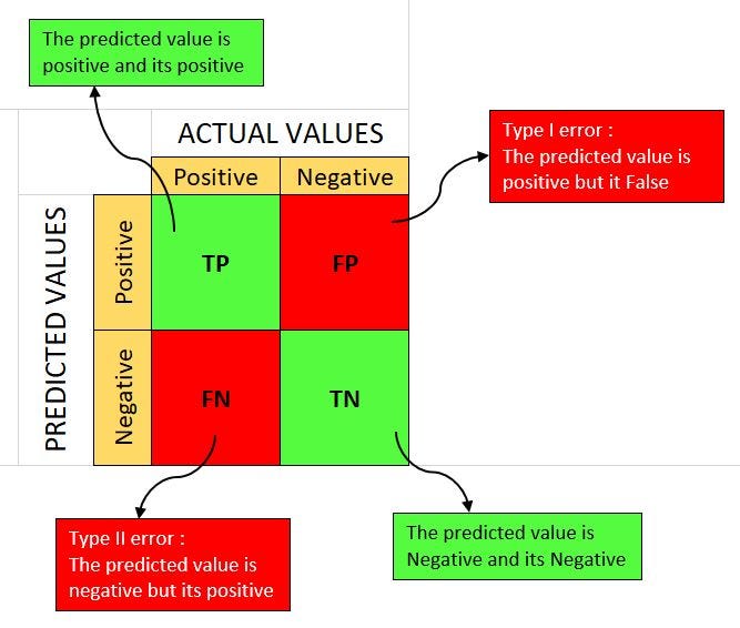
Confusion Matrix
A confusion matrix is a table that is used to evaluate the performance of a classification algorithm such as logistic regression, K-nearest neighbors, decision trees, etc. For more information on classification algorithms, see this article.
The matrix compares the classifier’s prediction with the actual values by dividing the observations into four classes:
- True Positive (TP): A test result that correctly indicates the presence of a condition or characteristic.
- True Negative (TN): A test result that correctly indicates the absence of a condition or characteristic.
- False Positive (FP): A test result which wrongly indicates that a particular condition or attribute is present when it is actually not. when it is actually not.
- False Negative (FN): A test result which wrongly indicates that a particular condition or attribute is absent when it is actually present. when it is actually present.
Using the number of observations in each of these classes, we can calculate true/false positive/negative rates by using the following formulas:

We use these rates to calculate certain metrics as described later in this article. In general, you want your algorithm to minimize the number of false cases. Thus, you want a low false positive rate and a low false negative rate, and high true positive and high true negative rates.
Example: Predicting Sickness
Let’s consider an ML classification algorithm that predicts whether a person is sick or not using variables such as the person’s body temperature. The confusion matrix below outlines the TP, FP, FN, and TN categories.
A confusion matrix visualizes and summarizes the performance of a classification algorithm. At first glance, we see that the model predicts that healthy people are healthy (the true negatives) for a majority of the sample size! To determine exactly how well the model predicts sickness, we can calculate the true positive rate (TPR), false positive rate (FPR), true negative rate (TNR), and false negative rate (FNR) to evaluate model performance.
In this example, we calculate the following rates using the formulas from above:
TPR = 30/(30 + 10) = 75%
FNR = 10/(30 + 10) = 25%
TNR = 930/(930 + 30) = 97%
FPR = 30/(930 + 30) = 3%
We can analyze these rates and plot them as curves as shown later in this article.
Accuracy Score
The accuracy score shows how many of the model predictions are correct.
Accuracy Score = (TP + TN) / ( Total # of predictions )
Precision Score
Precision helps us to measure the ability to distinguish true positive samples from true negative samples.
Precision = TP / ( TP + FP )
Recall Score
Recall helps us measure how many positive samples were correctly classified out of the actual positives.
Recall = TP / ( TP + FN) = True Positive Rate
Notice this is the same formula as the true positive rate!
Precision-Recall (PR) Curve
The PR curve plots precision and recall at each threshold. These thresholds determine which observations are considered positive vs. negative. For example, given a threshold of 0.5, all prediction scores above the threshold are considered positive while all prediction scores at or below 0.5 are considered negative. In our model that predicts sickness, individuals who have a prediction score greater than 0.5 are classified as positive/sick while those who have prediction scores at or below 0.5 are considered negative/healthy. Each point on the curve corresponds with a different threshold: the precision and recall scores will change accordingly. We want to optimize the classifiers’ threshold to maximize precision and recall scores. Note that a small change in the threshold considerably reduces precision, with only a minor gain in recall.
A good precision-recall curve will be closer to the top right corner because the model will have high precision and high recall. The perfect classifier would have a curve that follows the red line where precision = recall = 100% at point 2 in the plot above. This would mean Precision = TP / ( TP + FP ) = Recall = TP / ( TP + FN) where there are zero false positives and zero false negatives. Point 4 would be the optimal threshold level for a realistic model. Notice the tradeoff between precision and recall scores: increasing precision will decrease recall and vice versa.
ROC-AUC Curve
The ROC-AUC (Receiving Operating Characteristic Area Under Curve) provides an aggregate measure of performance across all possible classification thresholds. It plots the true positive rate (TPR which is the same as recall) vs. the false positive rate (FPR) at each threshold level. You’ll notice both ROC-AUC and PR curves plot the true positive rate. The main difference between the ROC-AUC curve and PR curve is that the ROC-AUC curve highlights the number of false positives compared to actual negative cases by graphing FPR = FP / (FP + TN) while precision highlights the number of true positives relative to all positives predicted by the algorithm since Precision = TP / ( TP + FP ).
Thus, we want a high true positive rate and a low false positive rate. A perfect model would have a true positive rate of 100% and a false positive rate of 0% in the top left corner as seen above.
You can interpret the AUC as the probability that the model correctly classifies a true positive versus the probability it incorrectly predicts that a true negative is a positive.
Example: Predicting Sickness
In our example, we calculate accuracy = (30+930) / (1,000) = 96%, which means that our model is on average accurate 96% of the time. Generally, scores above 90% indicate excellent model performance.
We then calculate precision and recall as follows:
Precision = TP / ( TP + FP ) = 30 / (30+30) = 50%
Recall = TP / ( TP + FN) = 30 / (30+10) = 75%
This means that our algorithm has a poor precision score of 50% vs. a fair recall score of 75%. The algorithm is relatively better at identifying true negative cases than true positive cases since there are more false positives than false negatives (30 FPs > 10 FNs).
For the AUROC score, we see that the true positive rate (which equals the recall score) is 75%, and the False Positive Rate = FP / (FP+TN) = 30 / (30+930) = 3.13%. This means that the model incorrectly predicts true negative cases 3.13% of the time on average.
In the context of predicting sickness and related health outcomes, this model does poorly. Why?

If a model is better at predicting true negatives than true positives, that means a person who actually has the medical condition is less likely to be identified as having the condition. In a similar example, a person who has cancer will be more likely to receive the wrong diagnosis while a person who does not have cancer will be more likely to receive the correct diagnosis. This might be great for people who don’t have cancer (since they don’t have to worry about getting the wrong information), but people who actually have cancer will not find out that they are sick. Therefore, it is important to consider these scores in the context of your data and understand the implications of having higher or lower true/false positive/negative rates and scores.

Using Precision-Recall and ROC AUC Curves
In our example, only 40 people are truly positive/sick compared to 960 people who are truly negative/healthy out of our total sample size of 1,000 people. Most classification problems follow a similar class-imbalanced distribution. This means that there are relatively few numbers of true positive cases compared to many true negative cases as seen in our predicting sickness example.
Precision = TP / ( TP + FP ) = 30 / (30+30) = 50%
True Positive Rate = Recall = TP / ( TP + FN) = 75%
False Positive Rate = FP / (FP+TN) = 30 / (30+930) = 3.13%.
Notice that a small number of correct or incorrect predictions could drastically change the PR and AUROC curves. Let’s consider which curve would be affected more due to a change in true positives. If the number of true positives increases (which implies that the number of false negatives decreases), that would increase both precision and recall scores while keeping the false positive rate constant. The recall score would increase more than precision since the fewer false negatives also decrease its denominator. This thus impacts the PR curve more than the AUROC curve.
It’s important to refer to the context of the dataset when determining which scores to use.
Precision is useful when the cost of a false positive is high such as when marking important emails as spam (see denominator in the formula).
Recall is useful when the cost of a false negative is high such as missing a contagious virus or fraudulent behavior (see denominator in the formula).
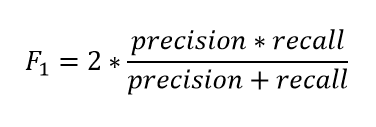
But as we discussed, having a class imbalanced distribution weakens the reliability of these metrics. Thus we turn to the F1 score, which maximizes both precision and recall scores by using weighted averages.

F1 Score
The F1 score is a machine learning evaluation metric that combines precision and recall scores. The accuracy score metric reflects how many times a model makes a correct prediction in the dataset. This can be a reliable metric only if the dataset is class-balanced: if each class of the dataset has the same number of samples. However, real-world datasets are heavily class-imbalanced. For example, if a binary class dataset had 90 and 10 samples in class-1 and class-2, respectively, a model that predicted only “class-1,” regardless of the sample, would still be 90% accurate.
The F1 score is the harmonic mean of the precision and recall scores, ranging from 0–100%. The harmonic mean is biased towards lower scores. For example, a classifier with a precision of 1.0 and recall of 0.0 would have a simple average of 0.5 but using the harmonic mean makes the f1 score equal to 0. A higher F1 score denotes a better-quality classifier.

Sample-Weighted F1 for Class-Imbalanced Data Distribution
A variant of the F1 score is the sample-weighted F1 score. It computes the net F1 score for class-imbalanced data distribution. It is a weighted average of the class-wise F1 scores based on the number of samples available in that class.
For an “N”-class dataset, the formula is:
where wi = ( # of samples in class i )/ (total # of samples)
For example, given the data below:

We can calculate the sample-weighted f1 score as:
wi=240 (82.60) + 260 (84.13)(197+42) + (40+220)
=240 (82.60) + 260 (84.13)(240) + (260)
= 83.40%.
An F1 score of 83.40% is fairly good according to these metric interpretations:
Interpreting Scores
0.5–0.7 = Poor discrimination.
0.7–0.8 = Acceptable discrimination.
0.8–0.9 = Excellent discrimination.
>0.9 = Outstanding discrimination
The sample weighted average F1 score thus addresses the common problem of class imbalanced distribution as encountered in our predicting sickness example by using the proportion of observations in each class to weigh the class-wise F1 scores.
Python Implementation of Metrics
Now that we’ve covered the theory behind these metrics, you can calculate them via the Python package scikit-learn. This package computes the accuracy score, precision-recall curve, and average precision score based on the ML prediction scores. You can also use scikit-learn to compute the roc curve and roc auc score based on the ML prediction scores.
Scikit-learn computes the f1 score where the “average” parameter can be binary, micro, macro, weighted, or none. The “binary” mode of the average parameter is used to get the class-specific F1 score for a binary-class dataset (i.e. two classes). The micro, macro, and weighted averages are the corresponding averaging schemes for calculating the scores on datasets with any number of classes. Using “None” returns all the individual class-wise F1 scores.
We can also use scikit-learn’s classification_report to get a summary of the metrics we’ve covered (e.g. precision, recall, f1 score). The function takes the true and predicted labels as inputs and then outputs both class-wise metrics and the different average metrics. See the example output below.
If you are interested in seeing the code, check out this link here!
Takeaways
We described how a confusion matrix is used to calculate common metrics like precision-recall and area under curve to evaluate ML model performance. The ROC AUC is used to select an optimal cut-off value to classify binary classes based on true and false positive rates. While precision measures how many of the “positive” predictions made by the model were correct, recall measures how many of the positive class samples present in the dataset were correctly identified by the model. The F1 score maximizes the precision and recall scores for both class-wise and overall evaluations, and the sample-weighted F1 score can adjust to class imbalanced distributions. Finally, these ML model evaluation metrics can be computed with the Python scikit-learn package as exemplified in the code here. We hope this article has helped you understand how to calculate and interpret ML metrics in order to improve your model performance!
Written by Annika Lin