How to use geodata to make maps — explained in five GIFs.
Do you want to put GPS coordinates on a map? Or do you want to visualize other information on a map? This post explains how in five GIFs.
Data and evidence drive our thinking at IDinsight. Geodata, or location information often used for navigation, is one such kind of data. Pertinent geodata is often available and informs our work with governments and NGOs. It can be a powerful way to understand and inform programs, telling us where people live and where the services such as schools, clinics, or infrastructure are close by. Mapping data can also be useful to understand how outcomes such as income or school enrollment rates differ across geographic areas, regions, or districts. These analyses are easy to start; in fact, you can do the most simple ones in minutes. This post aims to show you how through five GIFs (note that they might take moment to load, and are also linked as videos in the captions), using Google Maps (free), QGIS (free), or Stata (proprietary).
Situation 1: you have GPS coordinates that you want to see on a map
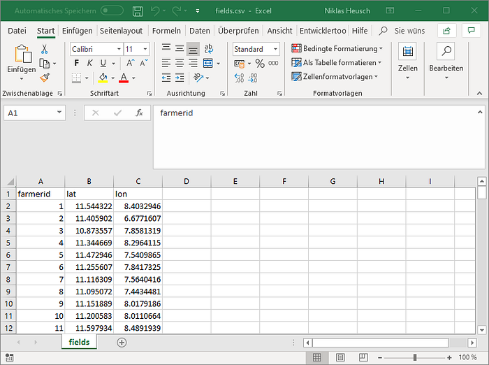
Recently, we were working with farmers in Northern Nigeria on agricultural extension services. Visualizing their locations on a map helped us to better understand where farmers lived and how spread out and geographically diverse their houses were. Shown below is our starting point: a list of farmers’ locations as GPS coordinates.

a) If you want results in one minute: use Google MyMaps

You also can:
- Import addresses instead of GPS coordinates (Google MyMaps will place them automatically).
- Customize the map (for example, display some points blue and others yellow): after importing your data, click on uniform style (on the left, for the layer you imported) and choose individual styles or style by data column.
- Display polygons (simply import KML files): if you have data on the extent of fields, neighborhoods, catchments, etc.
- Share the map with others.
- Do even more (such as adding media or editing your data), explained in seven minutes here.
Try it yourself with this sample dataset on Google MyMaps.
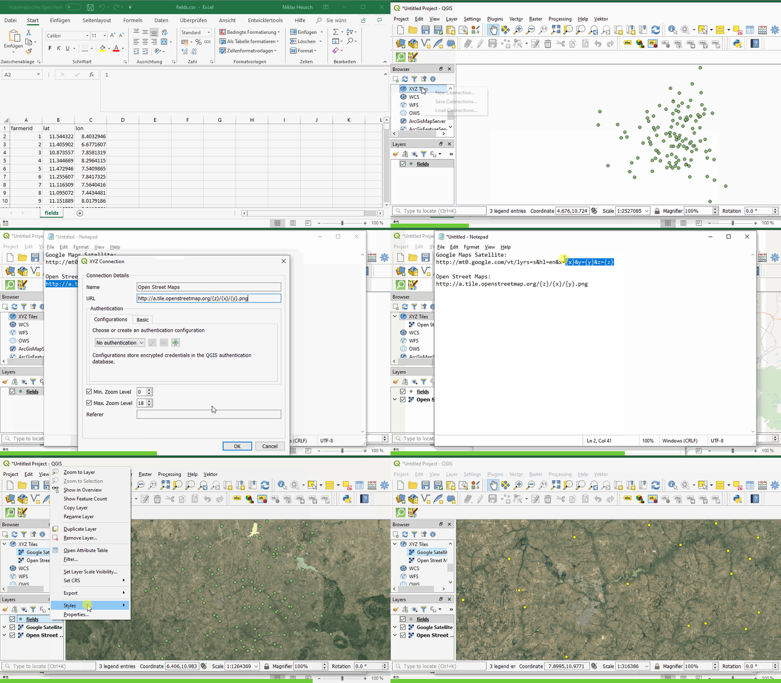
b) If you want to go one step further (analyze your data, create custom visualizations, use different map layers): use QGIS

You also can
- Easily add satellite photographs or maps as the background to your locations (here).
- Do almost anything you want- QGIS allows you to make beautiful maps, incorporate additional data sources, do analysis, etc. You can watch how to do this in a 30 minute beginner video (here) or use explore this website (here) for great tutorials.
- If you have not used QGIS before: download QGIS here for free (Windows: use the standalone installer for the latest release).
Situation 2: you want to visualize data on a map and produce an image
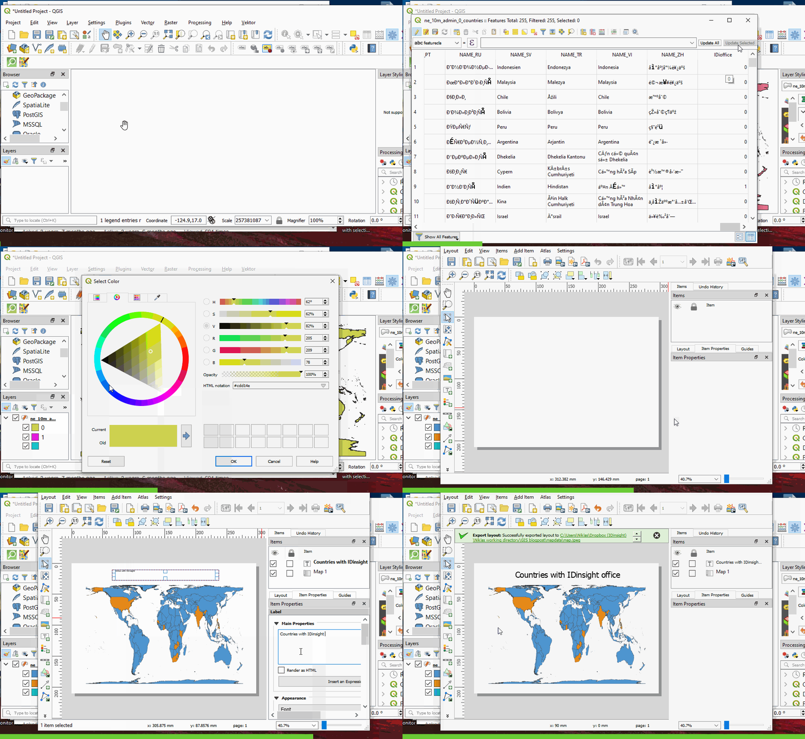
a) If you are using Stata and want to generate maps from your do-file. For example, the countries where IDinsight has offices.


- The Stata website has a good tutorial to get started with spmaps and customize outputs (here).
- spmap allows the use of color schemes (use the option fucolor), and it’s easy to set the color scheme for your map. Color schemes available by default are Color Brewer (displayed here and here) and spmap-specific schemes (displayed here). To design your own scheme, the palettes command is helpful.
2b) If you are using QGIS (or don’t have Stata) and/or want to further customize your map.


- Your customization possibilities are endless; this map uses the Gall-Peters projection to show countries as big as they actually are. Here is how to use it in QGIS.
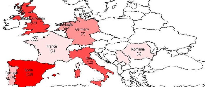
2c) If you want to map data: for example, how many times has each country won the Champions League?


- Data on Champions League victories comes from Wikipedia; when joining this data to the shapefile, you need to ensure that countries have the same name in both datasets.
- spmap similarly allows you to shade countries/features according to a variable (here, the number of victories). See the tutorial for details.
Where can you get shape files?
Be prepared to spend some time searching, this can be the bottleneck when making maps.
- Through websites: GADM, Natural Earth, IPUMS, Google, ESRI (if you have access)
- Through OpenStreetMaps: OpenStreetMaps has great coverage for many areas and can be used to give you shapefiles, for example of countries’ administrative boundaries. Here is how you can import OSM data into QGIS (and here and here as videos, for boundaries and points).
- From your partners/the organization(s) you are working with.
- By combining multiple shapefiles into one (see here) or editing shapesfiles (i.e. combine multiple features into one, see here and here).
- From an image, by georeferencing it yourself (see here, here, and here).
Where can you learn more?
QGIS:
- QGIStutorials is a great resource to help you get started, offering free, hands-on, step-by-step guides for QGIS (here).
- Official, comprehensive, and well-written, the QGIS website also provides a training manual (here).
- First time ever in QGIS: start with a great 30-minute video walk-through (here).
For spmaps in Stata, the official tutorial (here) and helpfile (here) tell you what you need to know.
We hope that this will ease the process of making maps no matter what platform you’re using. Questions? Issues? Suggestions for what has worked for you? Let us know in the comments below.

