UI kit with 40+ material components for Figma from Indigo.Design

The joy of having a design system at hand usually comes from a combination of excitement that has built up from the articles we read and the swears (this is how I unite the sweat and tears) while creating your own. Of course, there are many parts of design systems, such as plugins, user testing, extensions, UI frameworks etc. and I am very familiar with them, having worked on each of these pieces, but in this short read I would like to focus your attention on the UI kit. It is a tool for the UI/UX designer to compliment his workflow and let him be ordinary but creative, unique but consistent and concise but explanatory at the same time.
As we set off to create a versatile and reusable design system initially with our first version of a UI kit for Sketch, two things were crystal clear to us. We had to start with the complete picture in mind and we had to dissect interfaces again and again until we reached the most elementary pieces. Therefore, it was very easy to grasp Brad Frost’s vision of Atomic Design and the notion of our system with styling, components and patterns revolves around his idea of atoms, molecules and organisms.
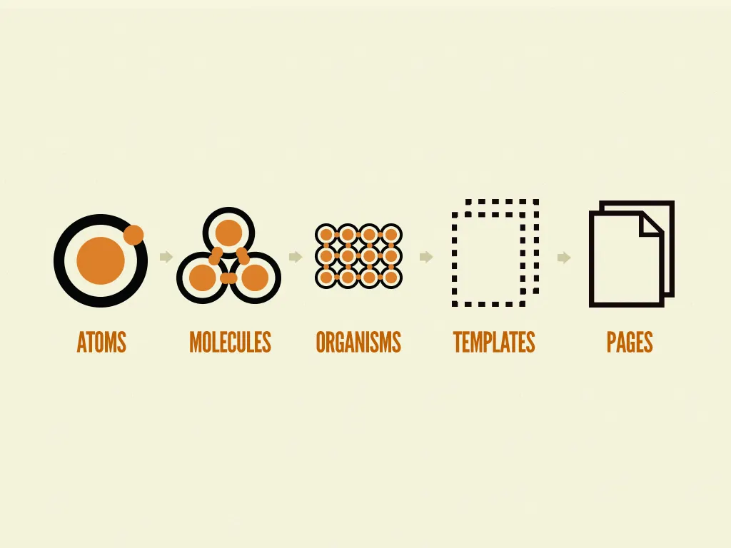
As our UI kit matured it became apparent that there are very few ways in which we could grow the simpler pieces e.g. in the latest release we added some really cool illustration stencils, and innumerable ways to create more sophisticated design elements from what is already there as a foundation. So today, a year after we shed light on our Sketch UI kit, our roadmap includes a component or two and there are hundreds of patterns waiting for their time to come getting closer and closer to the vision of Brad Frost.
“by assembling rather than deconstructing, we’re crafting a system right out of the gate instead of cherry picking patterns after the fact”
What made this possible is the richness of the Indigo.Design kit with components when compared to one of the hundreds of UI kits flooding the internet. 40+ atomic components with hundreds of variations such as avatars and buttons but also grids and charts give a strong advantage and make it possible to design enterprise-grade apps just as easily as you would craft your sugary shot for dribbble.
I hope that the read so far does not make you think that I neglect the importance of colors, typographies, shadows and icons. They are fundamental for the design process and the unmatched styling flexibility that comes with all of the Indigo.Design tooling that we provided in the past year affirms how firmly we believe in this. The infrastructure that Sketch provided for styling was one of the reasons why we picked it for our UI kit initially but fortunately others have caught up, and with this article I would like to announce the availability of Indigo.Design as a UI kit for Figma.

Today, Figma’s notion of styling is probably the most elaborate one on the market of design tools letting you not only define and reuse styles, but also combine them. And this is true not just for combining a type style containing the text properties with a color fill style defining the font color, but also combining fill, stroke and effect styles, which I have not seen in any other tool on the market.

However, this is not the only strength of Figma according to our experience. The possibility for real-time online collaboration and the fact that the tool is platform agnostic and runs in the browser opens up Indigo.Design to a whole new world of UI/UX designers and product owners. We’ve had more than one conversation in the past year with people loving the idea of what we are doing but being PC users they were unable to gain the productivity boost we promise with our ecosystem. Not anymore, try the Indigo.Design UI kit for Figma and let us know what you think and how we could improve it to better fit into your design workflow.
Since in the beginning I promised to keep it short, I’d like to wrap things up by sharing a thought of a fellow designer with whom we are driving many of the efforts around Indigo.Design. He described his first impression of working with Indigo.Design as being able to focus on the experience much more. He felt that even though he started with an empty canvas it didn’t feel like that because of the tooling just a few clicks away that saved him time thinking about states and behaviors of components and let him redirect that time to the user understanding his needs and frustrations better to craft a functional and usable experience. So if you are a Figma user do not hesitate to download our UI kit, give it a try and let us know what you think.
