The Story Behind the IOEN Brand

At IOEN, we’ve always believed that it’s important to not only build great technology, but also communicate in a human way that the community can connect with. Communicating in a manner that connects with a broad audience is the only way to truly achieve mainstream adoption.
Because of this, we make sure to keep storytelling at the heart of our brand. The development of the IOEN brand went through an extensive process to arrive at the final iteration. We’re excited to now be sharing our story with the world as we ramp up our pre-IDO promotion. So in the spirit of storytelling, we want to take you through how we arrived at IOEN, and the meaning behind the symbol that you have now become familiar with.
So firstly, the name. Why IOEN?
The Internet of Energy Network — IOEN.
The name’s history actually starts all the way back in 2018. IOEN is built on the work of Australian technology company RedGrid. For the past three years, RedGrid has been implementing distributed technology, built upon Holochain, with large corporate clients. This technology is called ‘The Internet of Energy’.
You can catch some of the earliest mentions of this here:
RedGrid is now open-sourcing this technology, and opening it up to the world through the non-profit Internet of Energy Network organisation.
So why ‘Network’?
Network was added for two reasons. Firstly, the purpose behind the technology is to create a network of minigrids. Secondly, for our favourite reason, we now pronounce IOEN name as ‘ion’. An ion is an atom that bears an electrical charge, which fits perfectly with our narrative.
The Result:
IOEN: The Internet of Energy Network, a pronounced like ‘ion’ a particle, atom or molecule with a net electrical charge. IOEN as an organisation is positively charged to deliver a network of clean energy minigrids throughout the world.
The Symbol
When designing our logo, we had several key elements in mind that we wanted to capture.
It needed to tell the story of energy and DeFi coming together. We wanted to capture the idea of globalisation and connection, without using the classic distributed technology symbol of connected dots.
We see our technology as something that empowers others, and naturally, this led us to look at the power source of superheroes for inspiration.
Developing the concept
Like a bolt of lightning, three concepts hit us simultaneously.
1. Tony Stark’s arc reactor. The source of near-infinite clean energy, and the source of his superpowers to save the world.
2. So yes we believe that everyone can be a superhero for clean energy, but we also wanted to convey the underlying principles of our technology and how we visualise our technology internally, using chord diagrams. Chord diagrams represent what we do because we are an agent-based system, which means each agent can act and transact with each other. This goes beyond peer-to-peer transactions that are linear, and is more of a way that arcs and network effects take place. It’s not just one-to-one, it’s many-to-many.
This was our starting point, and we went through many early iterations. Samples below:
3. Sankey flow diagrams
Sankey diagrams are a type of flow diagram in which the width of the arrows is proportional to the flow rate. They have been used to show how energy transitions take place — moving from mostly coal and fossil fuels to clean renewable energy. IOEN’s core mission is to facilitate that flow through web3 and DeFi, so we wanted to capture this movement from yesterday to tomorrow’s energy systems.
So we created this version:
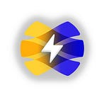
This was close to how we wanted to communicate our story, and it also gave a subtle reference to the Holo logo shape, an organisation that has been connected to us from the beginning. All we needed was to adjust it to create the feeling of global connection, and bring in more energy through the use of a lightning bolt. We also made the colours stronger, using two colours that we believe represent energy (yellow) and DeFi (blue).
From these changes, the final version was created. A symbol that shows our superpowers, community, transition to clean energy, and global reach:
The IOEN Logo, a symbol that tells our story of creating a globally connected network of clean energy minigrids.
We love sharing the stories of how we have developed our brand and organisation with our community. So if you would like more articles that give a peek behind the curtain, leave a comment for what you would like to hear more about next.