5 improvements that the App Store deserves — a UX case study

I love the App Store. It looks and works better than ever. But also, I love tricky design challenges. How do you improve something that already works great?
However, my goal here is not to reinvent the App Store. Rather, I aim to find and solve pain points while keeping the current app unchanged as much as possible.
1. Today Tab: videos are worth a thousand words.
In 2017 Apple launched the Today Tab on the App Store. It contains original stories by the App Store editorial team: app reviews, lists, tips & tricks, etc. The problem is the format. It’s all text. It’s excellently written but not everyone has the extra-time or desire to read. I analyzed people’s feedback and found that many of them have stopped or not even started to read the Today Tab regularly.
I believe videos are more catchy, “todayish”, and relevant for a growing “TikTok generation”.
My suggestion is to shake up the tab with a new video format. People should be able to run through the relevant videos just like they do with Stories on Instagram.
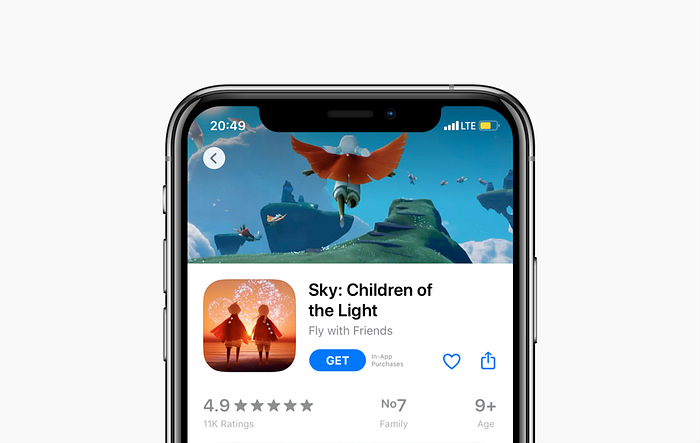
2. Search: 3 actions instead of 5 to get an app.
Imagine your friend tells you the name of a cool new app they think you’ll love. Maybe you didn’t notice but there are at least 5 taps required to get it through the AppStore! Have a look:
I don’t see a single strong reason to keep things going like this. My suggestion is to shorten the search process down to 3 steps:
3. Wishlist: let the collectors collect!
The App Store used to have the wishlist feature. But the 2017 update requires people to use 3rd parties apps or notes to save their favourite apps.

From my perspective, Apple took it out to encourage more impulse buying. This is a problem because the wishlist lovers still exist. Why don’t we keep the wishlist feature?
For business sake, I’ve hidden access to the wishlist on the account screen; this de-emphasizes it.

4. Subscriptions: transparent pricing.
More and more apps are switching to a subscription model. It has become hard to control your spending without a calculator. Visible prices and the “Total” line on the subscriptions screen are sobering.

In my view, encouraging healthy buying is a way for companies like Apple to be even more loved and respected by their users.
5. New Apps/Games: please the app diggers.
Removing a simple chronological list of new apps/games disappointed so many users:
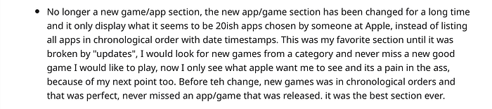
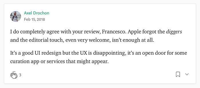
There’s nothing else to say. Let the diggers dig:

What I’ve learnt
- Sometimes a couple of targeted touches is enough.
- Brutally honest feedback is important.
- Mockup makers make mistakes 🙂

Thanks for reading
Thank you so much for reading through my case study. I spent 4 weeks to make this project come alive. I hope you enjoyed learning about my thought process and potential solutions. I’d love to hear your thoughts!
Figma, Photoshop, and After Effects were used in combination for this project.