Name Editing
“Your son chico-”
“…Nemo”
“Nemo!” (Finding Nemo)
The Goal
Allow patrons of FamilySearch to edit names that were incorrectly indexed. Human error often rears its head on the document itself or when it is indexed by volunteers. To allow partons to correct these errors had been the number one requested feature for FamilySearch users for over seven years. As a part of this endeavor, we wanted the patron to highlight the name they were changing. This would add clarity to the change as well as future feature possibilities. As an organization, we were finally ready to make this possible. It took an entire overhaul of our backend system, hard work on the design front, and what I can only describe as a butt load of user testing to get this done.

Project Duration: January 2018 — August 2019
The Team
This project was unlike any other I have worked on. I was fortunate to work very closely with my Product Manager John Huff. Initially, I was part of a creative/explorative team made of John, myself, Matt, and Ian. Once we had some feedback and testing under our belts, I became the sole designer on this with a team of two engineers Patrick and Brittany, and our QA Brian.
Target Audience
Our audience for this project were those who actively do research on FamilySearch and Missionary volunteers that spend a good amount of time on the site and helping others use it. However, this means that the target age for this project was 55 -75 and often times beginner to moderate experience with technology.
Problems to be Solved
- How is the best way to make an edit and encourage accuracy?
- How do we discourage people from making changes they should not?
- How do we inform users that edits are now possible on some documents? And why?
- How can we reach our target audience to make corrections and add highlights?
The Beginnings
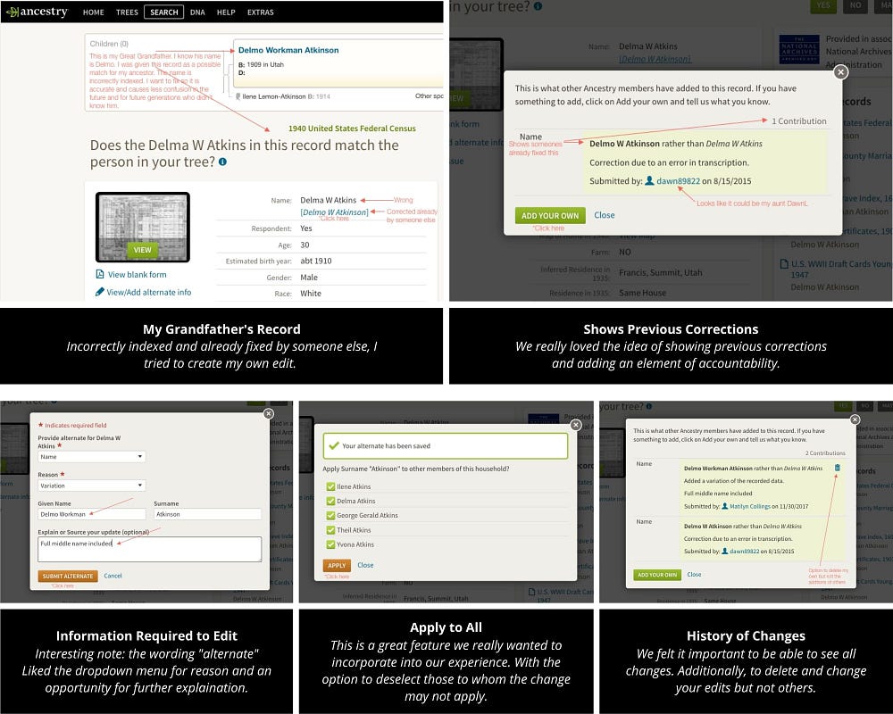
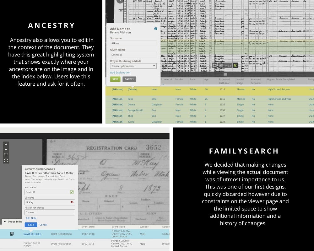
Looking at how others are finding success in a similar space is a great place to start. We began researching other sites that had edit capabilities. Ancestry was a great example as they have been successfully editing for several years. Taking an in-depth look at their editing process and asking how and why really helped me to understand what key features we wanted to incorporate into our product.

We learned a lot from the Ancestry’s and came to the decision that viewing the document while making an edit was essential! Additionally, we pushed to implement the ability to highlight the name on the document. Early explorations also included an open edit or an edit mode.

Constraints
If there ever was a theme to this project it was constraints.
- We decided it was important to view the image while making a change however, we were not able to make any changes to the current image viewer page.
- Neither the image viewer nor the page from which you were to begin the edit (the record details page) were owned by our small team. We worked very closely with many teams to get this feature out.
- In order to store new values, our backend system had to be reimagined. Our timing was often at the disposal of the engineer's progress, though we worked with great people and were able to really shape the future of the “records” experience.
- We were only equipped to tackle editing names at the time.
Core Designs
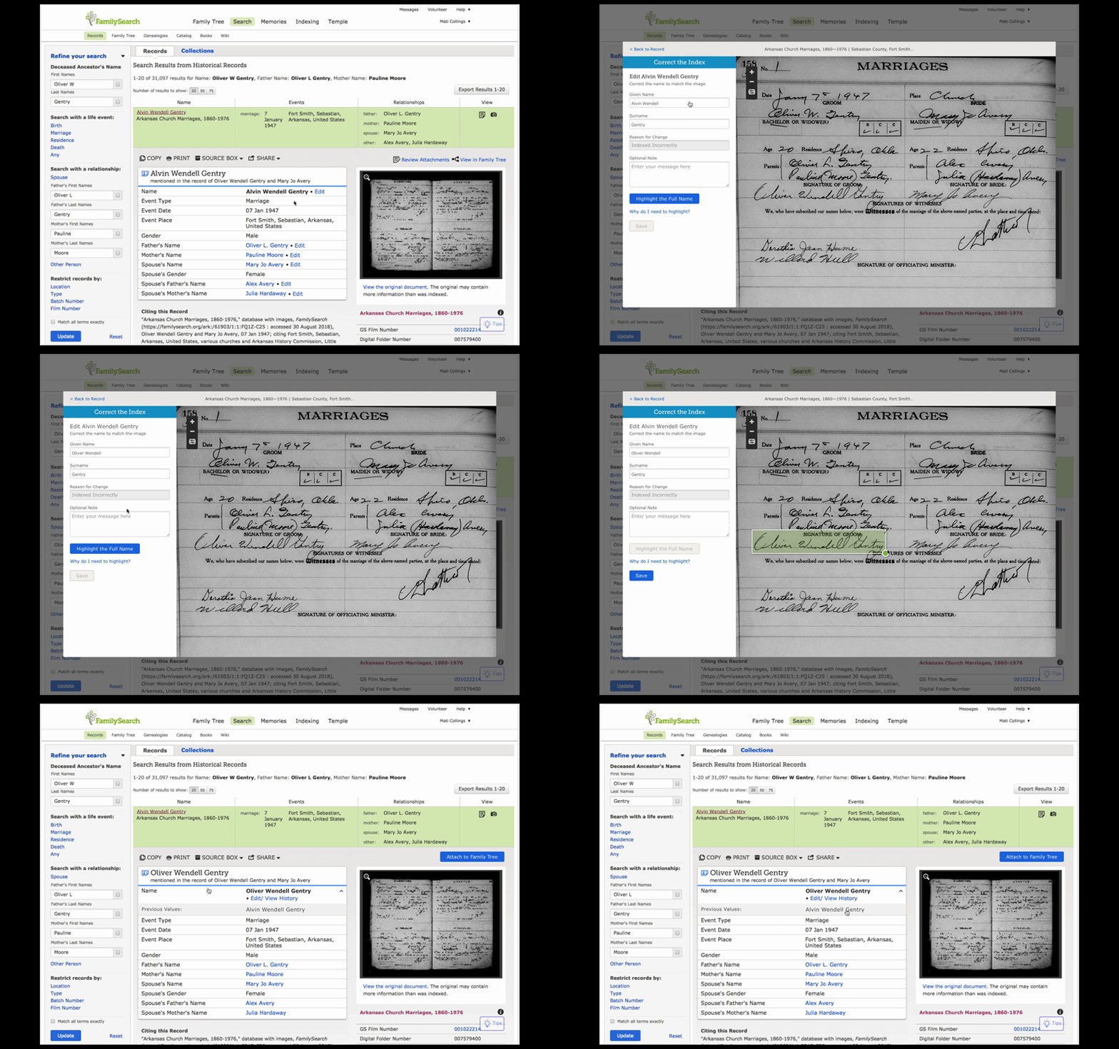
I can’t even begin to show all the variations and iterations that went into what seems like a simple feature. However, the gifs below demonstrate the core designs for both desktop and mobile.


Highlighting
A make or break part of the design was allowing the patrons to highlight where the name is located on the document. This was something I really strove for, we believed strongly that incorporating highlights in our flow would increase the quality of changes, decrease the number of errors made and pave the way for future highlighting opportunities. There were many who said it would not be possible for our key demographic to understand why and how to make these highlights. It was extremely difficult and required a lot of user testing to get it right, but we did it!
There was an enormous amount of fine-tuning required to get the interactions used to create the highlight just right. I had a load of help from others in doing this because this is one of the limitations of Sketch, it doesn't allow for interactions such as click and drag in a prototyped setting. With the help of some coworkers, we made some half-coded prototypes that allowed us to test the interactions with actual patrons until we got it right.
Onboarding
Another big piece to a brand new feature with never before seen highlighting components was onboarding. How in the midst of their research could we invite and explain how to make appropriate changes and mark the change on the document for future clarity.
This also when through many iterations and lots of testing and we found that the simpler the better, however, simple is never easy to achieve.
Additional designs
Besides the main flow of making a correction, I had to think through a dozen other flows as well including,
- All the access pages to making an edit (and believe me there were several)
- Error messaging
- Reporting abuse
- Previous changes bubble
- Allowing patrons to remove changes they made
User Testing
The amount of user testing I put this feature through is unbelievable sometimes. I can’t even count how many people we showed this to. Every step of the way from research to conception to prototypes (paper, Sketch, and half-code) to beta testing and production testing.
User testing is what made this project a success, we had a lot of time to do testing and were very fortunate to have easy access to testers. I will forever be grateful to my project manager who empathized the importance of user testing. He taught me a great deal about how to conduct tests, what to make note of, and how to create as unbiased a test as possible.
I was able to document dozens of user tests, some verified our design but most lead us to redesign again and again. I was able to go user testing with a myriad of other designers, my project manager, and even many of the members of my development team. This made a big difference and helped to get everyone on the same page and allow them to see where the patron's struggles were.
I can’t say enough about what I learned during user testing, but I will say that with anything less this project would not have made it off the ground our release success (below) directly correlates with how much we learned prior to release through user testing.
Production
We gently rolled out this feature a small percentage at a time, allowing us to closely monitor the changes and full functionality. We would increase the percentage weekly as long as no problems arose. I personally kept a spreadsheet of all the changes made in the initial phase to catalog our success and failures by noting what change was made and by who and if they were highlighted correctly. This began to show just how successful we were!
We also worked closely with analytics. This gave us a great overview of where users were coming from on the site and whether or not they were able to complete the editing process.
Another thing I am quite proud of was how well we worked with the FamilySearch marketing team to get this product released and increase awareness of this new feature. We worked together to write a blog and post on the company’s social media accounts.
The Future
Even though an editing feature may seem simple this project was a huge step forward for FamilySearch and was anything but simple. Editing records represented so much more than changing a name it opened the gates to the future of the experience of viewing a record. It was just the beginning of an entirely new way to view and interact with a document.
We began working toward another idea which we lovingly referred to as the combo viewer. In this viewer, you would be able to view and more importantly interact with all the information we have about the document in one location, which is unheard of in all of the family history communities.

