Easy as Pie Chart
Behind the scenes of making the “Real Pie Chart”

Hi there! We are Kompany. We visualize data, build interfaces, and maintain a Telegram channel on the topic. This summer we had the pleasure of working on the very fun “Real Pie Chart” project for the amazing team from Stamen. Below I’ll tell the story of making it and share some takeaways to help other designers who work in small teams.
Preface
The Stamen team eats a pie or two every week. They call it “Pie Day Friday” and have carefully collected data about every pie eaten for more than a year. We were granted access to their Google spreadsheet containing all the details and were supposed to make something fun out of it. No specific goals.

The Process
I started sketching up ideas first, trying on crazy combinations of T-SNE, BioFabric, and On brodway:

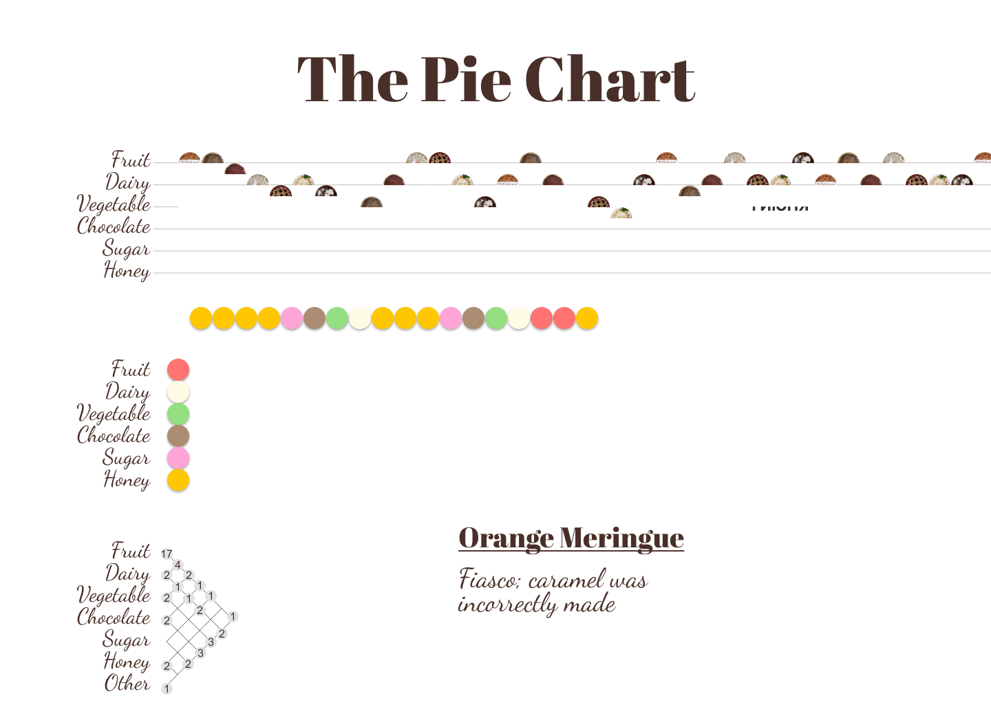
There was an overwhelming number of ways to organize the data, but I wanted the project to be easy to understand. So I picked the simplest option possible: a timeline of pies.

But that wasn’t fun enough. We still had more data to depict! So I thought of user scenarios:
- have a birds eye view to all the pies at once.
- find out changes in the team taste.
- learn more details about a specific pie.
So we needed to add filters at least!
The Fillters
No, the double “L” is not a mistake :–)
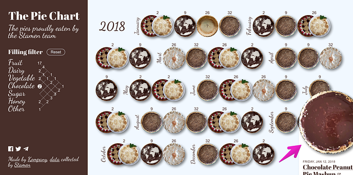
We decided we wanted to create a way for users to filter the data in order to view specific pies. There were two fields in the table: primary and secondary fillings. We knew we could make an adjacency matrix to filter out any combinations.
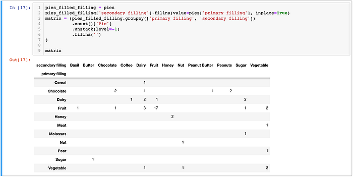
But would we have enough space for all the fillings? We found out using Pandas python library and data pulled directly from the Google sheet:
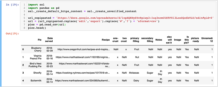
Then we printed the matrix of all filling combinations. If secondary filling was empty, we copied a value from the primary one.
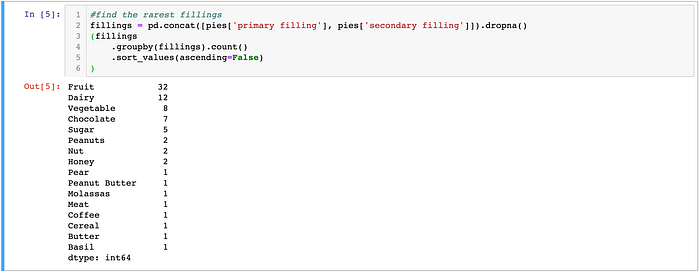
It turned out to be rather big for a UI element. But it was pretty sparse. So we condensed it by making an «Others» category and grouping rare fillings into it. To find the most rare fillings:
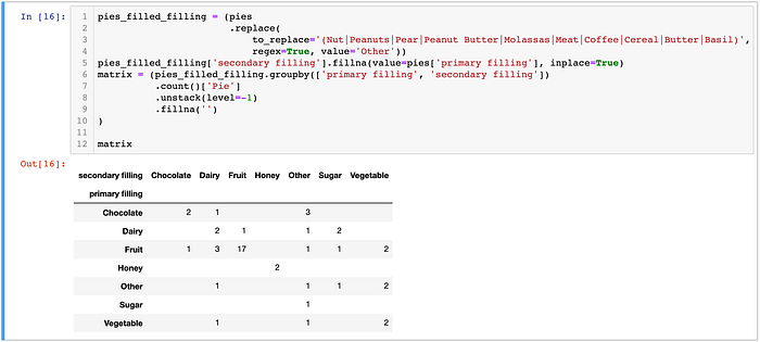
That grouping made the matrix more compact:
Then we could turn it into a handy controller:


Perfect! It was time to find a good form for the timeline.
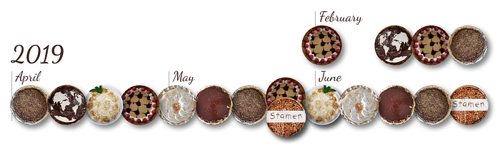
The Timeline
I want to call it “Pieline” all the time.
At first, I wanted to map x-positions of pie images to corresponding dates. If multiple pies were consumed on the same day, I suggested stacking them on top of each other. Here’s the mockup I showed to frontend developer Olga Mokhova:
She started coding and came up with a rough prototype:
It turned out that horizontal stacking of pies was more easy to implement, so Olga made it this way. She also didn’t map pies to a specific date, but instead came up with a simpler solution by spacing them regularly. I embraced both ideas and fixed the mockup according the prototype:
That saved hours of work and made the timeline more neat.
The Margin Problem
Hovering was supposed to enlarge each pie image and expand to show details like date, filling and additional notes. However, this behaviour caused a problem if the pie was near the right margin or bottom edge:
The straightforward idea was to move the popup over and up until it fit into the screen. But it would have involved another cycle of coding, testing and fixing bugs. Plus, it would also make behaviour less predictable.
So we came up with a much simpler solution by just enlarging the right and bottom margins so the popup fit. The bottom margin became huge, but we pretended that was made on purpose by placing an encouraging inscription there:
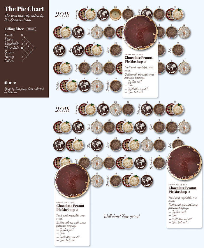
No extra coding-testing-fixing. The problem was solved in under 10 minutes.
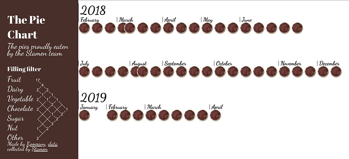
The Database
We used a copy of the initial Google spreadsheet as a database (as we did in Evolution of Primates). This approach has its pros and cons:
Pros:
- Easy to change
- Serverless
- Version history is supported
Cons:
- Easy to mess up. Anyone can make a change that will break the product.
- We still have to crop pie images and upload them to Github manually.
Nevertheless, a Google Sheet database was a good fit for this case, because Stamen could continue collecting data and see updates on the site immediately.
Takeaways
All the takeaways focus on what can be achieved when a designer and programmer work collaboratively, with both skill sets informing the final product.
- Use real data in mockups when possible. That will help to identify difficulties earlier and save time in the long run.
- Consult with developer while designing. They can bring their expertise in UX standards and suggest usability improvements which are easy to implement.
- Mockup is not a product. So don’t make a developer follow the mockup with pixel perfection. It’s normal if they deviate from the original drawings to make the interface more consistent or avoid crutches in the code. In exchange, the designer is free to customize some variables for sizes, margins and colors to make the product look better.
- Usual workflow assumes updating the product until it matches the mockup. But sometimes it’s worthy to update mockups according to the product. This practice makes development more iterative, helps to reinvent and simplify some elements, find new ideas and speed up the process.
Check out our website and join our Telegram channel. We will be happy to implement your project! Email us at ivan@dianov.org