Historical Viz Digest: Issue 3
April 2019: Of Communists, Traffic Maps, & Charts In Space
The Data Visualization Society (DVS) historical-viz channel continues to be a rock ’em sock ’em daily onslaught of the most amazing visualizations we have (mostly) never seen before. We’re averaging about 4 posts a day now and gosh have we seen some gems this month:

It’s Soviet poster time! Stephanie Tuerk kicked us off with a suite of Soviet posters from the National Library of Scotland. Part of The Woodburn Collection, this group of around 70 posters issued between 1919 and the 1930s mostly focuses on economic and social issues from the 1920s. They were brought from the Soviet Union by Scottish Labour MP Arthur Woodburn after his visit in 1932. The image above is an amazing mixture of modernist design and photomontage interspersed with statistical charting, predominantly using area and bar charts.

Since the DVS is a global group, we made a call for Russian speakers and was immediately helped by Andrey Lukyanenko, who transcribed the above poster:
Text in the left:
Distribution of investments in fixed assets by sectors of the national economy (billions of roubles of the relevant year)
The planned investments with create giant factories, a lot of transport, large-scale socialized farming with high technologies, cultural houses and way of life
In the circle:
16.3 — Industry
10.0 — Transport
23.2 — Agriculture
5.9 — Building houses in cities
3.1 — Electrification
6.1 — Warehousing, education, and medical facilities
This poster is a visual pitch to the Soviet populace created in a constructivist style. Constructivism was an art movement where design elements are combined to form abstract structural forms, often reminiscent of industry or technology. The influential movement originated shortly before the Russian revolution and was (amazingly/briefly) adopted by the nascent Communist government. The heavy focus on constructivist design is interesting, as it adds a massive amount of contextualization and pushes our understanding of its intentions.
Really just a big pie chart, the background of the poster juxtaposes a dreamy cloudscape with an industrial landscape and arrays of power lines against a photomontage displaying all the perks of a future-forward society. Modern methods of fabrication, agriculture, and transportation fit within a new urban model. This poster can be seen not only as propaganda for the investments of the state but also as an emblem to modernity itself. Crafted to plan; the design and message reinforce each other towards the larger goal of communicating the image of a new society.
Images like these, of course, set off a flurry of posts of material from Communist countries, but I think we need to have a special article to focus on them, so I don’t want to let the cat out of the bag just yet.
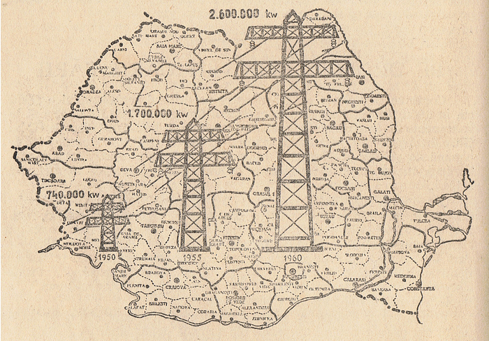
Then Arnold Platon chimed in with an image that’s too excellent to hold back: “…and one I found of early communist Romania of what seems to be an increase in electricity production between the years 1950–1955–1960.” To which Stephanie, replied “Agreed! I am loving these! And yes, of course, the electricity towers are a visualization (on top of a map)! They use the scale to represent the quantity of kW.” Yet another representation of modernity, this isotype-influenced illustration joins the scale of infrastructural growth to a detailed map complete with each locality. The message of progress is literally overlaid on the entire territory of the Romanian People’s Republic.

Next up, Jill Hubley shared a flurry of traffic flow maps with this beauty. Here’s what she says about it: “Los Angeles is infamous for its sprawling layout and clogged highways. The unrestricted growth of the city occurred over a couple of periods; the first in the 1920s, spurred by The Federal Road Act of 1916, and the second after World War II. Between these stretches of time, traffic congestion had already become a burden. The 1946 map of “Daily Vehicular Traffic Flow” is at the center of this pivotal time in LA’s infrastructural history and reveals some of its nuance. Removed from that context, it remains a striking visual. The map exploits movement, an elemental principle of art composition, to lead the viewer’s eye across the page. All flow maps do this, but traffic flow maps, with their many routes and variances of line width (i.e. traffic), are particularly rhythmic.”
Inspired by the above, wgeary then shared 2 more great traffic maps in response:

“The above traffic flow map from James Cheshire: “London’s traffic in 1911. Red is trade, pink is passenger vehicles. Total for Old Kent Road (to the southeast) was 12k vehicles between 8am and 8pm: 2,000 cycles. 1,200 electric trams. 400 barrows. 200 “passenger motor carriages… most of the rest were horse-drawn…”
And then wgeary shared one more: “1889 Paris — with passenger numbers for trams, the circle rail line, the mainline terminal stations and boats — which carried a huge number of people in this pre-Métro city. I wonder why it is that early Parisian transport mapping is *so* good?”

Then we were dragged back to the communists by terence, with these two spectacular isotypes from the 1932 project called “The Struggle of Five Years in Four.” These two images were created as a folder of 64 statistical charts produced by the IZOSTAT Institute, Moscow: State Publishing House of Fine Arts. A catalog for an exhibition called “Isotype Revisited” at London’s Victoria & Albert Museum from 2011 provides the background:
“Neurath and his team had only been working at the IZOSTAT Institute for a few months when this collection of statistical charts was published. Many do not strictly follow the Vienna Method and instead contain illustrations. The collection’s title refers to the Soviet Union’s economic First Five-Year Plan (1928–32) declared complete in four years rather than five.”
The catalog continues: “Dr. Otto Neurath was a prominent Austrian political economist who promoted the Isotype as an International Picture Language through charts and other graphics. The Struggle for Five Years in Four was the result of a visit of Dr. Neurath and his Viennese team to the Izostat Institute in Russia in the early 1930s. The German methodology was adapted to explain visually the enormous gains in economic, industrial and social growth under Stalin during his First Five Year Plan.”

Next up, I shared this spare but amazing history map by the visionary Buckminster Fuller. Always the futurist, Fuller maps the discovery of the elements from 1250 AD to 2010 (from the vantage point of 1964) and places the elements in comparison to advances in transportation and notable scientific figures. Just part of his overall approach to systematically mapping knowledge, Fuller was compelled to document his theories and regularly shared them in public.
This led to a series of lectures towards the end of his life called “Everything I Know” where he would speak for up to 42 hours on his life’s work. These thinking out loud lectures examine in-depth many of Fuller’s major inventions and discoveries such as the geodesic dome, tensegrity structures, and Synergetics.

One of the subjects that the group is especially passionate about is exploring the amazing illustrations found in Fortune Magazine during the 1940s. terence shared this beauty which mixes geospatial area mappings with illustration to create a handsome centerfold spread. Recently, Archive.org released scans of the Fortune magazine archives, so we’re all just digging in. More articles to come on this as well.

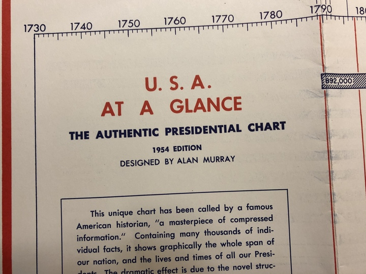
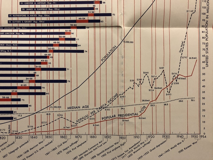
Then I shared an item that I bought on eBay a few months ago: “USA at a Glance, the Authentic Presidential Chart” by Alan Murray in 1954. While I haven’t found any information on Murray yet, I can confirm that it was included with a book called “This Nation Under God” by Elbert D. Thomas.
While that book seems a bit iffy, I just love this map. I find the layering of the lives of the presidents, their tenure in office as compared to the US median age, overall population, per capita income, and popular presidential vote. It’s a great example of how layering in additional data points on a common scale can add layers of meaning to the data story being presented.
At the end of our conversation that darn Adam Pearce added: “I wonder what the inauthentic chart looks like.”


Then our friend Martin Telefont showed us an amazing chart first released in “The Graphical Statistical Atlas of Switzerland”(1914). He elaborates, “this amazing chart depicts the length, height, and slope of ‘Cable Cars in Switzerland’ (1912). The line color shows the steepness of the slope (red) of the lines show slope steepness. Notice that some of the cable cars actually have multiple sections with different length, height, and slope (eg 34/35, 44–50).
“I like the plot because it conveys information in a very intuitive way (you could almost add little cable cars below the coloured lines for emphasis), and only uses very basic encoding to do this. Unfortunately, Helvetica Font wasn’t invented until some years later so sadly this plot doesn’t qualify as a national treasure. :wink:”
That was just one example of an amazing book filled with historical visualizations, and it turns out that there are a few more of them. Luckily for us, RJ Andrews decided to compile them into an amazing list! He introduces it thusly:

“Includes historic overviews and modern retrospectives: books, book-like publications, and some historic pamphlets. While the goal is not to catalog all historic visualization, some specific cases are included because their associated explanatory text gives insight to historic practice.
Works are ordered by the date associated with work (c.) or modern date of publication for broad histories. Personas highlights main personality associated with the book: author, editor, or practitioner. ✩’s designate works of popular significance.”

Well, it turns out we weren’t done with Communism just yet, as Attila Bátorfy then briefly introduced us to his incredible work exploring a treasure trove of Hungarian visualizations. “The National Atlas of Hungary (ed. Márton Pécsi) from 1989 was maybe the last peak of thematic #cartography in Hungary, 280 pages of graphic performance and #dataviz of the highest level.” Batorfy has amassed over 500 images as part of his PhD work on the history of Hungarian visualization in the Communications and Media Department at ELTE BTK Budapest. There’s certainly a story to be told in this work that I’m not sure has been understood outside of the region and language, so I’m near-certain this will be an important study to follow!
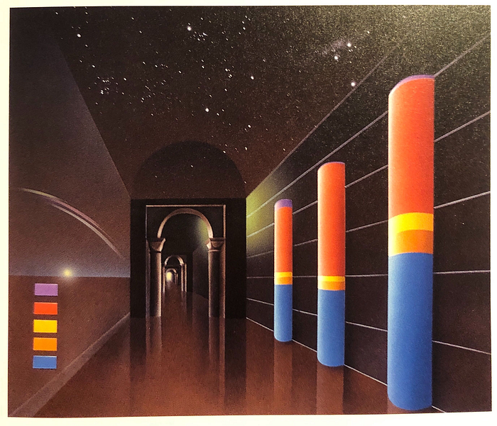
I’ll wrap up this edition with the especially fine work of graphic accuracy above. It’s an airbrushed illustration by Walter Pepperle from the 1997 book “Graphis Diagram 2”. The book is billed as “A superb reference for creating diagram and chart renderings, this guide presents an all-inclusive range… and has expanded to include many more types of diagrams: historic, comparative, statistical, technical, cartographic, scientific, architectural — plus flow charts.”
I mean, it’s easy to make fun of this chart as it’s literally the embodiment of “chart junk.” terence chimed in, “And here I was, trying to figure out what the vertical axis is” while Elijah Meeks quipped “Who would have thought that the Pillars of Heaven were really just a 3D bar chart.”
That’s it for this month! Thanks as always to the entire Historic-viz channel and my co-moderator Stephanie Tuerk! We’ll be back with more in 28 or so days, and as always, feel free to join us for near-constant inspiration and chit- chat!
The Data Visualization Society is developing meaningful resources in order to establish a discourse and remove barriers between practitioners across tools and industries. To sign up please register at datavisualizationsociety.com/join


