Designing the OakCDL Logo

As CDL moved into a new stage of its incubation, it’s was time to rebrand ourselves. With the City of Oakland as our main partner and client, CDL is now Oakland Civic Design Lab!
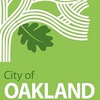
We also reworked our mission and vision, and developed a new set of values to abide by before jumping into creating a new logo. Together the team created the new logo you see above.
1. Brandon’s Initial Logo Explorations
Brandon, the Lab manager, created the first explorations for the new logo. Inspired by simple shapes and bold colors, he came up with 12 or so iterations. We discussed the common elements throughout and brainstormed what appealed to us: bold colors, bold type/sans serif, something that works on colored backgrounds, and felt “Oakland.” We also wanted a logo that’s clear, legible and recognizable due to working closely with government.

2. Inspiration & A Mini Oakland Field Trip
The next iteration of logos was initiated by a mini field trip (and break) walking through Downtown and Old Oakland. Local shops became big inspirations to build on.
The logo explorations that were created reflect the clean, geometric shapes and colors that can be found throughout small Old Oakland shops and surroundings. The black and white logos were inspired from Oaklandish’s brand, with the iconic “O.” We loved the playfulness of the direction, but ultimately the logos on the top two rows were not clear enough to understand alone, we went shifted direction to the logos on the third row.

3. Reactions and Feedback
The team pulled people in from City Hall’s 9thfloor for quick reactions and feedback. We showed three types of logos: circular logos that focused on the “O,” text as logos and a combination of the two. People we spoke to preferred the text as logo and the direction, but felt that the ones in #2 were reminiscent of Greek letters or fraternity organizations.

4. Last Iteration
Finally we thought a lot about our 9thfloor colleague, Meredith’s question when she asked what we wanted to convey from our logo, and Brandon’s response was “playfulness.” However, from the logos that we showed for feedback, that spirit was not present. For the next development of designs we wanted to convey the essence of experimentation.
As you may have already seen, #3 was chosen as the official logo. The design decisions that were made aligned with the initial considerations the team spoke about. The logo is clear and would be easily distinguished from other Oakland government material, and the shapes were inspired by the letters in “OAK.”

5. Color Palette and other branding
We now had a new logo and needed to create a color palette that again reflected Oakland’s vibrancy, but still felt “official.”
Here was the first pass at a color palette and logo treatment exploration.
It was decided that color would be used sparingly only within the shapes using all three colors from the color palette. CYMK was the winner of the color palette.
Finally, we refined our logo, began an initial design system and created a one pager to outline our brand guidelines. The first collateral that applied the new branding guidelines were business cards. Right in time for the Code for America Summit here in Downtown Oakland!
So far, the logo and materials have been met with great excitement. We will keep you all updated on where we go from here.