Texty on Malofiej-22
The joy of working with data (in a very little team)
Ladies & gentlemen, at first let me say that I am so grateful to be here on Malofiej summit and to speak to you in the beautiful city of Pamplona
I am from Ukraine, and I am working for the Texty.org.ua web-site.
I am one of the founders of this site, which is kind of a mix between classical and "digital" journalism
We are the team of 2, or better to say, with two and half people. I mean, 2 people work full-time - my responsibility is a "data journalism", and my colleague - he is editor in chief, — he works with our freelancers to create traditional reporting, and the last one of us - it's our news editor, and he works part time

So our site is 3.5 years old. We've got no office, and have to meet approximately once per week in different places to plan our
current activity, to brainstorm a themes for articles and data projects, - in coffee-shops primarily
So eventually it's not a classic newsroom, but more like a transitional newsroom, or better to say not a newsroom at all but a transitional newstable - because we are sitting on the table an often make a transitions
from tea to coffee and back again
During the last months, after a dramatic events in Ukraine our audience increased from one hundred thousands of unique users per month to seven and half hundred thousands (we are now in a upper middle class for Ukrainian media, in terms of audience)
Some of our selected projects for the last time are listed here on our site in, yes, Projects chapter. Almost all of our projects about data are listed in other part of the site, called "data journalism". Because we were first ones who put such a name on the main page of a Ukrainian web-site, we are very proud to consider ourself as a fathers of "data journalism" in Ukraine. Just kidding
About our datasets: we made visualizations and data web-application about such distinct topics as tenders, schools performance or traffic accidents. Where we could find a data? So far 50% of data is coming from our
web-scrapers (these are special trained scripts, usually written with the Ruby programming language)
And other 50% - from information requests - we've got a law similar to FOIA, which worked unexpectedly well, at lest for us.
In the last year we started to publish our datasets on github. We are going to publish some our code too, soon, for educational purposes (as an examples of very ugly programming style, of course)
Personally the biggest joy when I work with data is to find something unusual, something unexpected, something new. And then show this to our readers. We'd like to educate, maybe even to enlight our readers a little bit.
I gonna show a couple of examples for such simple discoveries we made with different datasets.
Schools
The first case is about a quality of school education. After successful reform at 2008 we've got a system of independent testing for high-graders in the scale from 100 to 200 points. We scraped data from official web-site of center for independent testing. Dataset was about school performance. i.e. all test results for students of each school
The second dataset obtained for the same site, consist of couple hundreds thousands of datapoints, with a student ID, her Grade Point
Average value calculated in school (teachers evaluate school students in the scale from 1 to 10, but in this dataset values was converted to interval from 100 to 200 points by linear transformation), and finally in that dataset one could find the results of independent testing at the same scale

Here you could see two histogram for each of the method of estimation for student performance.
While independent testing (colored in pink) looks like a normal distribution, on the histogram of traditional method of estimation you could see something strange.
This chart is a beautiful. Immediately you have to notice these wonderful pikes, just look here. What's it?

The numbers here didn't have any sense for me. But we could remember, that these numbers was converted to scale 100-200 from the scale of 1-10. After backward conversion, we've got the next picture:

What we should immediately notice - these are GPA results, pretty rounded to nearest integer.
And number of such amended GPA is huge - tens of thousands
And this is a main story for this chart. The strongest hypothesis here is that some teachers
artificially amended Grade Point Averages to make them looks better and distort an overall distribution
by rounding an average to nearest integer.
In any case, one should notice, that independent testing looks much more promising to better estimate student's performance.
So after that as I said we've scraped information about test results for students of about ten thousands of schools in Ukraine, and geo-located each of the school — that was a hardest part of work
Please, take a look at result: comparison of schools in biggest cities of Ukraine: http://texty.org.ua/mod/datavis/apps/schools2013/
…
Tools used: d3.js, Open Refine, Ruby
Classy deputies
Our lawmakers had a really bad habits of "non-personal voting". I mean they frequently vote for the bills in parliament not only with their own electronic cards for voting but also with a cards of absent deputies.

We call such a MPs a "piano players" or "button pushers".
Of course, such a behavior is a shame. Moreover it's against our Constitution and must be prohibited, but somehow they don’t want prohibit themselves
Till now only ones who fight with this habit is a watchdog organizations. Some times ago, at 2012 we were the first to count, how many "ghost" voting occurred, and how many laws was accepted in Parliament with a help of this un-constitutional behavior of deputies
We managed to scrape information from web site of our parliament about electronic registration - to vote for the bills in specific day, deputy should register a card for an electronic voting system. And at the same time,
we've got information about non-digital registration for the deputies in each day of voting (deputies should register themselves by hand-signing of an entry in special paper journal)
After that we've took information about all the voting in parliament for one year, and checked for every card that voted for each bill, whether an owner of the card have put a signature in journal of registration.
The results was kind of amazing: 86% accepted bills was voted against a Constitution, by “piano players”. You could get a detailed view here, on our another interactive: http://texty.org.ua/mod/datavis/apps/rada2012/
I have to say that compared to situation 3 years ago, now a non-personal voting is a big issue in Ukraine. And our efforts also helped to achieve this, even just for a little bit
Tools used: Ruby - for web-scraping, MySQL - to work with voting data, d3.js - for on-line visualization
Dangers of supermarket's parking lots
One of the our recent projects - research of traffic incidents in Kyiv for 2011-2012 year. We managed to map about 100 000 of accidents, and this is a result: http://texty.org.ua/mod/datavis/apps/dtp2012/
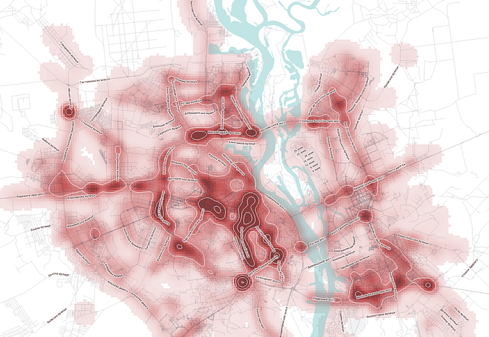
And we are trying really hard to persuade a traffic police to take a look to our research, to check these most dangerous traffic light and parking places, maybe somehow to optimize road situation at that places
Leninfall, and the real sense of Ukrainian revolution
This is a map of election results, popularized by Alberto Cairo (thank you very much, Alberto!): http://texty.org.ua/mod/datavis/apps/elections2012/
Due to this map, Ukraine seems to be a deeply divided country. But this map is slightly misleading if we don’t take in consideration more wider historical and social background.
There is almost a consensus about this division in western media too, see for example a map from the Washington Post

WaPo argues here that division is mainly due to a language difference - Russian vs Ukrainian.
In terms of voting yes, we have different parts in a country, but not so divided as it seems. For example, even in most regions on the East, dominated on the last elections by supporters of (ex-president) Yanukovych there was a strong support of more EU-integration also.
And most interesting part of story about division are not presented here on that maps - it’s a story about temporal evolution of voting due to evolution of our society, during 22 years of independence. I think that good proxy to show that evolution is a voting results for a Communist Party.
You could notice a three waves of different voting. First one for 1998 - you could see clear division between West and other Ukraine ( West of Ukraine was occupied by USSR only after Molotov-Ribbentrop pact in 1939)
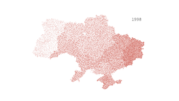

So traditionally West of Ukraine was most anti -communist, most independent region.
Second wave - when another line of distinction started to form since 2002 election - central Ukraine dropped support for
communists, and became much closer in electoral sense to Western part.

And lastly, there are new line of distinction formed, where West and center showed almost the same results, part of Eastern region - first of all Dnipropetrovsk and Zaporizhzhya - started to lean toward the west and center

The only stronghold for communists remained — it is a group of 3 region - Donetsk, Luhansk and Crimea.
During these waves “the border of division” actually moved as a wave, from west to east of country.
So I predict the next round of voting will shift line of distinction ever further towards East. Of course, If such a voting will happen, because there are deep concerns about possible full-scale military invasion from the Russia, in the nearest time, to the mainland of Ukraine.
Maybe most amazing thing is that such temporal evolution of the voting for last 20 years repeated itself during the time of our last protests:
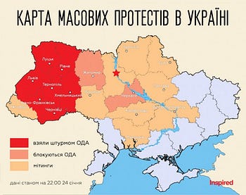
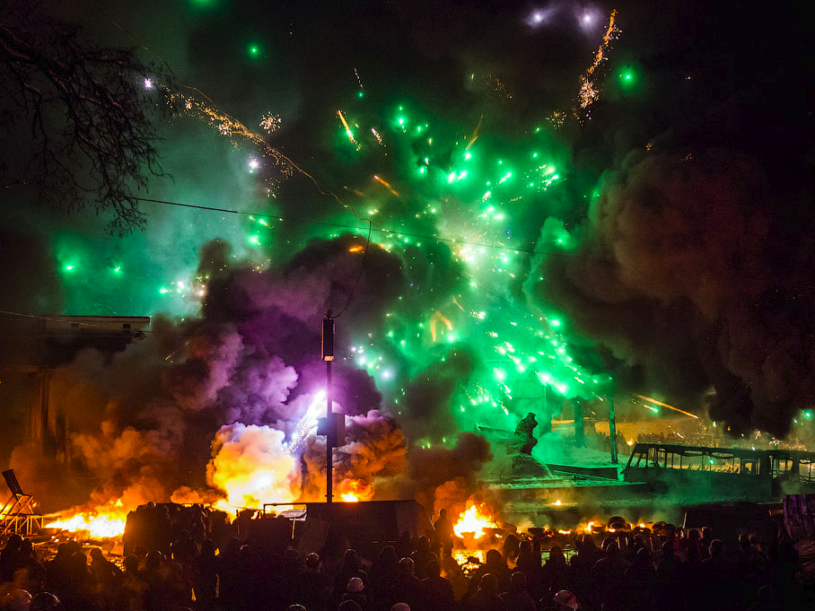
first of all the events in Kyiv was immediately supported by western Ukraine, then mass protests started in Central part (more intense protests showed in red)


then after couple of days it started in that parts of east and south which I mentioned in third wave of voting (among them Zaporizhzhya and Dnipropetrovsk region) and last but not least, we've seen first massive pro-ukrainian actions in
Luhansk and Donezk region, but only after ex-president Yanukovych was outed (not presented on these maps).
sources of maps: Inspired
To illustrate my point that it was a post-colonial revolution too, let me show how deep Ukraine is in a post-soviet conditions. Take a look to this work we made two years ago.
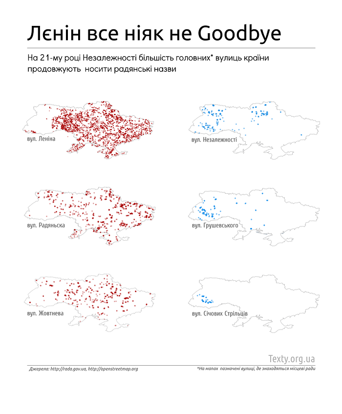
This is a names for main street in each populated places of Ukraine, i.e. street on which local authority are located. Data was obtained from geo-coded articles about all the habitable places in a country, by the way. You could see how many cultural legacy from USSR was in Ukraine till now. In the left, in red, we presented number for names of the streets, which corresponds to USSR cultural legacy — for example, the most popular name of “central” streets is Lenin’s street (upper left)
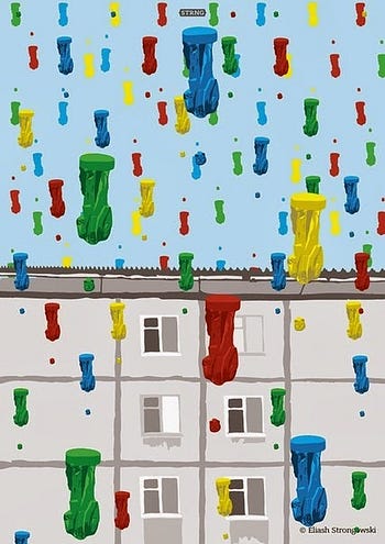
Not anymore I hope - one of the cultural phenomena of this popular uprising was a Leninfall (mass unsanctioned demolition of Lenin's monuments in cities and towns of Ukraine), started in Kyiv and spread like a fire.
Here you could see a simple interactive map with places where such a demolition of Lenins was condacted) http://incognita.day.kiev.ua/infohraphics/padinnya-vozhdya.html
So this voting wave — which basically show of withdraw of communist support — , and Leninfall, together they are hints that dramatic events which took a place in my country for the last 4 months — it's not only anti-criminal revolution but also a post-colonial revolution, when after a 22 years of post-soviet, post-colonial legacy we are finally ready to drop such legacy. So the main story about “deeply divided country” is what there is no such deeply divided, and that existing divisions are changing.
Now, what's almost all about an our work with data. I think that our next project will be about propaganda wars in Twitter during protests (we collected all tweets with main hashtag, #євромайдан) http://texty.org.ua/mod/datavis/apps/euromaidan/
This is preliminary work. Basically now it's barchart, with number of tweets per hour, but with a little twist: there is a tooltip for each bar that show most popular tweet (repeated or retweeted) for this hour. Because of such tooltips, it's really detailed timeline of protests, with all main events captured by most popular tweets. Next for example we’ll try to show how a pro-presidential "trolls" work in twitter to discourage people go to streets. It must be quite interesting.
Finally I'd like to repeat a list of our favorite instruments, most of them are Free/Open Source software:

d3.js - for the web-interface programming and interactive online visualizations,
Ruby, R, and Open Refine - to filter, transform and analize a data
Sinatra - Ruby-based lightweight web-framework
QuantumGIS, PostGIS, Polymaps and Leaflet libraries to work with maps
Inkscape - simple vector editor to make a static visualizations
MapBox and CloudMade as a additional sources of map data
and
OpenStreetMap, FOIA requests, web-scrapers as a main sources of data at all
***
To all organizers and volunteers: thank you again! Tank you to everybody for listening me, I'm very proud to be a part of Malofiej. Please, ask me a questions if you have ones.
