Indie Fitness App Development. Crafting the Visuals
Creating a user-friendly and visually appealing interface is a journey filled with challenges, especially when it comes to graphical assets. Nowadays, UI is more or less standardized, and people expect to see familiar elements. The main screen UI has been clear because of this. A two-column grid — simple and effective. However, it definitely needs more refinement.

And then you did the first exercise on stretching your neck…
The workout screen is more complicated. There are several exercises, and I aim to include animated transitions between them. This is necessary to ensure the app doesn’t just look minimalist but also avoids appearing bare. Additionally, for exercises, I need to show extra information, such as a pause screen between exercises.
I decided to use PagerView in Compose, which does a lot of work for me, like managing screen layout, animating transitions, and handling user interactions (not for the first version, but…). I thought it would solve all my needs, but I was very wrong. However, it will stay for now.
As I mentioned, graphical assets are a challenge. I searched stock images for a consistent style for all the exercises I had, but surprisingly, there were no complete sets. I chose not to use AI-generated images from tools like DALL·E because… well… I’m suck at generating consistent style and similar images via neural networks :)
Instead, I’ve decided to draw everything myself. I’m experienced in creating UI, love to work with wood (hehe.. just to show that I have imagination), and do sketches frequently. However, I’ve never crafted a set of illustrations or fine-line images for an app, especially ones demonstrating movements… but necessity is the mother of invention.
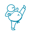
First, I drew simple “stick-man” illustrations. It was physically challenging, as I damaged my thumb a month ago, and it is still painful to hold a pencil. After a couple of hours and many expletives, I was done with basic sketching for the illustrations.
Masterpiece!

This drawing process also allowed me to gauge the complexity of the exercises. They must be straightforward for those new to fitness or who haven’t exercised in a while, focusing on mobility and stretching, and above all, safe.
When I drew the app icon and the individual exercise illustrations, a significant inconsistency in graphics throughout the app became apparent. The icon is styled with smooth lines, while the small icons for exercises, like fitness or cardio, are borrowed from emoji sets. The illustrations for the exercises look hand-drawn with a pen. There’s a clear dissonance that needs to be addressed.

To unify the visual language of the app, I’ll need to refine these graphics. This might mean redesigning the icons to match the hand-drawn aesthetic of the illustrations or vice versa. It’s crucial that the visuals across the app feel cohesive to provide a seamless user experience.
As I continue to refine the app’s interface, I’m reminded of the delicate balance between functionality and accessibility. Every line drawn, every colour chosen, and every transition animated is done with the user’s journey in mind — from their first stretch to their hundredth.
Oh boy… when will I find my point to stop?