Design thinking tools and techniques
UX tools for every phase of the product design process

Each product design project presents its challenges in terms of scale, timelines, budgets, client expectations, and user needs. These variables have guided how I tailor my design process for each project or sprint. A key to success lies in being flexible with your process, enabling you to meet every project's unique demands. This adaptability helps craft solutions that are innovative and closely aligned with user needs and business goals.
A big part of this flexible design process is the vast array of tools and techniques at our disposal. In this constantly evolving design landscape, there are an overwhelming number of UX tools available. From research methodologies and user journey mapping to the latest updates in Figma, coding, and data analytics, the list is endless, and we keep finding more stuff online.
Over the years, I’ve picked up many tools and activities as a product designer but never really documented them or the process I usually follow. Reading The Design Thinking Toolbox (TDTT) book helped me realize the importance of documenting my process and the tools that will help me constantly enhance my design practice.

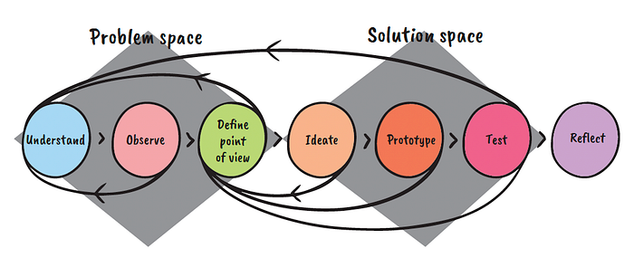
In this article I plan to follow TDTT’s designing thinking micro-cycle: understand, observe, define, ideate, prototype, and test. In the end, we can also add the reflecting phase to learn from our actions. These phases also fit into the British Design Council's Double Diamond Model. Throughout each phase, I will provide comprehensive documentation of the tools at our disposal for each phase. This will include online resources, templates, and practical insights on their utilization.
It is important to note that this is not a linear process. Every step has a feedback loop, where we learn and can refer or go back to the earlier phases if needed. I view this design process and its toolkit not as rigid steps but as a flexible guide. This approach lets me use the tools as needed or understand why they can be skipped.

Understand
The “Understand” phase starts the project by familiarizing the team with the problem. We aim to question the problem or brief, understand the end user’s needs, and formulate a problem statement.
We start by using tools like 5W+H questions and 5x Why. These exercises help us gain in-depth insights and new findings to grasp the problem or situation holistically. Then, we move on to get an overview of all stakeholders with a claim or interest in the issue. This is followed by understanding the needs of the end users. Finally, we will use the information from these tools to formulate a problem statement.
With every step of the design process, we refer back to this statement, constantly checking whether we are moving in the right direction and sharpening and modifying it iteratively as we uncover more insights.
1. Stakeholder map
- This map helps us understand the complete landscape of stakeholders, including organizations and individuals, who have a stake or interest in the issue and its potential solutions.
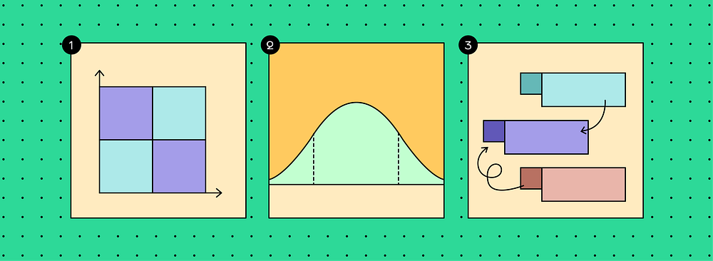
- Nielsen Normal Group (NNG) has provided a power-interest matrix to visually identify the different stakeholders and corresponding management strategies to handle them. Managing relationships with these stakeholders is one of the most underrated reasons for the success of any design sprint and project.
2. Extreme users/lead users
- Understanding the needs and expectations of average users is crucial, but innovative insights often stem from focusing on extreme users. Most user distributions form a bell curve, with mainstream users at the center and ‘extreme users’ at the edges. It’s the extreme users that challenge the conventional use of the product, uncovering both its strengths and limitations.
- The Design Thinking Toolbox has provided a great template to map these users and identify their behavior.
3. Problem Statement
- The problem statement defines the key problem statement coherently and captures it in a simple sentence. The statement has to be narrow enough to direct focus but broad enough to inspire creativity and open the floor to innovative solutions. Throughout the project, this statement will serve as a benchmark, guiding the team to evaluate their ideas' relevance and impact.
- The information gathered from the exercises mentioned above helps lay the groundwork for crafting the statement. Toptal and NNG have provided excellent examples of what a good statement should look like.

Observe
This phase is centered on learning as much as possible about the end users and their needs. We collect data and insights using tools such as the empathy map, user personas, competitive analysis, and clickstream analysis.
1. Empathy Map
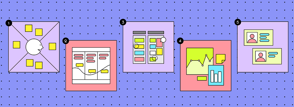
- An empathy map is a visualization used to articulate the end user’s experience with the product. Traditional empathy maps are split into four quadrants (Says, Thinks, Does, and Feels), with the user or persona in the middle.
- The empathy map exercise ensures product development aligns with the users’ emotional and practical needs.
- IxDF has provided a great example here. FigJam has also offered an empathy map template for a quick collaborative session.
2. User journey map
- The user journey map is a UX tool that illustrates the steps that a user takes in a process to accomplish a goal.
- This process begins by organizing user actions into a timeline, enriched with their thoughts and emotions to craft a narrative. This story is then refined and transformed into a visual representation, offering insights into the user’s experience, and highlighting areas for improvement in the design process.
- NNG has provided a great template and example.
3. Competitive analysis
- I think most people are familiar with this step. It involves reviewing and comparing competitor products or services to gather insights.
- This process helps identify industry patterns, emerging trends, and user preferences. By analyzing what users appreciate in similar offerings, designers can discover opportunities to innovate or improve their own products.
- Statista & ComScore are great tools for strategic UX research. For browsing userflows and screens of top apps & websites, I recommend using Mobbin, Scrnshts, TheAppFuel, and Refero.
4. Clickstream Analytics
- Clickstream analysis is a powerful tool that enables businesses to gain insights into user behavior, identify pain points, and make data-driven decisions to enhance the overall UX.
- It measures users' interactions across web and mobile applications by capturing clicks, page navigation, and other behavioral data within your product.
- This article on HighTouch provides detailed information on the different kinds of clickstream data that can be collected during a user’s product journey and how we can act on that data to power business outcomes.
- Heatmaps are another way to provide visual insights on improving the user experience by helping us identify which page elements users engage with (or ignore). This article by Hotjar offers more information on heat maps and the different tools they have available to conduct such research.
5. User Persona
- This is one of the most popular UX processes. Using this tool, we create fictional characters based on our research to represent the different user types that might use the product or service.
- They are helpful because they help us empathize with users rather than view them as statistical terms and broad profiles.
- NNG’s article provides great examples of how to craft user personas.
In addition to these tools, various UX research techniques, such as surveys, diary studies, focus groups, and field studies, can help provide unique insights into user behaviors. They can be used at different stages of the project, and we will examine some more of them during the “test” phase.

Define a point of view
After the Observe Phase, all the data we collect is summarized, analyzed, discussed, and evaluated. Then, we use that information to formulate a point of view. This is then used later as a starting point in the ideation phase and to find a solution.
- How might we statements
- How Might We (HMW) statements are crafted to inspire creativity and brainstorming for complex issues. They are design challenges phrased as questions that lead to creative idea generation.
- Formulate HMW statements after identifying the problem but before ideation, as they broaden thinking and encourage exploring new ideas.
- This NNG article provides tips on how to write good HMWs, including some great examples.
2. Defining Success
- Defining the success of a digital product during the UX process is crucial as it establishes clear objectives and measures for evaluating the product’s impact and effectiveness.
- This early definition guides the design and development team in making informed decisions that align with user needs and business goals, ensuring the product delivers value and meets its intended outcomes.
- Google’s HEART framework is a great way to help identify design metrics that should be measured to determine a project's success. It stands for Happiness, Engagement, Adoption, Retention, and Task Success. This article provides a great in-depth explanation of HEART framework and this article provides a great example of it.
3. Critical Items Diagram
- This is a great exercise for structuring the findings from the earlier phases and preparing them before we head into ideating and experimenting.
- Often, teams need help registering the elements or criteria important for the problem and decisive for a successful implementation later. For this reason, the critical items diagram is a straightforward way of becoming aware of what is essential at the moment. It helps the teams to agree on a common line.
- This can be done as simply as structuring and organizing all the data up to now and summarizing it. Design Toolbox has also provided a great template to initiate this process.

Ideate
Once we’ve grasped the problem, understood user needs, and outlined our approach, we start on the ideation phase. This phase involves brainstorming to generate many ideas through various methods. Selecting the top ideas emerges as the significant challenge during this stage. To navigate this, techniques like dot voting and decision matrices help make informed choices.
1. Dot Voting
- This is a self-explanatory and simple tool. Each team member assigns a token (“dots”) in front of the ideas they prefer the most. It is an easy, straightforward tool to democratically prioritize items or make decisions in a group setting.
2. Impact Vs. Effort Matrix
- This decision-making tool helps teams prioritize features based on their potential impact/value versus the effort required to complete them.
- It is a 2x2 matrix with impact on the y-axis and effort on the x-axis. The resulting matrix captures the relative effort necessary to implement candidate features and their effects on the users.
- The four quadrants made using this matrix are — quick wins, big bets, money pit, and fill-ins.
3. Blue Ocean Strategy & Buyer Utility Map
- The blue ocean strategy helps to differentiate a product or service from the competition and opens up new market opportunities. The goal is to shift strategic priorities in existing markets by tapping into unexplored opportunities, thus rendering the competition irrelevant.
- The Buyer utility map (6 by 6 matrix) is a tool from the Blue Ocean Strategy that allows you to visually map out the entire buyer’s journey against the six utility levers that can be used to develop your messaging and strategy. Examining the intersections of these categories will help identify the pain points in the industry that can still be exploited.

Prototype
Prototyping helps to communicate the vision to stakeholders and illustrates motion to developers. Prototypes can be used to visualize a simple function or the final product.
With so many tools at our disposal, we choose based on the experience we aim to convey.
1. Interactive Tools
Figma is widely recognized as the industry standard for digital interface prototyping, while Protopie is an excellent choice for creating complex, multi-state, and dynamic prototypes. If you want to prototype motion, I highly recommend using Rive or LottieFiles with AfterEffects.
2. Service blueprint
- A service design blueprint encompasses the touchpoints between people, processes, and both digital and physical elements across customer actions.
- It gives an organization a comprehensive understanding of its service and the underlying resources and processes—seen and unseen to the user—that make it possible.
- Utilizing a service blueprint during the prototyping phase of a digital product is pivotal for understanding how the product integrates with other touchpoints in the entire customer journey rather than viewing it in isolation. This holistic perspective enables teams to identify optimization opportunities and uncover business weaknesses effectively. Additionally, service blueprints facilitate cross-functional collaboration by clarifying roles and processes, ensuring a unified understanding across teams.
- For a comprehensive understanding of Service Blueprint’s key elements and advantages, please look at NNG’s article. Additionally, TheCXLead has featured insightful service blueprints from Airbnb, Spotify, and Starbucks, showcasing their application in real-world scenarios.

Test
After building the prototype we test it with potential users. The feedback from these tests helps us refine our view of the problem and user. This makes us look back at the “understand” and “observe” phases to gain a new point of view.
In this phase, we will have a look at some of the most popular methods to conduct tests on our prototypes to gain insights. To better understand when to use which method they are usually categorized in a 3-dimensional framework: “Attitudinal vs. behavioral”, “Qualitative vs. quantitative” and “context of product use”. Each method serves a specific purpose and can also be used in different phases of the design journey.
- A/B testing
- A/B testing in UX is a method in which two versions of a web page, app interface, or other product features are compared by randomly serving them to users to determine which performs better.
- This process involves showing two variants (A and B) to users at the same time, then using user interaction data to assess which version achieves a predefined goal more effectively, such as higher engagement or conversion rates
2. Usability Testing
- This method involves observing users attempting to complete tasks using the product. It aims to identify usability issues and gather qualitative and quantitative data to inform and improve the user experience.
- There are various usability testing methods and selecting the right one depends on your goals, resources, and timeline.
3. Feedback Capture Grid
- The Feedback Capture Grid is a method for collecting and organizing feedback during usability testing or design reviews. It consists of four quadrants to categorize feedback: What worked, Needs to improve, Ideas, and Questions. Here is a FigJam template to quickly get started with one.
- This tool helps in capturing insights, helping design teams identify areas for improvement and potential innovations, and clarifying any uncertainties about the product’s design or functionality.

Reflect
This final phase allows us to evaluate our process, team collaboration, and stakeholder involvement. Reflection and learning are crucial, making them fundamental to our design practice. Techniques like “I like, I wish, I wonder,” and the “retrospective sailboat” facilitate this reflection, enabling us to assess and improve our procedures critically.
- I like/ I wish/ I wonder
- This is a simple reflection method for gathering feedback: Let participants complete the sentences “I like…”, “I wish…” and “I wonder…”.
- It can be used to reflect on the collaboration and to achieve a specific result. For example: “I like how you motivated us to conduct another customer survey” or “I wish that the prototype were tested in other cultures as well.”
- You can find examples of this technique here. The Design Toolbox template makes it easy to start using it.
2. Retrospective sailboat
- This technique turns your team into the crew of a sailboat travelling to its final destination: a sunny island.
- It visualizes a team’s journey, identifying factors that propelled progress forward (winds), obstacles that held the team back (anchors), feel-good factors (sun), potential risks (rocks), and goals (island).
- This approach encourages open dialogue about past projects, facilitating a deeper understanding of successes and areas for improvement, thus promoting a learning culture within teams.

