Making It Look Cool: STAR WARS

I admit it. I’m not immune to the sci-fi pop culture zeitgeist fervor that’s swept most of the free world.
I’d daresay… a force has awakened in me.
Star Wars is finally upon us and there’s no escape. So what’s an illustrator and graphic designer to do? Join in the fun and add to the excitement with a piece of fan art, that’s what!
JJ Abrams appears to have captured lightning in a bottle. The Force Awakens trailers recapture the magic and splendor of the original Star Wars trilogy while simultaneously circumventing the bad buzz most ardent of fans are capable of generating. Therein lies the spark for my piece; evoking a sense of nostalgia yet feeling very modern and contemporary.
Comic books and Star Wars have shared a special synergy from the very beginning. Howard Chaykin’s first Star Wars cover for Marvel Comics remains one of the most iconic and enduring images from the late seventies. Doing a recreation seemed like a no-brainer. Hell, if it worked for Alex Ross, then damn it, it can work for me!

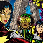
From Abrams’ trailers one easily takes away that there are not one but two co-leads, Rey and Finn. As a creator [and more importantly, a FAN of color] a stormtrooper who evolves into a lightsaber-wielding hero resonated with me. And I’m not alone. The shouts heard around the world from enthusiastic Blerds were deafening. Deservedly so. It’s 2015 yet heroes of color are still grossly under represented. I personally never intentionally set out to focus on AFROFUTURISM as a backdrop for new creative work, yet here I am. I can’t complain about the under-representation of diversity unless I do my part to help change it.

So THAT’S the long answer to why I chose Finn in the Luke Skywalker pose from Chaykin’s Star Wars cover. Moving forward let’s dig deeper and discuss my thought process and the mechanics of the piece. From the onset, Chaykin’s cover would be the starting point, however there would be differences… some planned, others happy accidents. First, who to include and what to exclude? Finn of course, replicating Luke Skywalker’s classic pose, was obvious. Equally heroic would be Rey. Even without indication that she too would wield a lightsaber, she nevertheless comes across as formidable. Her pose would have to convey that. Next up would be the aging Han Solo in a pose reminiscent of the original. Having his gun arm fully outstretched came across as more dynamic than with elbow bent so I ran with that. As a result the semblance symmetry to the original cover went out the window, all the figures moved slightly to the right to accommodate Han’s gun arm. I also toyed with adding Chewbacca in the background along with BB-8 in the foreground just behind Finn’s right leg. Both ideas I quickly discarded, not wanting the piece to be too busy. One also extrapolates that BB-8 is Rey’s droid and it would make more sense to have it by her side rather than Finn’s.


Next up would be the menacing floating head of Kylo Ren. To my knowledge there isn’t a Deathstar in the new film [who knows? I could be wrong!] so I couldn’t use that imagery as a backdrop. It was just as well as the focal figures were no longer centered. Instead the Millennium Falcon would take its place with chasing Tie fighters. Your mind’s eye can sometimes play tricks on you. My initial thought would be to have the Falcon streaking downward from the left and behind. Again, that was too busy, but the overall shift of figures to the right opened up a wonderful design opportunity. Adding the Millennium Falcon to the lower left going into warp and using the subsequent streaking star field gave a sense of flow and motion. Now things were coming together, and to capitalize on the shift in design I decided to make Kylo Ren’s head smaller, accentuating the design by moving him upwards and to the right. Captain Phasma wasn’t in my initial sketch but I decided to include her. As stated initially, the idea of homage was a starting point but I had an opportunity to put an original stamp on it.

Hyper realism is all the rage in American comics world now. However I’m influenced by classic Anime and Manga as well as by extremely stylized artists like Michael Golden, Jason Pearson, Humberto Ramos, and animators such as Phil Bourassa, and LeSean Thomas to name just a few. I specifically go out of my way to be UN-realistic and to exaggerate. Long figures, big hands and feet, hyper-stylized drapery when it comes conveying clothing and a blending of Anime-American design cues in faces come into play. These sensibilities bleed into how I color pieces as well, opting for a bright palette, accentuating hard cuts in color replicating the color process used in cell animation. If at first glance the figures look like something out of animated series… then I’ve succeeded!
With adjustments in figure placement, penciling, inking and coloring [Whew!] I could finally get around to the FUN part. I love incorporating typography and graphic design into my pieces and this would prove to be a fun exercise. Utilizing the black and white version as a mock up I forged to recreate the actual layout from the original Star Wars cover as best I could. In fact I lifted and manipulated much of the original logo and design elements and rearranged them for optimum effect in the mock up. To be frank, I initially thought I’d had gone a bit overboard and down a rabbit hole [sorry for the mixed metaphors!] however that extra bit of problem solving proved to be a boon…


As with the original illustration the design elements of the homage would be the starting point, but I was determined to modernize the presentation of the existing copy. I set out to replicate the old school Marvel trade dress from scratch. The classic Arial Black font turned out to be a good fit for the “Marvel Comics Group” banner. Speaking of the banner I decided to forgo the original green, opting for red instead as it was very complementary to the fuchsia in the colored piece. It certainly wasn’t a conscious decision on my part, but in retrospect I felt I was channeling Michael Golden when coloring this piece. A fan on social media mentioned similarities and he was right! But I digress…
Next up, a cleaner version of the Comics Code Authority stamp was found and placed. Once again the Arial font worked perfectly for “the greatest space-fantasy film of all”, this time in bright yellow. I followed this by securing a very modern black and yellow vector Star Wars logo, which with some slight manipulation fit snugly in the space above Han. It was planned from the onset that Han would be in the foreground obscuring part of the logo. However making the interior of the logo transparent allowing more of Kylo Ren’s cloak to be seen was fun experimentation. Now the typography was working in tandem with the illustration giving depth and a tiered effect, perpetuating that downward right to center “flow” discussed earlier.
The next step was actually a misstep. I had forgotten to draw the small Finn in the character design box. I briefly toyed with not going that route but ultimately decided to anyway. Finn holding his lightsaber helped sell the iconic feel I was going for. I was back to the drawing board… literally. A quick inked sketch in the approximation of the classic box, colored with a complementary space background and I was in business!
Up till this point, although modernized, the trade dress faithfully replicated many of the original design elements. However, I wanted to use the copy from the original hand-drawn box captions but not to use a comic book font. Instead I went for the modern feel of a magazine and updated to a copy that befits Finn, Rey and director JJ Abrams respectively. Using Quarca condensed bold as the font, and flushing the copy left worked perfectly. Initially I wanted the text to be in red to compliment the red banner at the top. Unfortunately it didn’t “read” well. Ultimately I opted to go bright yellow, complimenting the Star Wars logo.
Voila! There you have it! From start to finish the myriad design choices an illustrator and designer goes through when completing a piece!
May the FORCE BE WITH YOU and go see the movie! I know I will.

For those interested in purchasing the 11x 17 original black and illustration sans typography… OR interested in a commissioned original piece don’t hesitate to e-mail me: alphacmt@hotmail.com
If you like what you’ve read, be sure to hit recommend below, to pass this story on to your followers. As always, consider following Panel & Frame for more emerging voices in Comics, Literature, Film, and Art!