Peter Breck — Revisited In Modern Times

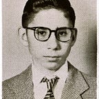
Only those who watch late-night films on TV would know who the actor Peter Breck was. He was an American but for many years he lived in Vancouver. He died here in 2012. I was lucky enough to meet this character actor of many westerns in May of 1989. Photographically a lot has happened to change how photographs are now taken.
Fortunately even though I am now 74 I can remember how I took these 18 photographs.
It all began with Ilford F-P4 film in 220 format (twice as long as 120) which I used with my Mamiya RB-67 which shot pictures that were 6x7 cm. Each roll of 220 gave me 20 photographs but the contact sheets and holders could only accommodate 18. I usually did not shoot those last 2 remaining exposures. 220 film is long gone but Kodak and Ilford make 120 film which I happily shoot with my Mamiya when I can. I process the film in my third bathroom and scan the results.

While I took these photographs of the actor for the arts weekly The Georgia Straight, the art director at Vancouver Magazine Chris Dahl where although I was a freelancer I was the de-facto staff guy who took most of the stuff. At that time Dahl was influenced by the b+w cover photographs by Irving Penn in Vanity Fair. I was commanded to shoot in that style. This involved lights that were either grids or spotlights. I also slipped a very deep green filter in front of my lens that blocked red blemishes on his face (and made them more obvious as they were rendered sharper). I also had my 140 mm macro lens very close to Breck’s face. I liked and like to hear my subjects breathe. I always made sure to have a good deodorant and I never forgot to brush my teeth in the morning.
When I scanned the two contact sheets I noticed my writing on the back. Dahl who read any and every magazine he could find asked me one day, “Do you know about split contrast enlarging?” I didn’t so I researched it.

My enlarger had what was and is called a colour head. You can dial individually the colours magenta, yellow and cyan. At the time I was using Ilford paper that we would call multi-contrast. If you did your exposure of the paper under the enlarger with lots of magenta the contrast increased. If you used yellow the result was softer. The idea was to use a bit of both (individually) to get shadow detail and still get bright highlights.

Of course with the advent of the scanner (and I have a very good Epson Perfection V-700 Photo machine I can do that split enlarging with the shadow/highlight tool of my 14 year-old Photoshop.
Originally published at blog.alexwaterhousehayward.com.