How to start making pixel art #7
Working with lines
This article was supported by Patreon! If you like what I’m doing here, please consider supporting me there :)
Also, this is the part 7 of a series of articles, read the whole series here in the Pixel Grimoire.
What are lines

Lines are one of the most important art tools ever invented, they are there to emphasize forms and contrast. You can’t see lines in the real world, but it’s something that helps us divide spaces, create texture and describe volume and direction.
In pixel art we have a very limited space in our screen. Since each pixel counts, lines can become very expensive. For this reason, if you’re working with a very low resolution it’s not very recommended to use lines in your pixel art. Even if you have some space it’s always a good idea to really consider each line and try to get away without using them. Minimizing the amount of lines is a good idea if you want to keep your pixel art clean.

You can replace unnecessary lines with shadowed or high contrasting areas. Merging the lines with dark shadows also makes the drawing look more unified and natural.
Unintentional corners
I explained this briefly before, but let’s examine this problem better.
It’s common that unintentional corners appear on your lines when drawing with natural gestures. This can be solved by manually cleaning them up or by using an automatic “pixel perfect” property in your pencil tool.

This algorithm is very useful for drawing single pixel lines but it’s not always perfect, you should also know how to fix unintentional corners manually.

It’s a simple pattern search: every time you see a corner (3 or 4 pixels forming a square shape) ask yourself if that’s really supposed to be a corner. If that part of the drawing is not a corner, remove one pixel to make it rounder.
Remember that this is different from jaggies, and I explain what they are and how to remove them in another chapter. Fixing corners can create a lot of jaggies, so it’s usually a multiple step process: draw> fix corners> fix jaggies.
Square lines

There is a different stylistic approach to the single pixel line problem. Instead of trying to remove them you can just add corners everywhere! It may sound counter-intuitive, but this is a stylistic choice that’s also really interesting and works specially well with highly stylized drawings, since it simulates a thicker line.
It’s basically the same process, but instead of removing the corners you should search for any diagonal pixel connection and make it square.

Note that doing that also usually creates a lot of jagged lines, so watch out for those and don’t forget to fix them.
Colored lines
Sometimes, especially in lower resolutions, lines can draw too much attention to them. One great way to soften that effect is to add darker versions of neighbor colors to them.

The process is simple, just re-visit each line you made and try to change it to a darker version of a neighbor color. Remember that when you do that, the chosen color will make that region look slightly bigger, so you might need to adjust the line position to accommodate there. Sometimes you won’t be sure on which neighbor color to choose, sometimes it will be pretty obvious. When not sure, I usually go with the darker color.
I still like to keep the exterior outline black, and depending on the resolution I even double that exterior outline. But remember, that’s a personal choice, it’s totally up to you.
Line sketching
We learned how to do cluster sketching on a previous article, now let’s try something different. This approach is great for drawing characters and sketching animation frames, since it’s so fast and focuses on shape and form, instead of light and color (like cluster sketching).
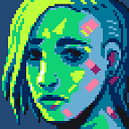
Let’s make a case study of an actual illustration now and apply everything I explained in this chapter. If you want to follow along and practice this step-by-step, I suggest you start a new file with a 64x64 resolution and the AAP-64 palette.
Step 1 — Sketch

The first step is to forget pixel art rules for a bit and try to sketch the shapes as fluidly as possible. Basically the same thing as drawing on paper or in other digital, non-pixel art medium. Just try not to worry too much about cleaning up the lines yet. After that you can clean it up a little, removing obvious guide lines and defining some shapes.
Step 2 — Cleanup

Now let’s cleanup. Make the sketch layer semi-transparent by right clicking on its name and choosing properties, then lower the opacity. Now you can just draw on a layer on top of everything.

The idea now is to make the final line art. Focus on drawing the important lines first, the ones that make your character’s silhouette and face, for example. Don’t worry about color or light here, you can draw some of the main shadows if you want, but your focus is to get the major shapes right.
Step 3 — Base colors

This is usually a simple step, just find colors that match with what you want and fill drawing areas with the paint bucket tool. Try to avoid colors that are too saturated or too bright. It’s not the time to paint light and shadow, but be mindful of how the image is supposed to be lit, sometimes areas can be affected by their surrounding colors.
Step 4 — Shading

Start shading the image, adding both brighter and darker areas. Try to imagine how the light would shine on the object you are shading and render it accordingly. Having reference images and photos for this step is also a great practice.

I like to try to “soften” the black outlines as much as I can during this step by adding darker colors on the curves, almost like an anti-alias. Don’t overdo this, though, or the lines can start to look blurry.
You can change the line art on this step, but focus on the shading for now.
Step 5 — Coloring lines and anti-alias

Like I explained before, too many black outlines can get a little distracting. Softening them by making them colored is usually a good idea. Just search for the nearest and darkest color nearby and change the outline color to a darker version of it.
If the outline separates very distinct shapes like the chin and the neck, or the colar and the hair, you can keep the line very dark or even black. That’s the reason why I like to keep the external outline of the character black. Soft transitions usually have lighter lines, like the nose lines.
Step 6 — Polish and detail

The last step is where you should make sure that all the lines are anti-aliased, all the shadow transitions are properly softened (or not! If they are hard transitions) and add all the small details.
Add backlight, small specular lights and reflections in this step. Since everything is already in place, you should be able to measure how much detail you want in your image. Try not to overdo this, and watch out for too much noise.
And we are done! Keep practicing and try to mix this with concepts you learned in the other chapters.
Good luck!