How we would redesign DBS PayLah!
E-payment has been a trendy topic recently in Singapore, much owing to the tweet exchange between PM Lee and Razor’s CEO, Min-Liang Tan on a unified e-payment system proposal in Singapore. It was also highlighted by PM Lee in his 2017 National Day Rally speech.
There are many reasons on why the Singapore society has been sluggish in moving towards a cashless society. In our opinion, presence of various cashless payment methods by different financial institutions and service providers, albeit relatively trivial, are confusing the users and hence, leading to low adoption. In addition to that, we also feel that many e-payment or e-wallet applications could be better designed to educate users on its usefulness and convenience. Today, we would like to take a design-centric approach to analyze one of the most widely used e-wallet applications in Singapore — DBS PayLah! app. From a design perspective, we aim to generate constructive feedback on the UI/UX elements of the application, hoping to contribute as part of the movement towards a better cashless society.
Review on DBS Paylah!
To understand how DBS PayLah works, we downloaded the app and used it in various occasions for at least a few weeks. At the same time, we also conducted user interviews with several existing users to gather and understand their use cases, workflows and feedback on the app. Besides UI and UX components, one of the main metrics we looked into was the number of interactions a user has to have with the app when completing a task (i.e. sending or requesting money). This can be measured by the number of times a user has to tap on the screen during the process. If the number of interactions needed to complete a task is minimized, we believe that it will contribute to a more delightful user experience.
Below is the current UX flow of the DBS PayLah! app we have generated based on using the existing app:
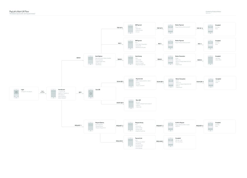
As the main functions of a mobile wallet is to send and request money from peers, it is natural that the flow of the app breaks into send or request after a successful log in. It is also reasonable to separate the QR function from the other flows as it provides a unique workflow and should be instantly accessible on the home page (you do not want the user to take a longer time to find the “Scan QR” function on the app compared to using cash payment in a retail store or hawker stall). These parts are pretty straightforward and fit a typical user’s mental model.
However, there are a few flows and screens which we believe can be improved.
1. Mismatched mental model

After clicking on the “Send” button on the app’s home screen, a pop-up appears — where users are faced with options like “Mobile Prepaid Top Up” and “Bill Payment” as seen in screenshot above . This violates users’ mental model of making a transaction as its purpose should have been established before taking the “send” action. Hence, these options should be displayed first.
Alternatively, we could use one single flow for all of them. This is because the purpose of transaction could be reflected in the individual components of the sending process. The subsequent steps of the options (Mobile Prepaid Top Up, Bill Payment, Send Money) in the screenshots below consist of different input fields that are labelled inconsistently, even though they actually all require users to input the recipient, transaction amount and additional information such as mobile number or reference number.


If this could be combined into one single flow and customized automatically based on the user’s input, the number of screens which the user has to interact with will be reduced. This is evident in many popular e-payment apps such as Venmo and Square Cash where these varying options are categorized under “send”. We have done the same for our proposed prototype below the article.
2. Cognitive overload in one single page
There are also several pages which contain multiple tasks that require user input and that, in our opinion, leads to cognitive overload and turn users off quickly.

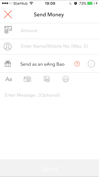
For example, when asked for details under the “Send money” action (above image), the user is presented with 4 tasks in one single page — he has to fill in the amount of money and the name of recipient, decide if he wants to send as an eAng Bao and add comments if necessary. Although some of these information are essential and some are optional, users could become overwhelmed by the way they are presented to him. To make the matter worse, users have to navigate through the tasks and fill in information one at a time — it does not prompt the user to subsequent tasks automatically after he provided the input and press enter. This, again, adds extraneous cognitive load on the user’s mind as it becomes a pain to complete this process. This is also observed in the request money flow. As these two actions are the main objectives of users, it is necessary to put in more thought into guiding users to complete these tasks as effortlessly as possible.
3. Placement of QR scan function

Using QR code to facilitate payment process is likely to become a common method in Singapore. It is meant to be fast and convenient so that people can use it quickly on the go. With this in mind, we identified two areas which the app can improve. First, since the QR scan function could actually be the main method of making payments in stores, it should be extremely accessible in the home page of the app. Currently, the icon is not well placed to allow easy usage (top right hand corner). Next, based on some of the interviews we had conducted, most do not know the difference between “Request via link”(after “REQUEST”) and “Show My Code”. From our testing, both actions seem to serve the same purpose of generating QR code except that the “Request via link” allows users to embed the request amount and user name in the generated QR code. We believe these two could be combined.
Our Proposed Flow: DBS Paylah! Redesign
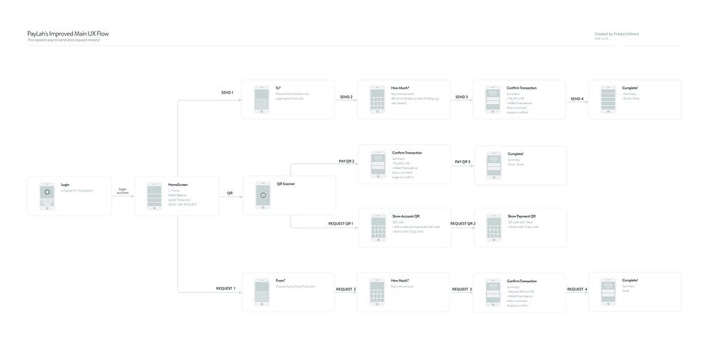
We decided to stick to the original idea of showing 3 main features in the home screen as it is simple and straightforward. Our improved UX flow can be seen in the image below:
1. Removed unnecessary steps
We decided to remove the transaction purpose page as we believe that it falls under the question of to whom the transaction is for. We also structure the flow such that it fits the mental model of everyday users. In the new proposed flow, users will be guided along during the process as they only need to carry out one task at a time. For example, after selecting to pay, users just have to answer to whom the transaction is for, the amount of the transaction and then decide to add any addition info if necessary. Regardless of who a user is paying (be it a friend or organization), the user will be directed to the same screen after clicking on “send” on the home screen.
The proposed flow significantly reduced the number of interactions a user will experience during one transaction. For example, for the send money action(since you click on send in the home page) the original number is about 10, we made it to 6. (Do check out our interactive prototype below)
2. Swipe to confirm transaction
Instead of a confirmation pop-up appearing every time we press for transaction, we have decided to use a swipe action instead. We believe that by asking users to swipe right to confirm, it prompts user to glance through the details and hence, review the transaction at the same time. This, again, reduced the number of interactions users have to have during the process.
3. Reorganized QR function
Referring to the prototype below, we placed the QR function centred at the bottom of the screen for easy access. Through the interviews conducted and also actual testing, we observed that most people will perform QR payment with only one hand, especially at places like food court or canteen. Hence, it has to be placed at a position where either hand can access conveniently.
We have also moved the “Request via request link” action to be categorized under the QR function because this action actually generates a QR code/link for an item a user wants to sell. This could replace the “Show my code” action which merely fills in the user’s account name automatically during a transaction when the payer uses the QR scan function.
Our Redesigned Prototype
Play with the interactive prototype below to see how we have redesigned the DBS Paylah! app in our attempt to improve the UX:
Conclusion
In addition to the points above, we also observed that the app gives users a “laggy” impression due to the loading icon that pops up regularly. If the app is to target tech-savvy younger generation users, transition between pages and feedback should be almost instantaneous.
In general, the app works well and does provide convenience when it comes to cashless payment to merchants and among peers. However, we strongly believe that with better user flow and design, it would attract more young users to adopt such technology!
Disclaimer
This article was drafted before the latest version of DBS PayLah! was launched in mid-September. Interestingly, some of the suggestions we have are addressed in the latest version (great minds think alike 😉). We see it as a form of validation in our design thinking process and we will strive to work on rethinking the design of more products!
What do you think of our review and redesign attempt? As this is our first project, we would love to hear your feedback. Share your thoughts with us by commenting below!
Follow us on Medium and stay tuned to our next redesign attempt!
— Product Miners (Zhou Kai, Nicole Jia Yu Low, toh.ruijie)

