A deconstruction of the old & the new
The Fourth Industrial Revolution generates fresh challenges and opportunities by bringing together creatives, technologists, scientists, logisticians and many more. Resulting in design that deconstructs everything, a clear reflection of modern day society.
This year creatives are undoubtedly using design to make their mark, no soft middle ground but clear cuts merge the old and the new. Crazy designs, experiments and wild imagination, designers are letting their creativity run wild and are adding an extra splash of personality to create eye-catching, smarter designs.
1: Breaking it up
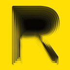
From disjointed text to the return of deconstructivism; Graphic designers are taking a more experimental approach to design and typography. Using their font-choice as a tool to communicate their ideas and evoke emotions. The trend of breaking it up is one of fragmentation and distortion. Ruining the aesthetics of a composition to create a strong visual appearance with controlled chaos. It is incredibly interesting because it challenges the way we look at things and forces us to think of new ways to communicate.
Within this trend ideas all advanced art and design movements are being explored and combined. Bringing the old to the future. With the distortion of typography we can identify three sub-trends: deconstructivism, disjointed text and the “ruined” effect.
Deconstructivism is characterized by an absence of harmony, continuity, or symmetry. Designers are distorting and dislocating elements, infusing black and white effects with colors, broken letter forms and chopped design elements to deliver an unpredictable visual appearance. It brings back nostalgic feelings of Russian Constructivism and Ray Gun magazine. It shows a clear rejection of the mainstream, almost forcing the receiver to become an active viewer of the work.
While Disjointed text is an even more deconstructive take on typography. It pushes boundaries and explores effects of breaking up letters and words. The message is there but the playful take on letter forms and separations creates abstract intriguing visual. It advocates abstraction and goes back to the essentials of form and colour. Even when the message is hard to apprehend, the deconstruction reinforces its meaning.
The “Ruined” Effect takes things a step further and is used to create captivating visuals by destroying the aesthetics of a composition. It includes splashing, scratching, ripping off, breaking or any other form of damaging effect to an already existing piece. It visualises a break from the desperate drive for perfection. Reflecting a modern day society in which imperfections are being cheered at.

2: Chopped typography
Chopped typography is the less chaotic sister of breaking it up, it is unconventional yet neat. The effect turns ordinary texts into something puzzling and fascinating. Within this trend typography takes centre stage in the design, it almost obligates you to stop and look.
The trend of Sliced text once again exposes nostalgic feelings. By bringing back art movements of the 20th century such as bauhaus, the identity gets a particular contemporary feel. It looks as if whole words have been sliced with an exacto knife, adding a bit of dimension and variety to text. The story takes the shape of letters to form another message, making it an excellent tool to create design with an edge.
Another take on chopped typography is Cropped typography, this trend has been on the trend board for awhile now and it doesn’t seem to be going anywhere soon. Although it might look simple, integrating cropped typography with other design elements requires a lot of thinking, but the effect can create incredible results. It is a great technique for designers that like to have some fun with typography yet want to keep it neat. It also forms opportunities to create wordplay, opening doors for wittiness or to deliberately create confusion.

3: Creative fonts
Typography is definitely king in 2018, designers are using creative fonts to turn letters and text into creative pieces of art. Digitization has opened a world of possibilities to play with layers, texture, shape and colors. The fun thing about creative fonts is that it allows designers to mix up all streams. Letters become a witty tool that can refer to the roots of its meaning or enhance the subject.
A picture speaks louder than words; Font as illustration is the art of turning words into an image. The font or letter shape becomes the illustration element. It can be used as the subject of a composition or in conjunction with photography. It makes room for exploring different combinations, scaling, overlapping and cropping to deliver an intriguing, original visual. This is a trend that definitely takes advantage of the digitization. It plays with human vision and optic illusions, clearly revealing that things are not always what they seem…
It’s clear designers never seem to grow old of challenging the dismal tradition of typography and layout. From emerging in designs of the 20’s and 30’s as well as the 70’s and 80’s, Playbill is yet another trend that always seems to find its way back. In a time where people are overloaded with content, playbill actually turns the information into a journey of discovery. In addition, storytelling is becoming more and more important but posters and packaging are often limited in space. Creative use of layering texts in different shapes and orientations offers a great solution.
Another clever take on classic typography is Liquid. The organic movement of liquid breaks with stiff structures and gives a unique, handcrafted appeal to otherwise generic typography. It adds dynamism to numbers as well as words and offers a lot of freedom to play with. From 2D to 3D, from liquid drops to paint traits, this trend can be addressed in a great number of ways.

4: Interaction with composition elements
If typography is king, than photography is queen. This trend lets elements interact in a refreshing, playful way. Whether it is merging fonts and photography or photography with other photography, every element complements each other. The imagery comes to life thanks to a dynamic interplay of layers. The dimensionality also reflects how our lives are quite literally interwoven with the things around us.
With over 5.3 trillion display ads being shown online each year Integration is an original way to make an otherwise dull subject pop out. Text and photography are merged to turn letters into real-life objects and digital tools are used to break with the stiff guidelines of the past.
Photo masking is similar to integration but in this case an optic illusion is created by ‘masking’ photography with text elements, colored bars or other photography shapes. It lets the picture quite literally speak for itself.

5: The game of color
What better way to stand out from the noise than by using an interesting splash of color? Unconventional, risky colors turn otherwise mainstream images into cool flamboyant creations. It almost seems as a sort of rebellion against recent minimalist years.
What better way to stand out from the noise than by using some Brightnessto spice up classic photography? However, less is still more! Designers do constrain themselves from using more than 3 eye-popping shades so the colors don’t lose their effect. As a result, the expressive imagery immediately nails our attention without feeling to overwhelming.
Glitch is another form of graphic ‘distortion’ by adding a touh of color. It refers to imagery that seems to be broken up by some kind of interference. The corrupted images are a reaction against our obsession with perfectionism and the constant recycling of content. It is honest, raw and visualises the rise of a society where imperfections are appreciated.
Our nostalgia for the 80’s and 90’s clearly remains and Color channelingbrings back some retro-cool to 2018 design. It’s a great technique to create a sense of distorted reality by doubling an image or using different overlapping images in monochrome colors. The result is an illusional effect with a retro feel.
Transparency can be seen as a trend that uses color to create a more minimalistic distortion. Transparent geometric shaped color blocks are used to highlight certain areas of a composition, resulting in a design element that forms a stark contrast. Generally it is a setup of retro colored blocks and black & white photography. This trend clearly brings back retro elements to make its statement.

6: Handmade illustrations
As brands seem to lack some kind of authenticity, illustrations are popping up all around us. Hand-drawn design elements are being used as a reaction against to all the mainstream imagery. From beautifully handcrafted logos to one-of-a-kind wrapping, this trend is used simultaneously with 3D structures, photography and typography to create a distinctive vibe.
It is particularly popular with brands in the food & beverage and skincare industry. The detailed elements add a nostalgic qualitative touch to artisan, organic or natural products.
We can also see a rise of Iconification. A trend that doesn’t “ruin” the existing piece, but leverages it to develop an icon by adding simple linear forms and hand drawn elements. Resulting in a simplified, witty illustration that clearly communicates the message.

7: Cinemagraphs
Cinemagraph, popular content that is seeing a rise in popularity. In fact, it is probably a REGGS cinemagraph that inspired you to click on this article. It is a beautiful twist that is something between a GIF and video, less screamy than video, but more attention grabbing than photography. It shows how creatives are looking for a middle ground that balances the best of both worlds. A quest for something that feels more organic and less intrusive. It inspired you to take a closer look, but doesn’t have the in-your-face mentality the deluge of video has. The repeated movement is often, but although the changes may not seem like much, the dynamics add an eye-catching touch.
There are constantly hundreds of ‘trends’ going on and it’s hard to pinpoint every single one. However, more importantly than the trends themselves, is the reason they emerge. Throughout all industries you can see a clear rejection of common stiff guidelines. Creatives and clever-thinkers are pushing boundaries in order to create a more dynamic space. Disassembling old standards so they can develop a new direction for the present…
This article is part of “The Magnificent Seven”, a series that explores the impact and influence of design with a healthy dose of must know. If you have any questions related to design, send a message to hello@reggs.com and we’ll write about it.