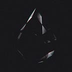
The challenge for this HP Spectre campaign was to create a unique piece of artwork from each unique sound source. An artwork that did not look computer generated, something you would deem wall-worthy.
Breaking this challenge down on it’s highest level, we identified two very important steps to tackle:
- SOUND — It needed an easy and intuitive art creation ow, from which a user could input some sound and…
- COLOUR — create an artwork that not only represented the message but looked like a beautiful unique painting.

We looked at art. Lots of it. From most of the masters we observed that human touch, the sense of organicness. In many you could trace the brushstrokes, see the ourishes and sense the rhythm in which it was carefully placed.
How could we combine these nuances with all the complexities observed in audio too? When recorded, a sound is represented by succession of frequencies, the peaks and troughs of a waveform. What if we mapped each frequency to a colour?
That method sounded ideal but it would had only have allowed us to create an artwork by looking at the sound sample piece by piece… each individual peak and trough represented. That wasn’t good enough for us…we wanted to literally picture the whole sound sample as an entre piece too.

Stuck on that problem we went back to square one.
Back to the painters. How does a painter make/manipulate their colours?
From the original tube of paint to the nal colour applied to the canvas a painter will use a palette of many to adjust the colour to the right tone.
We replicated that process. The colour tubes would be our input colour frequencies then we combine them in order to represent the sound as a whole.
We ended up with great diversity of colours not only representing the sound but the whole campaign.
The nal step was again created by observing the painting process. Using brushes, the painter will move the colours and mix them on the canvas.
In that manner, we wanted the sound to in uence the way the brush is going to be used. We quickly realised that the composition, direction and balance of the brush is key to get a good aesthetic. We tried a few options.

We came up with a two step process to creating the final artworks
Step 1 (during recording) — Painting the Background: By analysing the recorded audio, colours and brushes were assigned to different frequency brackets. If a particular frequency was detected, those corresponding colours were applied to the background.

To get the colours right and harmonic we used the HSB colour space. HSB stands for hue, saturation and brightness and it is more intuitive than RGB. It helps us to get the right spectrum of colours based on the frequencies and makes it easier to keep the contrast and the luminosity consistent by only offsetting the hue. Tints that are close to blue represented low frequencies whilst tints that go towards yellow were for higher frequencies. Those colours are then used as a tint base for the brushes that are being displayed.
The size of the paintbrush was affected by the volume of the sound giving additional variation.
Each individual brush was used as a texture on a plane that gets the motion and the transformation in relation to the frequency of the sound. We ended up with a maximum of 20 of those planes at a time to not overkill the performance.
Show an example of a video in the article that we could use.
To get the artwork / canvas lled with a maximum 20 planes oating we needed to make sure anything that gets drawn throughout the process remained and dissolved on the canvas as if it were real paint. The trick to achieve this was by keeping the previous frame of what is being drawn and then print it again alongside the new frame, therefore we are always one frame ahead. This was achieved with
a FBO (Frame buffer object) system. At the end of the background creation, the canvas was blurred to create a consistent colour eld.
Step 2 (during playback) applying brush strokes / colour mixing:

Adding the human touch…now that the background was complete, we needed to add a sense of brush strokes and movement to the nal artwork. This was done by displacing the background, using a set of ten unique brushes.
To get this effect we used the output image / background made throughout the rst step and processed it with another image used for displacing pixels. This second texture is made out of another set of brushes. They are drawn, scaled and moved in relation to the audio frequencies. The result is used as a displacement map to move across the pixels of the rst output image.
By digitally pushing and pulling the colour of the background in a diagonal direction, we were able to mix colours and achieve the sense of brush strokes.
Artwork
It was highly important for all artworks to have a unique visual output where each differed from one another based on the sound recorded. Yet at the same time, having a sense of art direction and overarching style meant creating a set of colours which complemented each other and a designing a group of brushes to be used.
Each frequency bracket was assigned colour values that gave enough range of difference but that would also work well with each other. Colour selection required constant testing throughout the experience.

The algorithm creating the artworks picks a series of brushes to use at the moment of applying the paint strokes. Rather than using a code based paint brush, each brush was designed to look appealing on the canvas. By having a limited set of brushes this gave a more human touch to the experience.

We wanted to create an audio waveform that served two purposes during different moments of the experience. The rst use was to show direct, one to one, feedback of you recording audio whereby the waveform would stretch and bend to the audio input it received. The second use was as a playback device where the user listened back to their audio as their artwork was being brushed.
To turn the input waveform into the playback version, we simply compressed its width which in turn created a waveform…

The Sound in Colour experience was created for the HP Reinvent Giving campaign, centered around sharing special moments with friends and family.
How did we create a print ready le from a website?
The rendering of the artwork on the website is only created at a standard web resolution which would not be high enough for a user to print on paper.
To create the high resolution version we built a back end system on a server using a high end graphics card to replicate the front end visuals. When a user recorded audio and created an artwork, all of the data of the colours, brushes, positional information and brush strokes was stored in a JSON le. This le was then sent to the back end and recreated at a much high resolution.
This notion of sharing played an important part in the nal goal of the website
Sharing digitally and physically your nal art piece.
At the end of the website, the user was provided multiple options to engage in this notion of giving. Firstly the user could share their artwork on Twitter, Facebook or download and image to post on Instagram. Yet more importantly, the user could download a high resolution printable PDF version to print themselves as well as print their artwork on canvas.
By utilizing a third party printing provider, we were able to generate an artwork at a quality ready for canvas print