How to Build Trust in Market Insights When Data is Limited

Market insights are increasingly becoming an attractive tool that software platforms can offer, giving their customers a sense of their position in relation to the market.
For example, many real estate listing websites now offer users an estimate of their property value based on market data and travel booking sites share market demand insights alongside advice on how to improve your listing.
At SEEK, we surface ad performance ratings to help our advertisers determine how their ad is performing in comparison to similar ads on our platform.
Platforms hold market data that is not available to customers. Therefore, when we present personalised and targeted insights, we can help our customers take immediate and specific actions as well as develop their long-term business strategies.
One difficulty in presenting market insights such as performance ratings is communicating the level of certainty about each insight to users. As designers, should we even show a market rating when uncertainty is high (such as when there’s not enough data to make an accurate assessment)? How can we best communicate the model and data on which a rating is based? Where is the line between too little information, too much information, and just enough information? Should we acknowledge our uncertainty about the rating and still show it to the users? If so, how does this affect users’ trust?
In the examples below, I’ll discuss a few approaches to consider when dealing with these questions. I’ve listed the advantages as well as the risks for each approach.
1. The conservative approach
Taking a conservative approach when confidence in a rating is low because data is insufficient — rather than showing the rating we display a message saying that ‘there is no market rating as data is not available’. For example, when on domain.com.au these messages appear for some properties:

On the plus side, this approach helps maintain users’ trust because they’ll know any rating they receive from the platform is trustworthy. The downside is that in many cases users will miss out on market insights and the value they provide, even if there is some uncertainty about them. The market insights tool will also be experienced as inconsistent, whereby a rating is presented for some items but not others.
2. The confidence caveat
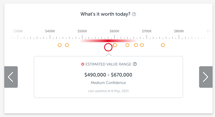
An alternative approach is to present market indicators even when data is limited, but with a level of confidence caveat as in this example on realestate.com.au:

The advantage here is that, in contrast to the conservative approach, this option assumes that some market analysis is better than nothing. There’s also better consistency, because a market rating is presented for almost every item. (Although sometimes it is simply impossible to present any rating).
The disadvantage is the risk of eroding users’ trust as users may ask themselves ‘why are you even showing this rating if you don’t trust your own data?!’ Another risk is over-trust where users may ignore the confidence warning altogether and accept the rating blindly. There is a challenge for designers to make sure the confidence caveat is visible enough.
3. User assessment
Instead of an automated confidence caveat, market indicators can be presented to users with a brief description of the underlying data. This allows the user to make their own assessment of the relevance and reliability of the market insight. For example, on talent.seek.com.au this message appears for some ads:

The positive aspect of this approach is that users can see the data behind the market rating and can make their own assessment of its reliability, applying their own market knowledge as opposed to relying on an automated assessment of confidence. This also creates more transparency in the data model and increases users’ trust. On the negative, there is again a risk that users will not realise some of the market ratings are less reliable.
Finding the right balance of what to explain with this approach is a challenge for designers. At what level of detail should the model be communicated? A partial explanation can be used, with the ability to read more for curious users who want more details.
So which approach should you choose?
As always with design, the answer is… it depends! Each approach can work in different scenarios. And, of course, the three approaches are not mutually exclusive and a combination could also work well, depending on the data model and what you want to communicate.
Since users are increasingly expecting access to market insights, investing the time to design their presentation is key to delivering the right experience. Design options can then be validated and refined in research with users to evaluate if the messaging is understood, and if it creates confidence and builds users’ trust.
Have you seen any more examples or approaches to presenting market insights, including when data is limited? Share in the comments below.


