Building content discovery for ShareChat users
Written by Mithun Madhusudan

When ShareChat was launched in 2015, the product consisted of a reverse-chronological feed with content in various Indic languages. Over the years, our algorithms have become more complex and sophisticated, catering to India’s language-first internet users’ unique needs across multiple Indic languages. While Feed remains the mainstay of our content consumption, our non-feed-based Discovery products have also significantly added to user experience and user retention. Today our ‘Explore’ product drives the maximum views after the Trending Feed.
This blog will talk about our experience of building Explore ground up and what we have learned about users and their content needs in this context. This blog will be relevant for teams who are building out use-cases across content and commerce for the ‘new Internet audience’.
First, to set some context, let’s talk about who our users are.
Various nomenclatures abound for ShareChat users includes ‘Bharat’, ‘India 2’, and so on. While this is useful from a broad categorisation perspective, these definitions and narratives miss out on some nuances about our users.
For example, here are some large content categories that are typically available on our platform. The content is very earthy and extremely close to the cultural nuances of our users. Viewing such content on ShareChat immediately connects the user community and puts them in a comfort zone with a thought ‘these are my people, and I will be comfortable here’.

Additionally, our users are not ‘English native’ that means that even though they might be familiar with the language and read it to a certain extent, they fundamentally ‘think in their mother tongue’. Their cultural context has been set in their first language. This has implications on how we think about our content strategy, UX, in-app communication and reflects on our product strategy.
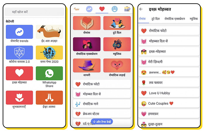
The Explore product within ShareChat is designed to give ‘power users’ access to the breadth and depth of content they want to consume, without the constraints of feed. It consists of categories, sub-categories, and hashtags, arranged in a hierarchical structure. Users can browse these categories and click on the specific hashtag that they want. The Explore product works hand in hand with the Feed to drive additional new signals about the kind of content our users want to consume.

Over the last few quarters, we have tried multiple iterations to make the product better, and here are some of the things we learned.
Learning 1: Users have extremely specific content needs which they cannot solve via explicit Search.
- Our users are fundamentally not ‘search native’ (as of today we see search behaviour picking up), which is why products that personalise content well and deliver the right content to the user in the fastest possible manner have taken off.
- However, they still have particular content needs, especially for power users. For example, a user interested in emotion related content would have the following mental map on the type of content they want. Eg: Ishq Mohabbat -> Romance -> Cute Couples as shown in the screenshots below.
- For this behaviour, a menu-driven hierarchical approach works well to get users to explore long-tail content categories which otherwise would not necessarily surface on the feed.

Learning 2: Once users learn a particular behaviour, any radical changes in the product (even if it is theoretically better UX) will set you back.
- For English native consumers, this would seem strange. When we download a content app, we generally stress-test the product by checking out all the features. However, for ShareChat users, this is still an alien behaviour. We have had heard about behaviourial patterns like ‘I don’t want to click this button because I don’t know what will happen’ and such things have been quite consistent. Even though there was no ‘loss’ in exploring the product, our users were just not comfortable exploring.
- Though we didn’t realise it, our users learned our UX patterns through trial and error over time.
- When we tried radical approaches by completely updating the UI, we saw a sharply negative impact on our returning user cohort. Even a simplistic revision of our user experience meant a steep learning curve for our users.
Learning 3: Given that there are no ‘standard UX patterns’ for our users, it becomes even more critical to iterate rapidly, which cannot be done in an app release context.
- Once we internalised that we were building for users who were not digitally native, and our job was to get them to the specific content they wanted in the fastest possible manner, we figured out the only way to do this was to build and test fast. This was constrained by app release cycles and adoption, which implies that we could ship and test at most 3 iterations on UI in a quarter. To bypass this, we started testing UI iterations on our PWA, where we could ship and iterate much faster than normal.
Next Steps for Explore
As we help our users go deeper into the Explore discovery paradigm, we realise that a generic content consumption experience across diverse categories will not work. Further experiments will focus on building differentiated experiences for content consumption depending on categories. A user browsing the devotion category and another user browsing the sports category should have different content discovery experiences. While this is challenging and might not fit with currently ‘agreed upon’ UX constructs, this is a direction that will add significant value to our users.

