自动化板式设计
Paper Summary: Automatic Generation of Visual-Textual Presentation Layout
Original Paper from Microsoft Research
*There will be a Chinese version soon…
[TL;DR] This article makes the following contributions.
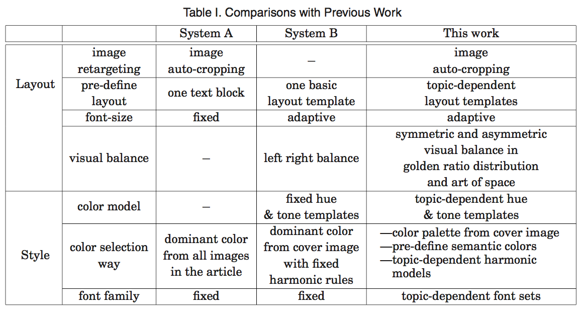
- propose a set of topic-dependent templates incorporating a set of aesthetic design principles as summarized by dominant experts.
- Design a computational framework to integrate all the key elements of layout design.
Designing a visual-textual layout is a multidisciplinary research topic that can be divided into three stages
- composing the image to match the size standard of the target media
- typesetting the text on the overlaid image
- coloring the textual elements
Image Composition -> Automated Layout -> Color Design Model
Template Design
The topic-dependent template design is motivated by two main observations in the automatic generation of visual-textual layout.
- the difficulty in precisely describing the visual and textual elements in terms of human perception
- people apply high-level experience and impalpable psychology in designing visual-textual media
the templates are defined by two aspects: spatial layout and topic-dependent style.
common design style point (from seven design experts):
- Textual information completeness
- Visual information maximization
- Spatial layout reasonableness
- Perception consistency
- Color harmonization
- Textual information readability
Aesthetic Principles
how to apply the principles of spatial layout and topic-dependent style?
We defined 16 types of common spatial layouts for a magazine cover (For different topics, the distributions of spatial layouts are also different)
We collected the eight most frequent topics including “fashion,” “economy,” “food & drink,” “travel,” “entertainment,” “IT & Tech,” “sports,” and “politics.”
In total, we cover eight most frequently used topics, defining 16 types of common spatial layouts. For each topic, we design topic-dependent styles with 20 semantic colors, four font emotion templates, and one or two color harmonic models.
GENERATION OF VISUAL-TEXTUAL LAYOUT
By combining high-level template constraints and low-level image features, we define a computational system framework.
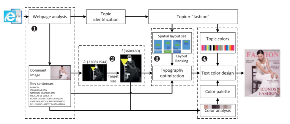
- The materials generator, where users can directly upload the image and texts, or we can analyze the webpage to obtain the dominant image and key sentences;
- Image composition, where the original image is automatically cropped and scaled to match the target layout size;
- Typography optimization, where the texts are overlaid on the resized image under the spatial constraints of the selected layout template;
- Text color design, where the texts are recolored with consideration of global color harmonization and local readability in a topic-dependent style.
Image Composition
A cropping-and-scaling-based image resizing algorithm. The complete procedure to align the original image to the target layout.
(Apply saliency detection [Cheng et al. 2011], OCR [Huo and Feng 2003], and face detection [Liang et al. 2008] to the input image)

We analyze the original Io to obtain the saliency, face, text, and gaze attention maps. These maps are combined to measure the importance of different regions.
We crop the image to have the same aspect ratio as the target layout by maximizing the importance of the remaining regions and scale it to the resolution of the target layout, so that image I matches the target layout in size and preserves important regions.
Typography
The typography of visual-textual layout is defined as the process of overlaying several sentences onto the background image.
Several basic principles:
- The text blocks should not overlap too much with salient visual objects in original image
- The text blocks should take full use of spare visual space.
- The text block with important information in semantics should be displayed in an important location in non-salient regions of background image.
We formulate the typography as an energy optimization problem that minimizes the cost of text intrusion, the waste of spare visual space, and the mismatch of information importance in perception and semantics, with constraints in the automatically selected templates.
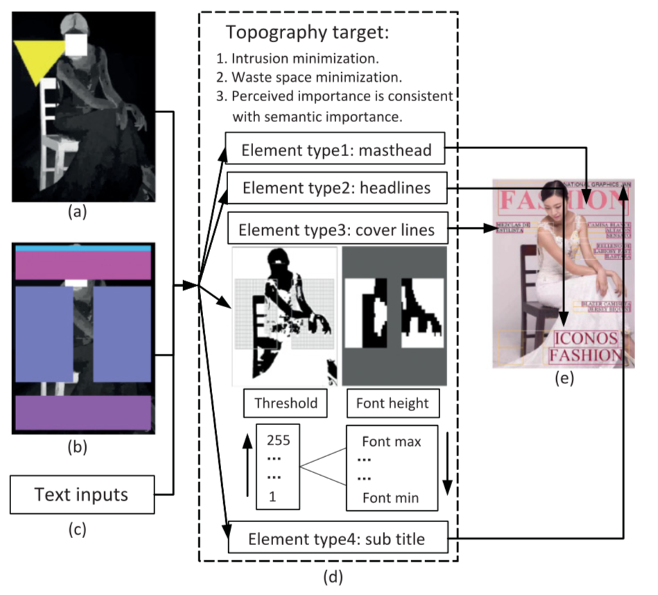
(a) the visual importance map (in gray) with gaze attention (in yellow);
(b) the selected template from the top-5 ranked templates;
(c) the input texts waits;
(d) the details of the typography procedure, where the energy defined as E(L) will be minimized in a sub-optimized solution by controlling front height iteratively (e.g., “Coverlines”);
(e) the typography result with bottom-up image features and top-down spatial layout constraints.
Harmonic Color Design
two requirements for harmonic color design:
- keeping text color in global harmonization with the background image
- preserving texts’ local readability
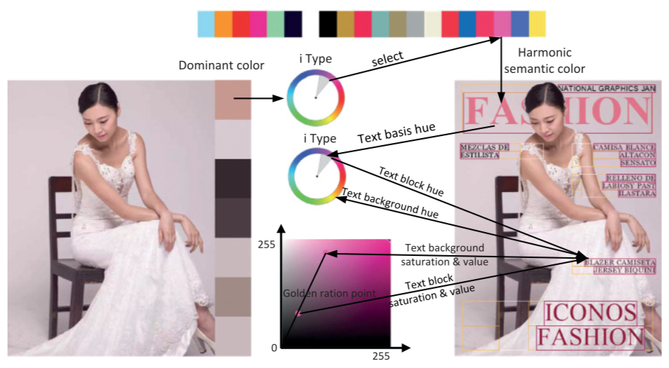
- the dominant color is extracted from the salient regions in the auto-resized image.
- one semantic color is selected out with the dominant color in the analogous type harmony model. The masthead of the layout is set as the semantic color.
- the “hue” value of other texts are determined by the “i” type hue model [Tokumaru et al. 2002]. To compensate for the contrast with the background, we set the tone of text at the golden ratio between the background tone and the farest possible opposite direction in the tone space in saturation and value coordinates.
Final Result: Comparisons with previous work.
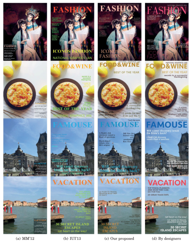
(a) and (b) are generated by the re-implementation of parts of MM’12 and IUI’13, respectively.
(c) Our work, which look natural and professional with balanced spatial layout and harmonic color.
(d) Designed manually by recruited designers who have never seen our proposed visual-textual layout. The figure is better viewed in color.

