Group X
Creating a symbol where mystery meets meaning.
I’ve been designing for a little over a decade and running my own shop for six of those years, and I can tell you from experience that projects like this almost never come along. At the end of the day, most companies who are looking for a new brand are trying to sell something and make a profit. Nothing wrong with that—just facts. But when we were asked to help create the brand for a project that’s only goal is to inspire people to feel a childlike sense of wonder again, we had to do it.

Group X is an anonymous group of artists and curators that are focused on breathing new life into the public art space.
Like a majority of us, they are tired of the traditional way public art is handled: boring statues of dead folks, tiny signs that say ‘don’t touch the art,’ bland concepts built only to appease donors, the list goes on and on. Most public art is just not very accessible. And most of the time, it’s not even that fun to look at. Group X set out to change all of that. Their goal is to provide an art experience that can be enjoyed by anyone and everyone, no matter what neighborhood they come from or what their relationship is with ‘traditional art.’ Basically, Group X just wants to make people smile whenever they see or interact with one of their projects.

This group is known for having a hand in some of the most awe-inspiring public art that’s recently popped up in Philadelphia. Remember those giant tentacles bursting out of that building in the Navy Yard? That was them. Remember that insane cocoon web thing? Also them. Piñata car? Them.


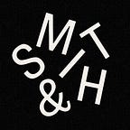
A dog? A ghost? A dragon.
When we set out to make the Group X logo, not gonna lie I was kinda like, “What can we possibly make that will represent an anonymous group of public art curators?” (v niche.) Luckily, we had just hired Emma Hansson as an apprentice, so I kinda hit her with the trial-by-fire vibe to see what would happen. I think my exact brief was, “Okay, let’s think about mythical creatures, I dunno something like a dog, or a dragon, or a ghost???”

She came back with a few interesting concepts, but one idea really stood out: a hydra. For those who may not be familiar, that’s a legendary dragon with a bunch of heads and when you cut one of them bitches off it grows two more. And I was like this is PERFECT. All the different heads could represent the members of the group. I encouraged her run with that concept and kept pushing her on the dragon shape/heads and then I was like I feeeeeeeel like we can add another layer here. Then I was like WAIT…what if…
…
TWO HEADS BUT THEY MAKE AN X!?
I then spent a full week trying to figure out how to make that work. In the end, putting in the time paid off and we ended up with something that felt super special and totally fun to look at. The lil serif heads and claws are what really do it for me.

I was hyped on the layers and layers of meaning baking into this mark, while it still managed to feel simple and approachable. Even if you’re like, “Yo, I absolutely do not give a damn about some hydra-headed BS,” you can still be like…that dragon X is chill tho.
The symbol is meant to deliver both meaning and mystery. Group X projects are all kind of mysterious. Their art projects pop up out of nowhere and make you wonder what the hell is it, and why is it here? The answer is: it doesn’t really matter. It’s here for you. It’s here for everyone. It’s here to spark some imagination. It’s here just for fun. We tried to capture all those vibes in this brand, not only in the mark itself, but also in a few sentences of copy as well:
This brand isn’t built to explain, it’s built to inspire. It’s rooted in fantasy, made to spark imagination and reward curiosity. It invites the viewer into a secret world — one where mythical creatures come to life, where rare and beautiful things appear unexpectedly around every corner, and where anyone can get carried away by the experience of art.

We also whipped up this take on a construction banner because this is exactly the kind of thing Group X might actually use during installation to keep their future projects secret. But we didn’t want to make it feel like we were hiding something. This isn’t some new trashy highrise where they don’t want you to see the shoddy plumbing they’re installing. We wanted to invite people to look closer—to get them wondering what in the world might be happening behind this thing. We wanted to encourage people to let their imagination run wild. And who knows—maybe there could even be a little window that opens up at a very specific time of day, where you can get a sneak peek? Always reward curiosity.


Hard hats–obviously.
If I ever get the chance to throw a hard hat into a brand concept presentation, you better believe I’m doing it. These folks work on construction sites, they operate heavy machinery, they are up on cranes installing beautiful artwork, so I was like obviously you need branded hard hats for you and your artists and all those big name sponsors you bring by for tours. These hats would be so easy to make, just some clear vinyl stickers on a white or black hard hat; nothing custom, since we’re not all made of custom hard hat money. And it would be such a memorable treat for the artists to take home as a keepsake. Plus you know people are going to be taking selfies wearing that thing while they are up on a crane hanging off a building.
The Escapist Journal — Because we’re a little extra.
We also presented this idea of a quarterly or annually circulated newspaper—The Escapist Journal. Which, believe it or not, the URL was available and I scooped that baby right on up. Group X was flipping public art on its head, so why not do the same with traditional media? People expect certain things from newspapers these days, but when you sort of walk the line between sensationalism, escapism, and public art, I feel like most folks would at the very least give this jam a double take.


My favorite part of this newsprint piece was the name plate. I’ve been trying to use Portrait Condensed for years, but felt it always had a bit too much personality and kind of overwhelmed whatever situation it was in. Here, though, it fit perfectly, with it’s psedo-blacklettery vibe matching up with the dragon aesthetic. And when paired with Service Gothic, it really creates this vintage-esque time period that doesn’t sway too ‘old fashioned.’ Less mason jar bar, more secret society notebook.

Dusting off the ol’ wheatepastin’ bucket.

Often when we make brands they just live in the digital realm forever, and honestly that kinda makes me sad. So I was like, you know what, I’m going to get some stickers made and I’m going to do some old fashioned poster pastin’. Who needs ‘Poster_mockup.tiff’ when I know how to do this stuff myself? I forgot how much of a rush pasting is and was just blasted with a nostalgic feeling of joy when I stepped back from slapping it up there.
Guess it’s fitting that this project reminded me how putting something you make out into the world truly comes with a special feeling. Someone is going to see this, whether they like it or not. And they will have an opinion about it, whether I like it or not. There’s very little control and it just feels so good to put something out there that has a little chaos energy to it. Ironically, I ended up pasting over a poster for a brand that I created a few years back, City Fitness. Sorry team, no beef. (It was actually their 2020 campaign tho so I’m sure we’re chill.) I went back to shoot some more photos later in the day and some wild old man saw I was taking pictures and decided to try to rip them down, which I can’t lie was hilarious.
*~* Chaos Energy *~*


Stickers are how I got involved with the whole street art world in the first place (shout out TK), so it’s been fun to slap these up throughout the city while out on adventures with my kid. She loves putting them up, too. Kids loooooove stickers. Most folks probably don’t pay too much attention to the stickers around their city, but once you start to notice, they are everywhere and they are beautiful and sometimes they are also hilarious. So next time you’re out and about, take a second to actually look for some stickers and you’ll be pleasantly surprised.

I had a bunch of fun working on this project with some really intelligent, thoughtful, and kind artists. Their response to the brand concept presentation is something that I will remember forever. They even wrote me an email that shook design twitter a bit. Keep your eye out for the next Group X project and remember let yourself get a little lost in art sometimes. It’s good for you.