Studio D 2019 End of Year Report
This is our sixth year of operation.
Most of our work is, and will remain confidential.
—
Sometimes the best thing to do is flip over the table and start over.
The top line is this: Studio D is humming along nicely — a clear continuation of the trajectories of 2014, 2015, 2016, 2017 and 2018. So clear in fact that it would be churlish to recap it here. So instead of beautiful-photos and inspiring stories in this EoYR I’ll share a bit about the strategy behind the studio identity and logo.
What’s in our DNA?
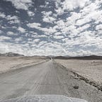
Our teams spend a lot of time on the ground in interesting places and often take tens of thousands of photos as part of field work studies. Thus, rich photographic content is simply part of an existing workflow, is compelling, and provides a solid sense of how we roll without revealing the clients. Less than 0.001% of these photos will ever see the light of day, but oh my do we have an archive. These are honest, shot in-context with all the in-depth knowledge that comes from first hand experiences, are deliberate and unique.
But I’m kinda jumping the gun.

In 2014, when I left my role as ECD of frog’s Global Insights organisation my business partner and I had no idea what we would or could be.
I launched the studio on a squarespace site (d-rad.co) with a Kabutomushi (Japanese Rhino Beetle) logo. Both the site and the logo were designed as placeholders until the shape and direction of the studio could be figured out. That poor beetle lasted a year during which time it was largely tucked away in a matchbox in the back of a warm cupboard—although it was also printed on the uniform of a chin lone team that the studio sponsored in Myanmar. It scales terribly.

How is it possible to launch a design studio without a meaningful identity and logo? First, we prioritised delivering client-work over telling a coherent story of who we were—our first clients trusted our reputation followed by what we delivered for them (we still work with clients from that first year in business). Second, we didn’t know what we wanted to be when we grew up, but we understood we needed the space to figure it out. Third, it depends what you consider “design”, as in these are all strategic decisions that serve a purpose for a moment in time—good design is about making optimal trade-offs with an eye on the bigger picture. Finally, when people are turned off by the rough edges of the studio they, and we, are proactively are making a statement about cultural fit.
In 2015 as we were preparing to launch our luggage brand, one of the questions that came up in the D3 owners manual (30+ pages of design notes and feature requests from the first ten beta testers of the D3 Duffel) was the question of what our new luggage brand should be called, its brand identity, and whether and how this would relate to Studio D.
It was time to articulate our identity.
Yeah but, who are we?
The identity and logo needed to reflect the way we operate, our ability to reconfigure to the needs of the client and project, and our preference to remain behind the scenes. Also, the character traits we look for in our team hires often includes curiosity, adaptability, smarts, remaining humble and grit. We also value fearlessness, but that term is so overused in business & consulting that it diminishes its value (far better to build fear into project outcomes and see who signs up).

It took an evening to sketch a basic shape, that most people assume to be a mountain, but is also a Tokyo building (where the angles are tightly defined by planning laws based on light access for neighbouring buildings) or a stealth bomber (when rotated 90 degrees). From this base shape a multitude of identities can spring forth.

For the Studio D logo we added two perspective lines. The logo is designed to be imbalanced, a reflection of what it’s like to be on a fast paced field work project, with the need to maintain a spatial awareness and react to things out of left field. The human mind constantly tries to re-adjust the logo on a horizontal plane and because this is never resolved, discomfort is an inherent part of the design, and the design is inherently impermanent. It felt true to what we were experiencing.

As a side note, when staff are assigned an email address, they are provided with a subset of the outlined logo—each of these shapes makes up part of the whole. We used to make these individually for each hire, until our pace of hiring outstripped the desire for customisation.


SDR Traveller
The SDR Traveller logo reinforces the mountain interpretation of the base shape. Since our luggage has no external branding, it’s use was limited to the website and discreet tags inside the luggage, plus some limited edition collateral.

After three years, when the brand nudged from totally obscure, to ever-so-slightly-less obscure we removed the text. Less is more.

Other Permutations
With the launch of the Field Study Handbook, we introduced another permutation, for our new imprint Field Institute. This is used in our externally published books and internal client publications. It’s a little heavy, much like our first publications.

We generally prefer the text free version, although occasionally this fuller one is used.

As our publishing business has grown it’s developed more of its own identity and we felt it deserves a break from the mothership. This will be launched in our first book that we’ll publish in 2020.
Some individual projects are given their own logos.

The original blog, Future Perfect nabbed a blast-first version.

For the Fixer List we tweaked the stealth bomber to make it more like a paper airplane—our fixers are versatile after all. Simply take away the lines and they revert to stealth.

Internal projects that have the potential to break out as new businesses are given their own identity. The project associated with this may or may not see the light of day.

What Lies Beyond?
As our businesses start to gain a foothold, they deserved some dedicated love. Masterclasses and Retreats business have their own range of icons for each content area. We have four more launching in January 2020 to compliment our expanding line up.


Each expedition receives its own logo. Both masterclass icons and expeditions sets were designed by Saloni Soni.

Collaborations also remain true to themselves. The Hamidashimono logo, was designed by Eko Hayashi, with input from James Gibson and myself, has a wholly different identity.


What’s Next?
After six years of operation we are now able to plan ~nine months ahead, and have found our working rhythm. To reflect this new found stability we updated the Studio D logo that will be rolling out in January 2020. It currently sits at peace.

We’re also now two years into the four-year project that are the Afghanistan Expeditions. The design language system for our field /mountain assets is well underway and will be applied to everything from books and maps, to equipment and med kits. The scope of the project/s is as expansive as the mountain ranges we will will explore.
—
To our clients, teams, collaborators—thank you. It’s been a solid year, with big things, and plenty of new variations of the base logo planned for 2020.
— Jan
Founder, Studio D

And if it’s your thing, sign up for the Studio D Radar Mailing List.