Breaking Down the Infamous “Demon Sheep” Campaign Ad
Hello, readers. I’m Will Kramer, and this is the first of my Campaign Ad Breakdowns. This will hopefully become a weekly series in which I take a look at a political campaign ad of some kind and analyze the factors that go into it, ranging from the camera angles to the music to the production company and anything in between. Sometimes, I’ll also take a deep dive into one or more of these aspects. For example, I might do a harmonic analysis of an ad’s background music, or I might take a look at the phrasing and speaking rhythm of a political message. I could even look at the text art overlaid on the screen of some ads (and in fact, that’s what I’m about to do). For this first breakdown, I do first want to address: Why are campaign ads so important? Or are they even important at all?
As someone who lives in an early primary state, I had the (mis)fortune to be bombarded with digital advertising on the daily right up until caucus day (which, thank God, has now passed). This is mostly due to a guy whose name starts with “T” and ends with “om Steyer.” Because Steyer’s a billionaire (as is his fellow candidate Mike Bloomberg), he has functionally infinite money with which to run as many ads as he likes during the primary season. But as someone who also lives in a politically crucial region of a very competitive state, the primary isn’t the only time I get a political ad on every single video I watch. When it’s time for the general election, that means it’s also time for ads like this one:
They blanket the airwaves with overproduced lines of attack and defense. Personally, I find most ads of this style ludicrously bad, but once in a while there’s a diamond hidden in the rough. Alternatively, they’ll cross the border into “so bad it’s good,” and I’ll derive some twisted joy at watching them appear on my screen over and over again. But that’s probably just me.
In any case, campaign ads are a key ingredient of the message for almost any modern political candidacy. As Democrats and Republicans rev up their respective online fundraising juggernauts and as more and more Super PACs and self-funding billionaires begin to pour money into races, our television and computer screens have become another battleground in the partisan war of current politics.
It’s also important to note that ads have evolved over time. Older ads tend to let the viewer do the thinking for themselves. Take President Lyndon B. Johnson’s notorious “Daisy Girl” attack ad against Barry Goldwater:
This ad doesn’t really make the connection to politics until it’s nearly done. It mostly relies on the viewer to get the message (here, that Goldwater is dangerously hawkish on foreign policy and might lead the world into nuclear apocalypse.) On the other hand, modern day ads like the one attacking Rosen are designed to do the thinking for you. They explicitly narrate why a candidate is bad or good, and how you should vote as a result.
Another key development in the evolution of campaign ads is the idea of “earned media.” When an ad is picked up by the press or by social media, it will often receive (“earn”) much more exposure than was paid for by the campaign. In the modern day, this takes the form of desperate attempts to get ads to go viral. Some do this very, very poorly:
And some do it quite well:
The great hunt for a viral campaign ad probably has its origins somewhere around the 2008 election, where Democratic presidential candidate Mike Gravel (yes, that Mike Gravel) took the mediasphere by storm with this strange yet beautiful production:
This pretty much brings us to “Demon Sheep,” which follows in the footsteps of “Rock” in being an extremely long, utterly absurd political ad ran by what some might call an “unorthodox” candidate. I call ads of this style “the Salvador Dalí of campaign ads,” and I love them all dearly. “Demon Sheep” is probably the pinnacle of these ads. Let’s break this baby down.
We’ll kick things off with a little bit of context. This ad was made for the 2010 California Senate campaign of Carly Fiorina. You probably remember her from her 2016 presidential run, in which she cruelly got named as the aborted running mate to losing candidate Ted Cruz and got called “Horseface” by winning candidate Donald Trump. 2016 was quite a year for poor Carly. But before she was the only woman on the stage of several of the Republican debates that year, she ran for Senate on the Tea Party platform. Her main opponent in the 2010 Republican primary was Tom Campbell, a moderate former Congressman and California state director of finance from the Bay Area. At the time, Campbell led Fiorina by a 10% margin in the only two polls released after he joined the race. Fiorina likely thought a desperate (or at least surprising) move was in order, and so her campaign turned to this man.

This is Fred Davis, who AdAge describes as “[t]he man behind some of the most memorable Republican ads and web videos of the last few election cycles.” He’s a Republican consultant who was known at the time for an ad produced in 2008, called “Celeb,” that tied Obama to the “Hollywood elite.”
For Fiorina’s pièce de résistance, Davis went with a reasonably standard message. “Demon Sheep”attacks Campbell from the right as weak on fiscal conservatism and as a flip-flopper in general, calling him a “wolf in sheep’s clothing.” Nothing too out of the ordinary yet. That much is just standard Tea Party politics. The extraordinary part is the production and drama that goes into this ad. Here is “Demon Sheep” in all its glory:
Look at the voice-over! The music! The ridiculous animation and lighting! The jump-cuts between stock images and videos! The weird text overlay! The guy wearing a sheep suit with gloooowing reeeed eeeeeeyessss… The whole ad is a masterwork of hilariously produced advertising. Personally, I love it. I also asked my friends what they thought of it, so here are some of their quotes.
“Overall? Disturbed.” — a classmate
“Funny enough to share… a win.” — a teacher
“Has surprisingly good points on policy… if I care in the slightest about fiscal conservatism that would’ve swayed me.” — another classmate
“Demon Sheep” got a surprisingly good reception among the relatively liberal population of my school. For one thing, it’s a funny ad that keeps you entertained for its entire three-minute run time. For another, the policy positions it takes are so right-wing it’s funny from a liberal perspective, and for a third, it’s just so different from the standard political ad. I should throw in the disclaimer that I, personally, would not be swayed politically by anything in this. Fiscal conservatism isn’t exactly my cup of tea. But from an advertising perspective, I do think this ad is very well done.
Now, let’s begin the deep dive. I’ll start by breaking down “Demon Sheep” into different sections and then exploring how Davis times each one to keep the viewer engaged and entertained.
Section 1: The Pedestal

“Purity. Piety. Our fiscally conservative leaders. Men we admire, aspire to be. Wholesome. Honorable. True believers.”
The first section, which I’m calling “The Pedestal,” lasts from the beginning of the ad until about 24 seconds in. It draws the viewer in with a message that is unlike any other political ad. For one thing, the narration doesn’t even mention Tom Campbell (or any other name, for that matter) until fully 18 seconds into the ad. I also like how Davis structures the initial opening that I put in the epigraph (indeed, I was struck by how easily it translated to a freestyle rap in my head). There’s a lot going on in there, from rhymes between “leaders” and “believers” or “admire” and “aspire” to a parallel structure between “Purity. Piety.” and “Wholesome. Honorable.” It feels semi-poetic and seems like it’s designed to enhance the mystique of these “true believer” fiscal conservatives. I like that Davis’s goal is to push the supposed infallibility of these people to its extreme here. It builds tension and perhaps confuses the viewer a little bit. I’d certainly wonder why the ad is going so over the top, at minimum. The stock footage does the same thing (that is, it makes the viewer wonder “why are there a bunch of sheep on my screen? What is going on here?”). Consider that even by only 18 seconds in, an average 30-second spot would already probably be nearing the end of its message. But only at that point does the viewer see a Monty Python-style animated sheep starting to be lifted into the clouds. That’s a huge sign that something a little different is going on. Normally, if you didn’t know how long this ad is going into it, you’d expect it to be just about finished. “Demon Sheep,” on the other hand, is just getting started.
Section 2: The Fall

“Fiscally conservative, Tom?”
This second section, from around 30 seconds into the ad until roughly the 2:20 mark, covers most of the actual policy complaints against Tom Campbell. After lightning strikes in the background and the sheep falls off the pedestal, the ominous narrator delivers a litany of violations of Campbell’s supposed “fiscal conservatism.” This is where Fred Davis really sells the ad. The catchphrase “Fiscally conservative, Tom?” (particularly delivered in the ominous voice-over) feels like something out of an unreleased early 2000s Batman movie, and the stock images also serve to baffle the viewer and energize the ad. It’s particularly notable how fast Davis transitions between each image. This serves to build an odd sort of tension throughout this section. I also want to analyze how Davis chooses what text to put on the screen. He generally goes pretty light on the text in this section, but it’s interesting that what text he does choose to put on the screen ignores the framing of the ad almost entirely. Rather than really trying to sell the horror-film style, Davis instead chooses to use the text to outline the main policy disagreements (things like “Supported a $12.5 billion tax increase” and “Campbell refused to sign ‘no tax increase’ pledge”). I think this is a smart move on his part. “Demon Sheep” is plenty memorable already. Adding more memorable text to the screen probably wouldn’t have much benefit. Adding text so that a viewer who remembers the ad also remembers the main policy points is much smarter from a political perspective. The other particularly smart thing Davis does here is put Carly Fiorina’s signed copy of the Taxpayer Protection Pledge prominently on screen for a few seconds. He’s already committed himself to making this ad mainly an attack on Tom Campbell. That doesn’t mean he can’t still sneak in a bit of product placement for his candidate here. Fiorina’s name is something else the viewer will remember, and it’s used in a way that both draws a contrast between her and Campbell and puts her in a positive light. That positive “gut feeling” is well worth the few seconds of screen time Davis allocates to the pledge. It’s also a very standard attack that the Fiorina campaign can later hammer home in other ads or literature. For that matter, it definitely flies under the radar how standard, even milquetoast, this ad is in terms of actual policy. Especially in the Tea Party milieu of the 2010 Republican primaries, it would not have been uncommon to see a normal ad with one or more of these attacks used against an opposing candidate. This makes it all the more remarkable that Davis can spin the attacks into an ad of this level of absurdity. Of course, this absurdity reaches its ridiculous climax in the denouement.
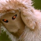
Section 3: The Demon

“Tom Campbell. Is he what he tells us? Or is he what he’s become?”
Honestly, I’m not even sure what’s there to break down about this particular section. It’s pretty self-explanatory. The third section, which lasts about 35 seconds from 2:20 to 2:55, brings this ad’s strange tension to its spectacular conclusion with the ad’s namesake “Demon Sheep.” It’s jaw-droppingly absurd in the best possible way! I have to say, I envy the guy who was paid to wear a sheep suit with evil eyes and do ominous movements in a field. Like, where can I sign up to do that? There is one thing I’d like to take a deeper look into, though. That would be the way Davis intersperses shots of his Frankensheep with footage of the normal sheep in the rest of the field. It’s rarely clear from the outset whether the camera is going to pan onto the eyes of a real sheep or the baleful red gaze of Tom Campbell’s sheepsona. Again, the speed at which the short clips roll helps add even more absurdist tension and even a sense of urgency to this section. Of course, Fred Davis isn’t really playing any of those feelings straight by this point. He knows that the viewer is likely rolling around laughing at the sheer shock value of the ad. But he needs to keep up the atmosphere to maintain cohesiveness, and boy, does he. This section is what gives the ad its name, and what really sells the production. It’s the moment of maximum laughter and tension in the ad, but we’re not quite done. After all, every good conflict has a resolution.
Section 4: The Choice

“Now that sounds like a better choice for California.”
This section, from 2:55 to the end of the ad, is where Davis cashes in on his sunken cost. By this point, the viewer has already used nearly three minutes of their life to watch this surrealist campaign ad. They’ll probably think it’s worth it to watch the remaining twenty seconds. As a result, this section is dedicated entirely to burnishing Fiorina’s image. The narrator basically outlines the theory of Fiorina’s candidacy. The main argument is that Fiorina’s a proven outsider with a fiscally conservative record. Again, this is really generic, which makes it all the more impressive that Davis can put it into this rollicking masterpiece of an ad. There’s not a lot more to say about this section precisely because it’s so generic.
Overall, I find the “Demon Sheep” ad absolutely hilarious (despite the fact that I agree with none of the policies outlined in the ad), and would happily give it a 10/10 rating. Even though my sense of humor dictates that I’m buried under roughly 500 layers of irony at all times, this ad is definitely just funny. Enough of my friends have given similar reactions to convince me that it does its job spectacularly well. Like Mike Gravel’s “Rock,” “Demon Sheep” was another of the proto-viral ads that have kept political consultants searching for some far-off joke or gag that will send their ad rocketing into the earned media stratosphere. In terms of electoral effectiveness, the record is mixed. Some have argued that “Demon Sheep” helped Campbell, but others believe it helped Fiorina. One thing is clear. It didn’t hurt Fiorina enough to stop her from winning the primary. But it’s still California, and a Republican would face an uphill battle in any year, even the Republican wave that was 2010. Fiorina lost to Sen. Barbara Boxer in the general. But “Demon Sheep” at least got her that far.
Thanks for reading, and hope you’ve enjoyed this inaugural Campaign Ad Breakdown. More to come soon!
Will Kramer