Effective Visualization of Multi-Dimensional Data — A Hands-on Approach
Strategies for Effective Data Visualization

Introduction
Descriptive Analytics is one of the core components of any analysis life-cycle pertaining to a data science project or even specific research. Data aggregation, summarization and visualization are some of the main pillars supporting this area of data analysis. Since the days of traditional Business Intelligence to even in this age of Artificial Intelligence, Data Visualization has been a powerful tool and has been widely adopted by organizations owing to its effectiveness in abstracting out the right information, understanding and interpreting results clearly and easily.
However, dealing with multi-dimensional datasets with typically more than two attributes start causing problems, since our medium of data analysis and communication is typically restricted to two dimensions. I have written a couple of popular articles around effective data visualization in the past and have also spoken in conferences about the same. This article will be a compilation of my experience so far in dealing with structured and unstructured data! In this article, we will be exploring the following aspects:
- The Grammar of Graphics
- Effective strategies of visualizing multi-dimensional structured data (ranging from 1-D up to 6-D)
- A brief into visualizing unstructured data including text, images and audio
Examples will be shown in Python, however, if you are interested you can replicate the same in R or any other platform of your choice.
Motivation
Data visualization and storytelling has always been one of the most important phases of any data science pipeline involving extracting meaningful insights from data, regardless of the complexity of the data or the project. Take a simple example of ‘The Datasaurus Dozen’ — twelve different datasets depicted in the following figure.
Can you guess what is common among these very different looking sets of data?

Answer: Summary statistics for all the datasets are exactly the same!

This is a fun variant of the well known Anscombe’s quartet, which many of you might be very familiar with, as depicted in the following figure.

The key takeaway from these demonstrations would be, “Do not trust your data blindly, and start modeling on your data”. Summary statistics can always be deceptive. Always visualize and understand your data attributes before moving on to feature engineering and building statistical, machine learning and deep learning models.
Another very important source of motivation, particularly for effective data visualization, can be derived from some excellent case-studies dating several centuries back when we didn’t even have computers let alone Python or R! The first one is John Snow’s famous visualization depicting the Broad Street Cholera Outbreak in London, England in 1854!

You can see how a simple hand-drawn visualization helped find the root cause of the cholera outbreak in Broad Street way back in the 1850s. Another interesting visualization was built by Florence Nightingale, the mother of modern nursing practice, who had a deep-seated interest in nursing and statistics.

The above figure depicts a polar area diagram depicting causes of mortality (death) in the army in the 1850s. We can see the visualization is definitely not simplistic, yet it conveys the right insights — clearly showing the proportion of soldiers who died due to diseases which were preventable, based on wounds or other causes. This should serve as enough motivation for effective data visualization!
A Quick Refresher on Visualization
I am assuming the average reader knows about the essential graphs and charts which are used for plotting and visualizing data hence I will not go into detailed explanations but we will be covering most of them during our hands-on experiments here. Data visualization should be leveraged on top of data to communicate patterns and insights with ‘clarity, precision and efficiency’ as mentioned by notable visualization pioneer and statistician, Edward Tufte.
We will be using the Python machine learning eco-system here and we recommend you to check out frameworks for data analysis and visualization including pandas, matplotlib, seaborn, plotly and bokeh. Besides this, knowing about D3.js is also a must if you are interested in crafting beautiful and meaningful visualizations with data. Interested readers are recommended to read ‘ The Visual Display of Quantitative Information’ by Edward Tufte.
Understanding the Grammar of Graphics
To understand the Grammar of Graphics, we would need to understand what do we mean by Grammar. The following figure summarizes both these aspects briefly.

Basically, a grammar of graphics is a framework which follows a layered approach to describe and construct visualizations or graphics in a structured manner. A visualization involving multi-dimensional data often has multiple components or aspects, and leveraging this layered grammar of graphics helps us describe and understand each component involved in visualization — in terms of data, aesthetics, scale, objects and so on.
The original grammar of graphics framework was proposed by Leland Wilkinson, which covers all major aspects pertaining to effective data visualization in detail. I would definitely recommend interested readers to check out the book on it, whenever they get a chance!
We will, however, be using a variant of this — known as the layered grammar of graphics framework, which was proposed by Hadley Wickham, reputed Data Scientist and the creator of the famous R visualization package ggplot2. Readers should check out his paper titled, ‘A layered grammar of graphics’ which covers his proposed layered grammar of graphics in detail and also talks about his open-source implementation framework ggplot2 which was built for the R programming language
I have identified seven major components which usually help me build effective visualizations on multi-dimensional data. The following figure illustrates it with some details about each specific component in the grammar.

We illustrate the same using a pyramid architecture to show an inherent layered hierarchy of components. Typically, to build or describe any visualization with one or more dimensions, we can use the components as follows.
- Data: Always start with the data, identify the dimensions you want to visualize.
- Aesthetics: Confirm the axes based on the data dimensions, positions of various data points in the plot. Also check if any form of encoding is needed including size, shape, color and so on which are useful for plotting multiple data dimensions.
- Scale: Do we need to scale the potential values, use a specific scale to represent multiple values or a range?
- Geometric objects: These are popularly known as ‘geoms’. This would cover the way we would depict the data points on the visualization. Should it be points, bars, lines and so on?
- Statistics: Do we need to show some statistical measures in the visualization like measures of central tendency, spread, confidence intervals?
- Facets: Do we need to create subplots based on specific data dimensions?
- Coordinate system: What kind of a coordinate system should the visualization be based on — should it be cartesian or polar?
We will now be looking at how to leverage this layered framework to build effective data visualizations for multi-dimensional data with some hands-on examples.
Visualizing Structured Multi-Dimensional Data
Let’s get cracking instead of me droning on about theory and concepts. We will use the Wine Quality Data Set available from the UCI Machine Learning Repository. This data actually consists of two datasets depicting various attributes of red and white variants of the Portuguese “Vinho Verde” wine. All the analyses in this article is available in my GitHub repository as a Jupyter Notebook for those of you itching to try it out yourself!
We’ll start by loading up the following necessary dependencies for our analyses.

We will mainly be using matplotlib and seaborn as our visualization frameworks here but you are free to check out and try the same with any other framework of your choice. Let’s take a look at the data after some basic data pre-processing steps.
We create a single data frame wines by merging both the datasets pertaining to red and white wine samples. We also create a new categorical variable quality_label based on the quality attribute of wine samples. Let’s take a peek at the data now.

It is quite evident that we have several numeric and categorical attributes for wine samples. Each observation belongs to a red or white wine sample and the attributes are specific attributes or properties measured and obtained from physicochemical tests. You can check out the Jupyter notebook if you want to understand the detailed explanation of each attribute but the names are pretty self-explanatory. Let’s do a quick basic descriptive summary statistics on some of these attributes of interest.

It’s quite easy to contrast and compare these statistical measures for the different types of wine samples. Notice the stark difference in some of the attributes. We will emphasize those in some of our visualizations later on.
Univariate Analysis
Univariate analysis is basically the simplest form of data analysis or visualization where we are only concerned with analyzing one data attribute or variable and visualizing the same (one dimension).
Visualizing data in One Dimension (1-D)
One of the quickest and most effective ways to visualize all numeric data and their distributions, is to leverage histograms using pandas

The plots above give a good idea about the basic data distribution of any of the attributes.
Let’s drill down to visualizing one of the continuous, numeric attributes. Essentially a histogram or a density plot works quite well in understanding how the data is distributed for that attribute.

It is quite evident from the above plot that there is a definite right skew in the distribution for wine sulphates .
Visualizing a discrete, categorical data attribute is slightly different and bar plots are one of the most effective ways to do the same. You can use pie-charts also but in general try avoiding them altogether, especially when the number of distinct categories is more than three.

Let’s move on to looking at higher dimensional data now.
Multivariate Analysis
Multivariate analysis is where the fun as well as the complexity begins. Here we analyze multiple data dimensions or attributes (2 or more). Multivariate analysis not only involves just checking out distributions but also potential relationships, patterns and correlations amongst these attributes. You can also leverage inferential statistics and hypothesis testing if necessary based on the problem to be solved at hand to check out statistical significance for different attributes, groups and so on.
Visualizing data in Two Dimensions (2-D)
One of the best ways to check out potential relationships or correlations amongst the different data attributes is to leverage a pair-wise correlation matrix and depict it as a heatmap.

The gradients in the heatmap vary based on the strength of the correlation and you can clearly see it is very easy to spot potential attributes having strong correlations amongst themselves. Another way to visualize the same is to use pair-wise scatter plots amongst attributes of interest.

Based on the above plot, you can see that scatter plots are also a decent way of observing potential relationships or patterns in two-dimensions for data attributes.
An important point to note about pairwise scatter plots is that the plots are actually symmetric. The scatterplot for any pair of attributes
(X, Y)looks different from the same attributes in(Y, X)only because the vertical and horizontal scales are different. It does not contain any new information.
Another way of visualizing multivariate data for multiple attributes together is to use parallel coordinates.


Basically, in this visualization as depicted above, points are represented as connected line segments. Each vertical line represents one data attribute. One complete set of connected line segments across all the attributes represents one data point. Hence points that tend to cluster will appear closer together. Just by looking at it, we can clearly see that density is slightly more for red wines as compared to white wines. Also residual sugar and total sulfur dioxide is higher for white wines as compared to red and fixed acidity is higher for red wines as compared to white wines. Check out the statistics from the statistic table we derived earlier to validate this assumption!
Let’s look at some ways in which we can visualize two continuous, numeric attributes. Scatter plots and joint plots in particular are good ways to not only check for patterns, relationships but also see the individual distributions for the attributes.

The scatter plot is depicted on the left side and the joint plot on the right in the above figure. Like we mentioned, you can check out correlations, relationships as well as individual distributions in the joint plot.
How about visualizing two discrete, categorical attributes? One way is to leverage separate plots (subplots) or facets for one of the categorical dimensions.

While this is a good way to visualize categorical data, as you can see, leveraging matplotlib has resulted in writing a lot of code. Another good way is to use stacked bars or multiple bars for the different attributes in a single plot. We can leverage seaborn for the same easily.

This definitely looks cleaner and you can also effectively compare the different categories easily from this single plot.
Let’s look at visualizing mixed attributes in two-dimensions (essentially numeric and categorical together). One way is to use faceting\subplots along with generic histograms or density plots.

While this is good, once again we have a lot of boilerplate code which we can avoid by leveraging seaborn and even depict the plots in one single chart.

You can see the plot generated above is clear and concise and we can easily compare across the distributions easily. Besides this, box plots are another way of effectively depicting groups of numeric data based on the different values in the categorical attribute. Box plots are a good way to know the quartile values in the data and also potential outliers.

Another similar visualization is violin plots, which are another effective way to visualize grouped numeric data using kernel density plots (depicts probability density of the data at different values).

You can clearly see the density plots above for the different wine quality categories for wine sulphate.
Visualizing data till two-dimensions is pretty straightforward but starts becoming complex as the number of dimensions (attributes) start increasing. The reason is because we are bound by the two-dimensions of our display mediums and our environment.
For three-dimensional data, we can introduce a fake notion of depth by taking a z-axis in our chart or leveraging subplots and facets.
However for data higher than three-dimensions, it becomes even more difficult to visualize the same. The best way to go higher than three dimensions is to use plot facets, color, shapes, sizes, depth and so on.
Visualizing data in Three Dimensions (3-D)
Considering three attributes or dimensions in the data, we can visualize them by considering a pair-wise scatter plot and introducing the notion of color or hue to separate out values in a categorical dimension.

The above plot enables you to check out correlations and patterns and also compare around wine groups. Like we can clearly see total sulfur dioxide and residual sugar is higher for white wine as compared to red.
Let’s look at strategies for visualizing three continuous, numeric attributes. One way would be to have two dimensions represented as the regular length (x-axis)and breadth (y-axis) and also take the notion of depth (z-axis) for the third dimension.

But is this effective? Not really! We can however leverage the regular 2-D axes for representing two continuous variables (scatter plot) and introduce the third continuous variable as a categorical variable by binning its values in fixed width bins — popularly these can be quantiles. Based on these quantiles (or bins) we can use size or even hue to represent the third variable here making it 3-D.

A better option would be to use the notion of faceting as the third dimension (essentially subplots) where each subplot indicates a specific bin from our third variable (dimension). Do remember you need to create your bins manually if you are using the scatterplot functionality from matplotlib as opposed to seaborn (depicted in the following example).

The above plot clearly tells us that higher the residual_sugar levels and the alcohol content, lower is the fixed_acidity in the wine samples.

The chart above clearly shows the frequency pertaining to each of the dimensions and you can see how easy and effective this can be in understanding relevant insights.
Considering visualization for three mixed attributes, we can use the notion of hue for separating our groups in one of the categorical attributes while using conventional visualizations like scatter plots for visualizing two dimensions for numeric attributes.

Thus hue acts as a good separator for the categories or groups and while there is no or very weak correlation as observed above, we can still understand from these plots that sulphates are slightly higher for red wines as compared to white. Instead of a scatter plot, you can also use a kernel density plot to understand the data in three dimensions.

It is quite evident and expected that red wine samples have higher sulphate levels as compared to white wines. You can also see the density concentrations based on the hue intensity.
In case we are dealing with more than one categorical attribute in the three dimensions, we can use hue and one of the regular axes for visualizing data and use visualizations like box plots or violin plots to visualize the different groups of data.

In the figure above, we can see that in the 3-D visualization on the right hand plot, we have represented wine quality on the x-axis and wine_type as the hue. We can clearly see some interesting insights like volatile acidity is higher for red wines as compared to white wines.
You can also consider using box plots for representing mixed attributes with more than one categorical variable in a similar way.

We can see that both for quality and quality_label attributes, the wine alcohol content increases with better quality. Also red wines tend to have a sightly higher median alcohol content as compared to white wines based on the quality class. However if we check the quality ratings, we can see that for lower rated wines (3 & 4), the white wine median alcohol content is greater than red wine samples. Otherwise red wines seem to have a slightly higher median alcohol content in general as compared to white wines.
Visualizing data in Four Dimensions (4-D)
Based on our discussion earlier, we leverage various components of the charts visualize multiple dimensions. One way to visualize data in four dimensions is to use depth and hue as specific data dimensions in a conventional plot like a scatter plot.

The wine_type attribute is denoted by the hue which is quite evident from the above plot. Also, while interpreting these visualizations start getting difficult due to the complex nature of the plots, you can still gather insights like fixed acidity is higher for red wines and residual sugar is higher for white wines. Of course if there were some association between alcohol and fixed acidity we might have seen a gradually increasing or decreasing plane of data points showing some trend.
Is this effective? Again, not really! One strategy to make this better, is to keep a 2-D plot, but use hue and data point size as data dimensions. Typically this would be a bubble chart similar to what we visualized earlier.

We use hue to represent wine_type and the data point size to represent residual sugar. We do see similar patterns from what we observed in the previous chart and bubble sizes are larger for white wine in general indicate residual sugar values are higher for white wine as compared to red.
Now this might be better than the previous 4-D plot but honestly its just alright in my opinion. Yes, the hue helps us with seeing which wines have higher or lower fixed acidity but I don’t quite like the notion of size since it is often hard to interpret. Can we do better? Yes we can! Let’s use facets instead as depicted in the following plot.

Look at that! Clear and concise visuals telling us fixed acidity is lower for white wine as compared to red wine and also residual sugar being much higher for white wine as compared to red wine samples. Also higher the alcohol level, lower the fixed acidity.
If we have more that two categorical attributes to represent, we can reuse our concept of leveraging hue and facets to depict these attributes and regular plots like scatter plots to represent the numeric attributes. Let’s look at a couple of examples.

The effectiveness of this visualization is verified by the fact we can easily spot multiple patterns. The volatile acidity levels for white wines are lower and also high quality wines have lower acidity levels. Also based on white wine samples, high quality wines have higher levels of alcohol and low quality wines have the lowest levels of alcohol!
Let’s take up a similar example with some other attributes and build a visualization in four dimensions.

We clearly see that high quality wines have lower content of total sulfur dioxide which is quite relevant if you also have the necessary domain knowledge about wine composition. We also see thattotal sulfur dioxide levels for red wine are lower than white wine. The volatile acidity levels are however higher for red wines in several data points.
Visualizing data in Five Dimensions (5-D)
Once again following a similar strategy as we followed in the previous section, to visualize data in five dimensions, we leverage various plotting components. Let’s use depth, hue and size to represent three of the data dimensions besides regular axes representing the other two dimensions. Since we use the notion of size, we will be basically plotting a three dimensional bubble chart.

This chart depicts the same patterns and insights that we talked about in the previous section. However, we can also see that based on the point sizes which are represented by total sulfur dioxide, white wines have higher total sulfur dioxide levels as compared to red wines.
Instead of depth, we can also use facets along with hue to represent more than one categorical attribute in these five data dimensions. One of the attributes representing size can be numerical (continuous) or even categorical (but we might need to represent it with numbers for data point sizes). While we don’t depict that here due to the lack of categorical attributes, feel free to try it out on your own datasets.

This is basically an alternative approach to visualizing the same plot which we plotted previously for five dimensions. However, considering the difficulty in interpreting size which we observed previously, you can convert one of the variables, if continuous, to discrete categorical using binning and then use that as an additional faceting parameter as depicted below!

While the additional dimension of depth or size might confuse many when looking at the plot we plotted previously, this plot due to the advantage of facets, still remains effectively on the 2-D plane and hence is often more effective and easy to interpret.
Visualizing data in Six Dimensions (6-D)
Now that we are having fun (I hope!), let’s add another data dimension in our visualizations. We will leverage depth, hue, size and shape besides our regular two axes to depict all the six data dimensions.

Wow that is six dimensions in one plot! We have wine quality_label depicted by shapes, high (the squared pixel), medium (the X marks) and low (the circles) quality wines. The wine_type is represented by hue, fixed acidity by the depth and data point size represents total sulfur dioxide content.
Interpreting this might seem a bit taxing but consider a couple of components at a time when trying to understand what’s going on.
- Considering shape & y-axis, we have high and medium quality wines having higher
alcohollevels as compared to low quality wines. - Considering hue and size, we have higher content of
total sulfur dioxidefor white wines as compared to red wines. - Considering depth and hue, we have white wines having lower
fixed aciditylevels as compared to red wines. - Considering hue and x-axis, we have red wines having lower levels of
residual sugaras compared to white wines. - Considering hue and shape, white wines seem to have more high quality wines as compared to red wines (possibly due to larger sample size of white wines).
We can also build a 6-D visualization by removing the depth component and use facets instead for a categorical attribute.

Thus in this scenario, we leverage facets and hue to represent three categorical attributes and the two regular axes and size to represent three numerical attributes for our 6-D data visualization.
Can we go higher?
The pressing question is, can we go higher than six dimensions? Well, it definitely becomes more and more difficult to hack our way around the limitations of a two-dimensional rendering device to visualize more data dimensions.

One method is to use more facets and subplots. Besides this, you can also use the notion of time if your dataset has a temporal aspect as depicted in the following example.
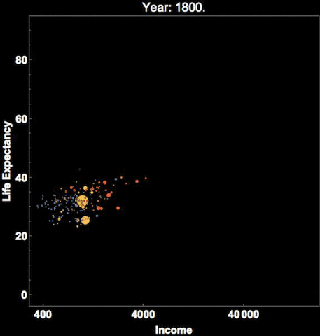
This depicts Hans Rosling’s famous visualization of depicting global population, health and various economic indicators across all countries. This was also presented in an official TED conference which I would recommend everyone to check out if they haven’t done it already!
This should give you a good perspective on how to leverage the layered grammar of graphics to visualize multi-dimensional data.
Visualizing Unstructured Data — Text, Image, Audio
The previous section introduced you to some useful techniques for effective visualization of structured data. But how do we deal with unstructured data like text, image and audio? Each of them are very different from each other and also vary significantly considering each of them separately! Here, we will briefly look at some ways of visualizing these three sources of unstructured data. Remember the end-goal of visualizing these data sources is not just for the sake of it, but to gather insights and to generate useful attributes and features which can be used further in downstream machine learning or deep learning applications.
Visualizing Text Data
Considering you have a corpus of text data, one of the best ways to get started is to do basic exploratory data analysis. This can be aspects like trying to find the distribution of typical sentence lengths or word counts. A sample is depicted below from one of my recent workshops on NLP.


Besides this, we can also focus on understanding and visualizing language structure by leveraging techniques like shallow parsing, dependency parsing and constituency parsing. Detailed code examples are present in one of my articles focusing on Natural Language Processing in case you are interested in further details.
The following figure depicts a sample example from my article demonstrating constituency and dependency parsing.

We can also look at embeddings based on recent deep learning models like Word2Vec, GloVe and FastText to understand text semantics besides structure. I have also covered this is extensive detail in my article on Feature Engineering Methods for Text Data which you can reference if you are interested in the gory detail!
Typically visualizing word embeddings can help you understand the context and semantics between words in your corpus and even leverage these features to build machine learning or deep learning models!

Visualizing Image Data
Images are basically multi-dimensional tensors which can be represented as matrices of pixel values. This really increases the dimensionality of even a simple small image and makes it difficult to work with them. A simple example is depicted in the following figure.

One of the best ways to get started is to load up any specific images of interest and look at their channel contributions based on their pixel values as follows.

Another interesting aspect to look at would be to observe image intensity distribution by checking out image pixel values and plotting a distribution as depicted in the following figure.

Considering visualizations which might be useful for downstream machine learning or deep learning, we can look at edge detection which can help identify image edges and even use them as potential features!

We can also visualize features obtained from HOG, which stands for Histogram of Oriented Gradients. In simple words, this helps in counting occurrences of gradient orientation in localized portions. A simple example is depicted below.

You can even use the feature descriptors obtained from the previous technique for building image classifiers, object detection and so on.
CNNs changed the world
Convolutional Neural Networks, popularly known as CNNs have really revolutionized the way of visualizing and modeling on visual data using automated feature engineering and representation. Each layer, typically known as a convolution (usually followed by a pooling layer) layer can extract specific as well as generic features from input images. An example is depicted in the following figure where the CNN visualizes and learns feature representations for each face at every layer in the network.

Visualizing intermediate layers of CNNs always help to understand which parts of the images are being extracted as features and help activate the hidden units in those layers!
Visualizing Audio Data
The biggest question here would be, ‘can you really see something which you can hear?’. The intent here is to be able to visualize any sound or audio being created from a specific source. Signal processing really helps in these aspects! I recently worked on an interesting usecase of classifying different categories of audio files from the UrbanSound8K dataset using deep transfer learning where we leveraged pre-trained models which were expert image classifiers, and surprisingly it worked giving us close to 90% accuracy! You can check out further details in my book, ‘Hands-on Transfer Learning with Python’ if interested and I have open-sourced the code for everyone on GitHub.
We leveraged the librosa framework for feature extraction and it also provides excellent visualization APIs. One of the easiest ways to visualize sound is to plot waveform amplitudes as depicted in the following figure.

However, more useful visualizations are mel-spectrograms which are literally visual representation of the spectrum of frequencies of our audio signals as they vary with time. The following depiction shows mel-spectrograms of our audio sources.

These visuals give us an idea of how different audio sources can be and are very useful features which can be used by deep learning models like CNNs.
Conclusion
Data visualization is an art as well as a science. If you’re reading this, I really commend your efforts in going through this extensive article. The intent is not to memorize anything nor to give a fixed set of rules for visualizing data. The main objective here is to understand and learn some effective strategies for visualizing structured and unstructured data especially when the number of dimensions start to increase. Do keep things simple and don’t go overboard with trying to build extremely complex visualizations.

I encourage you to leverage these snippets for visualizing your own datasets in the future. Feel free to give me feedback and do share your own strategies of effective data visualization “especially if you can go higher!”
Have feedback for me? Or interested in working with me on research, data science, artificial intelligence? You can reach out to me on LinkedIn.

This story is published in The Startup, Medium’s largest entrepreneurship publication followed by +398,714 people.
Subscribe to receive our top stories here.