Designing a Live Discussion Visualization for the Classroom
The course on Information Visualization at KU Leuven, taught by professor Erik Duval, has students choosing their own dataset and developing interesting information visualizations (see the course wiki if you wish to visit their blogs and check their work). As teacher assistant, I’ve decided to join the fun, and combine this with my own research.
My choice of dataset, which will come as no surprise, is Learning Analytics related. The goal is to involve the students as much as possible (hi students, hope you are reading this!), to help me create something useful for them (so the data will also have to come from them), while also presenting them with a real example of how we design, develop and evaluate our visualizations.
We’ve already been “tracking” some of the students’ work through a simple online spreadsheet they maintain themselves regarding time spent on activities. I presented a quick and dirty visualization hack, showing how these time entries per student can already give some simple insights. See the figure below, which shows clearly that the second activity required most of their time (in this case, learning D3.js). Quite a simple example of course, but more data such help us create better visualizations, right?
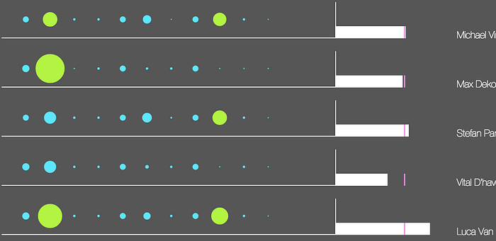
As always, it felt very Big Brother-ish to the students. The Quantified Self idea doesn’t translate well (or I’m really bad at explaining it!) when someone grading you is watching this closely to your data. We’ll look at anonymous visualizations some other time, but it’s important to note that students are scared their data will be misinterpreted. More effort, for example, doesn’t always lead to better results.
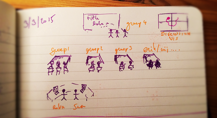
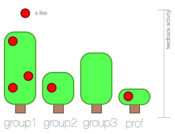
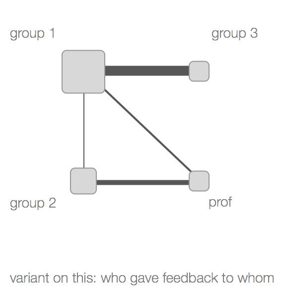
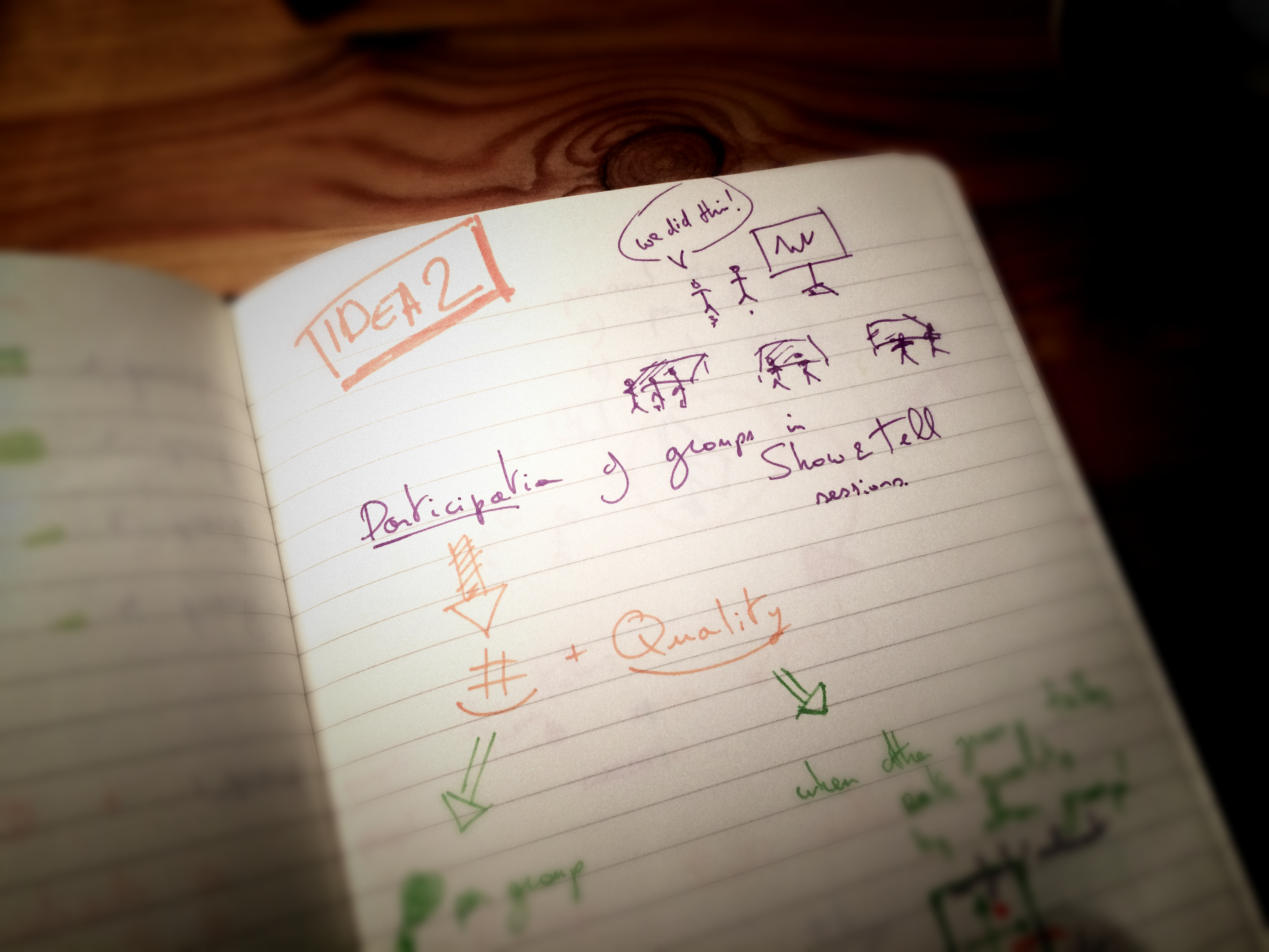
So on to the idea I’ll be implementing this week. In the InfoVis class, each group of students (4 groups of each 3 students) is required to present their work to the class. Every group not presenting, including the professor/teacher assistant/… can ask questions and give feedback. Contribution to such a discussion is useful for everyone, and thus visualizing the amount of contribution by each group can be interesting. It might just help create a better balance between time spent talking by each group, which is a good thing (?). See the image below for a similar application, which has inspired us for this idea.

Students did see problems with visualizing the amounts. People would give feedback just… to give feedback! We could end up with a lot of mediocre, “filler” feedback (“That’s great”, “I like that”, “I totally agree”). Visualizing the amount of feedback says nothing about the quality, therefore a rating system could also be beneficial.
That raised another alarm bell. “Negative rating will make me feel as if my feedback isn’t appreciated”, a student reacted. It was suggested that positive feedback alone, similar to Facebook’s “like”, could be experienced less negatively. So that’s what we’ll go for!
I’ll spare you the details, but Node.js and Socket.IO are going to be my best friends to make all of this happen by next Monday. I’ll create an interface to manually log who is talking (if the entire thing makes sense after deployment, I can look into microphones or noise sensors…), I’ll give each group a “like” button, and focus the rest of my efforts making some (hopefully) interesting, oh and did I say live?, large display visualizations.
To give you an idea of what I have in mind, here are some sketches of a few examples I came up with… Comments much appreciated of course!


