Javier Pérez Belmonte«The Reinvention of Science», crónica de ocho infografías y una portadaPublicar una serie de infografías en un libro de divulgación científica para World Scientific desde una aldea de Teruel, ¿puede…Jun 27, 2023Jun 27, 2023
VeraNovainHABLEMOS DE PSICOLOGÍAInfografía: Proyecto de ParentalidadElaborado para el curso de “Desarrollo Infantil” de la Licenciatura en Psicología.May 31, 2022May 31, 2022
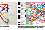
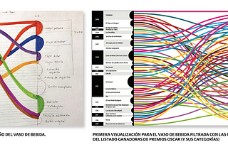
weareshiftainThink by SHIFTA5 ejemplos de infografías editorialesLa mejor forma de explicar la visualización de datos es haciendo un recorrido por los trabajos de nuestros Alumni. Hoy entramos al detalle…Feb 1, 2022Feb 1, 2022
Redactores de la noche¿Infidelidades en tiempos de covid-19?Un virus que solo ataca a las parejas.Dec 2, 2021Dec 2, 2021
weareshiftainThink by SHIFTACómo hacer una infografía análoga y participativaCon el objetivo de brindar una experiencia novedosa e informativa con visualizaciones de datos aplicadas a soportes de comunicación poco…Jul 6, 2021Jul 6, 2021
Raúl Baz S.inHABLEMOS DE PSICOLOGÍAInfografía “Calidad Total”Elaborado para el curso de “Recursos Humanos II” de la Licenciatura en Psicología.Jun 14, 2021Jun 14, 2021
Mariángela PetrizzoinSaber-es Libre(s)Una imagen vale más que …Te enseño cómo ordenar tus ideas para la próxima infografía que construyas.Feb 20, 2021Feb 20, 2021
Gonzalo HöhrImpasseRefugiados en el limbo. Entre un pasado destruido y un futuro incierto.Jul 26, 2020Jul 26, 2020
Ferran CaymelinThink by SHIFTACOVIZ 2020: el color del riesgoFerran Caymel es sociólogo, infografista y profesor del Máster Online en Diseño de la Información y Visualización de DatosJun 16, 2020Jun 16, 2020
Nacho AlonsoLas mejores visualizaciones, infografías y gráficos con datos del covid-19Estamos viviendo un momento histórico terrible. Cuando aun seguíamos pensando que la crisis de 2008 era la peor vivida en la historia…Apr 12, 2020Apr 12, 2020