Cohort Analysis: The Single Most Powerful Report in Google Analytics (2023)
Executive summary: Cohort Analysis is one of the most actionable reports in GA. It lets you compare different user groups (cohorts) over time and helps you understand whether your business is improving or worsen.
Updated in January 2022. This post was originally published back in April 2017. The Cohort analysis is still in BETA and hasn’t changed much, funny enough. However, my perspective has changed, hence I chose to update the post.
Update in January 2023. Google Analytics 4 now has introduced the Cohort Explorer, which is a new tool to do cohort analysis. I’ve written a new post about it here.
If you are looking to do cohort analysis outside of Google Analytics, then go checkout Unvault — it will help you send your data from Google Analytics to Google Sheets.

Let’s just dive right into it.
The single most overlooked report in Google Analytics is in my opinion the Cohort Analysis.
It can be tricky to understand at first, but give it a try — it will really pay off as it helps you investigate your data in much more depth than all other reports in Google Analytics.
Want to learn how to use data to accelerate your business? Interested in marketing and sales funnels? Join +10,000 other students and enroll into my online course on “How To Build a Sales Funnel For Your Subscription Business”. Enroll on Udemy or Skillshare (get 1 month for free when signing up through my Skillshare link).
What is cohort analysis?
Let’s start out by defining what a cohort is.
In simple terms, a cohort is a group of users who have a shared set of characteristics.
So what could this set of shared characteristics be? Essentially anything. However, the cohort analysis report in Google Analytics is currently in beta (April 2017 (still in January 2022)) and only offers to choose cohorts based on acquisition date. Acquisition date is in GA first time a user visited your website.
Although Google Analytics only offers the option to view cohorts by acquisition date, then the cohort analysis is so much broader than that.
You can break down your metrics by any cohort type. This shared set of characteristics could also be the type of device users use, what plan they are on (free, premium, enterprise) or another dimension you might have about your users.
It can also be other cohort types like:
- When they upgraded to your premium version
- When a user abandoned a cart
- When a user signed up for a newsletter
Giving the fact that Google hasn’t changed anything in this report for at least 5 years, is such a shame. The Cohort Analysis has so much potential, which currently isn’t being used.
Why should you use cohort analysis in Google Analytics?
If you want to follow a certain group of users over time, then you should use cohort analysis.
Why would you want to do that?
This could for instance be if you have been:
- Running a marketing campaign and want to isolate the quality of the users you gained from the campaign
- Communicating to your users or customers in a certain way that may or may not meet expectations.
- Making a mistake like having an error on your website, or in another way miscommunicating to your users, then you can isolate the impact from that mistake
- Offering promotions that might incentivise your users to have a certain behavior (like to churn faster)
But the reasons why you are using the cohort analysis in Google Analytics could be countless.
By following a certain group of users (or customers), you will also better understand the value of a user. Cohort analysis will help you understand your user's behavior over time. This can be very helpful to understand your user's lifetime value when they typically convert when they churn or lower their engagement. You can derive many insights from a cohort analysis.
Bottom line is that you want to use the cohort analysis if you want to isolate a certain group of users.
Where do I find this cohort analysis?
And for the lazy reader, here is an example of how it looks:
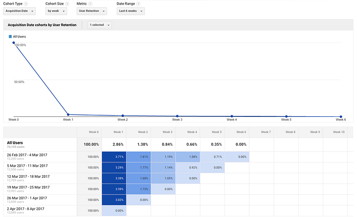
There are four things you need to know about cohort analysis in Google Analytics:
Cohort Type: Only option here is acquisition date. This is what goes on the vertical axis.
Cohort Size: How large should the cohorts be? Do you want to divide your cohorts into days, weeks, or months? What you should select here really depends on your business. To figure this out, you should ask yourself how long it normally takes for a user or customer to reach your cohort metric.
Cohort Metric: This is the metric that is being measured for each cohort. For example, this could be user retention, revenue, session duration, or any other metric from the dropdown list. The variety of Cohort Metrics is also very limited. If you for instance only have several different goals in your Goal settings, then you aren’t able to select a specific goal. You can only select all goal completions.
Date range: This is the time period you want to review your cohorts. This can either be days, weeks, or months, depending on what cohort size you have chosen.

At first, it might look a bit scary. Lots of numbers.
Let’s try to break it down a bit.
The cohort table should be read from left to right.
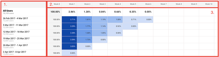
- This section shows your cohort time (which can only be acquisition date). In this case, the cohort size is set to weeks and the date range is set to the last 6 weeks. So what you see in box 1, is the different cohorts of users grouped by what time they were acquired.
- Box two shows their retention over time, in this case, weeks.
- This is where everything happens. These are the numbers you need to crunch. Take cohort row 26. Feb — 4 Mar. This row shows how well you have retained those users who first visited you during this period. Week 0 is 100% and week two is 3.71%. This means that 3.71% of the visitors were acquired from 26. Feb — 4 Mar came back the following week.
So in short: Vertically you have different groups of people grouped by the time they first visited your site and horizontally how they behaved over time.
Following so far? If not, read this section again. Otherwise, continue :)
Another example:
Let’s have a look at the example from before (now broken down by days instead of weeks):
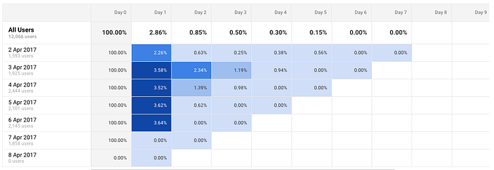
It shouldn’t take too long to see that something happens with the cohort of the 3. April.
That cohort seems to be better retained.
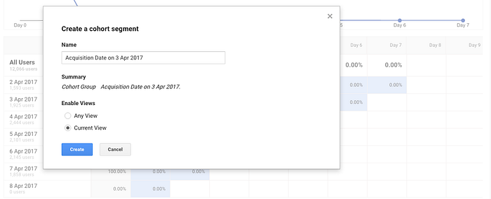
When you identify things like this, then it’s time to investigate! Google Analytics makes investigation easy. All you need to do is to click on the cohort you want to investigate:
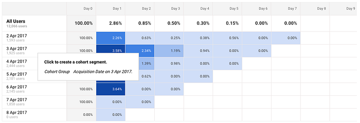
This will allow you to create a segment that you can use in all your other reports:
Now, we can see how that particular cohort performs in comparison to the average from the selected time period.
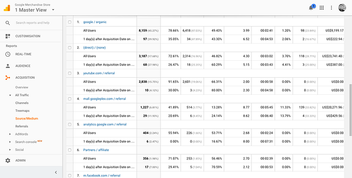
Although the sample size is small, it shows that we have got a lot of returning visits from most sources. This type of analysis takes time! Finding insights in these kinds of reports are time-consuming as you have to process much more information.
Now, why is this cohort analysis so important?
Cohort analysis is for the advanced user who doesn’t just look at the total number of users. Cohorts are a way to break those numbers down.
Where we normally would look at our data in totals or averages, breaking it down into cohorts allows us to understand those same users in more depth.
For those of you who have heard about vanity metrics, then this is the complete opposite! Cohort analysis tells you whether your metrics are improving or worsening over time and thereby makes them more actionable than just totals or averages.
For instance, you might know that you have a churn rate of 5%. But what type of cohorts is really churning? In order to understand this you can use cohort analysis to better understand WHO is churning. For instance, try to break them down by:
- What plan they are on: Is it your enterprise customers who don’t value your solution?
- Their source of acquisition (or campaign): Google Adwords might drive traffic, but if they are churning, are they any good then?
- Their device: Are we offering a poor mobile experience that makes users churn?
Overcoming the challenge
By now you must think:
“Phew, such many numbers and combinations of data!”
You are right.
Cohort analysis adds another layer of complexity to your metrics, but at the same time allows you to better understand your metrics as it breaks them down in a more meaningful way.
If you are looking for books, check out these two: My favorite book about analytics and one of the comprehensive books on Google Analytics which also covers cohorts analysis.
No one said data analysis was easy. Finding the outliers in this is not easy, but can help you uncover great insights about your business. But when you have familiarised yourself with cohort analysis, then you won’t go back to your boring standard reports.
Worth a share?
I’d love some more feedback (and thanks to my old colleagues who took the time to give me that ;) ). So please, if you liked it or not, I’d be thrilled to hear from you anyway. Just shoot an email at bomannmertz@gmail.com or post a comment below.
One little email can result in a blog post.
Also, if you liked this, I’d massively appreciate a share. It’s really my readers that keep me going.
Thanks a lot for making it here anyway :)
Want to learn how to use data to accelerate your business? Interested in marketing and sales funnels? Join +10,000 other students and enroll in my online course on “How To Build a Sales Funnel For Your Subscription Business”. Enroll on Udemy or Skillshare (get 1 month for free when signing up through my Skillshare link).

