Unboxing the Black Box: A Guide to Explainability Techniques for Machine Learning Models Using SHAP
This project is provided by IBM Skills Network.
In this article, we will walk through explainability techniques for various machine learning models. The purpose of Explainability in Machine Learning is to reveal the black box problem, in other words, to explain the reasoning that led to the model’s output. Model insights are helpful for the following reasons:
- Debugging
- Informing feature engineering
- Directing future data collection
- Informing human decision-making
- Building trust
➜ Pro tip: If you like to learn faster and run (or download) this project as a Jupyter Notebook for free, visit CognitiveClass.ai.
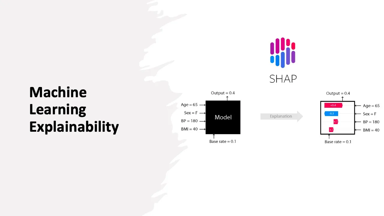
The algorithm that stands behind these Explainability techniques is called SHAP. SHAP stands for SHapley Additive exPlanations and is a game theoretic approach that can explain the output of any machine learning model without knowing how the model works internally.

Objectives
After completing this guided project you will be able to:
- Use LinearExplainer to explain linear models like linear regression
- Use TreeExplainer to explain ensemble models like light gradient boosting machine
- Use GradientExplainer to explain CNN models
- Use SHAP Explainer to explain pre-trained transformer models
Installing Required Libraries
%%capture

!pip install tensorflow --upgrade
!pip install shap
!pip install lightgbm
!pip install seaborn==0.11.0
!pip install transformers
import os
import numpy as np
import pandas as pd
import json
import tensorflow as tf
os.environ['TF_CPP_MIN_LOG_LEVEL'] = '3'
from tensorflow.keras import Input
from tensorflow.keras.layers import Flatten, Dense, Dropout, Conv2D
import keras
print(tf. __version__)
import matplotlib.pyplot as plt
import matplotlib.cm as c_map
from IPython.display import Image, display
import seaborn as sns
%matplotlib inline
import shap
print(f"Shap version used: {shap.__version__}")
from sklearn.model_selection import train_test_split
from sklearn.linear_model import LinearRegression
from sklearn.metrics import accuracy_score, confusion_matrix, roc_auc_score
from sklearn.preprocessing import LabelEncoder
import lightgbm as lgb
from keras.applications.vgg19 import VGG19, preprocess_input, decode_predictions
from keras.preprocessing import image
import tensorflow.python.keras.backend as K
import transformers
print(transformers.__version__)
from transformers import AutoModelForSequenceClassification, AutoTokenizer, ZeroShotClassificationPipeline
# initialize JS visualization for the notebook
shap.initjs()What is explainability?
In typical machine learning tasks, we predict a target value. Here, the accuracy of the prediction is of interest. Explainability refers to having an understanding of why a model makes a certain prediction. This typically comes from knowing the relationship between a model’s prediction and the input features used to generate a given prediction (text, pixels, features, etc.).
Linear models, like linear regression, ensemble models, and decision trees, are known to be easily interpretable. Deep learning models are black boxes, which makes it much harder to understand how these models make predictions. SHAP is a common model-agnostic explainability method that calculates the contributions of each feature to the prediction and can determine the most important features along with their influence on the model’s predictions.
SHAP
The SHAP library in Python can be used to calculate the SHAP values of a model efficiently. A model-agnostic method assumes that the model to be explained is a black box without any knowledge of how the model functions internally. It only has access to the input and the model’s predictions. The essence of SHAP values is to separate and measure the individual contribution of each feature to the final prediction outcome while preserving the cumulative contributions to the final result.
As seen in Figure 1, the explainer model is designed so that it can approximately make the same predictions as the model to be explained for a specific data instance. In a way, it mimics the process that the original model uses to make predictions. Hence, we say that the interpretable model can explain the original model.
LinearExplainers for Linear Regression Models
As our first example, we will use LinearExplainers() in SHAP to explain a Linear Regression model trained on the Red Wine Quality dataset.
- Original Source — https://archive.ics.uci.edu/ml/datasets/wine+quality
- Kaggle Source — https://www.kaggle.com/uciml/red-wine-quality-cortez-et-al-2009
We will start by reading the following dataset using read_csv in pandas. We will use ; it as the separator.
url = 'https://cf-courses-data.s3.us.cloud-object-storage.appdomain.cloud/IBM-GPXX0UKXEN/labs/winequality-red.csv'

data = pd.read_csv(url, sep=';')
data.head()
Let’s create a separate dataset for columns that we will be using as input features and a separate one for the label.
features = data.drop(columns=['quality'])
labels = data['quality']
Divide the data into training-test set with a 80:20 split ratio. Next, train and fit a simple linear regression model.
x_train,x_test,y_train,y_test = train_test_split(features,labels,test_size=0.2, random_state=123)

model = LinearRegression()
model.fit(x_train, y_train)

print(model.score(x_test, y_test))
The coefficient of determination is around 0.34, indicating a poor model.
Now, let’s apply the LinearExplainer() and compute SHAP values for linear models. Then, we will use these SHAP values to create summary plots for global interpretability. Click here for more information on SHAP explainers.
explainer = shap.LinearExplainer(model, x_train, feature_dependence="independent")
shap_values = explainer.shap_values(x_test)
shap.summary_plot(shap_values, x_test, plot_type='violin', show=False)
plt.gcf().axes[-1].set_box_aspect(10)
The summary plot combines feature importance with feature effects. The x-axis stands for the SHAP value, and the y-axis has all the features. The plot sorts the features by the sum of SHAP value magnitudes over all samples and shows the distribution of the impacts that each feature has on the model output. The red color means a higher value of a feature. Blue means the lower value of a feature. A positive SHAP value means a positive effect on the outcome, negative SHAP value means a negative effect on the outcome. We can get a general sense of the features’ directionality impact based on the distribution of the red and blue areas.
From the above diagram, what are the top three features that have the highest contribution to the model’s prediction and how does each class, within these features, contributes to the model’s output?
The higher value of “alcohol” leads to the higher quality of the wine. The lower value of “alcohol” leads to lower quality of the wine. The lower number of “volatile acidity” leads to a higher quality of wine and wise versa. The higher number of “sulphates” leads to medium-high quality wine, and wise versa.
TreeExplainer for Ensemble models
In this example, we will use the German Credit Risk dataset from UCI. This dataset is comprised of 1000 entries of people who took credit from a bank. Each applicant is categorized as a good or bad credit risk according to the set of features present in the dataset. We will start by loading the dataset, and printing the first few rows.
url ='https://cf-courses-data.s3.us.cloud-object-storage.appdomain.cloud/IBM-GPXX0UKXEN/labs/german_credit_data.csv'
data  = pd.read_csv(url, index_col=0)
data.head()
Now, we will segregate the numeric and categorical columns, and account for missing values by filling NANs with ‘Unknown’.
We will use Light Gradient Boosting Machine (LGBM) algorithm as our model. It can directly use categorical variables, and hence, we will not go for One-Hot Encoding. We will use label encoding to handle categorical columns.
num_features = ['Age', 'Credit amount', 'Duration']
cat_features = ['Sex', 'Job', 'Housing', 'Saving accounts', 'Checking account','Purpose']
missing_features = ['Saving accounts', 'Checking account']
data[missing_features].isna().sum()/1000 * 100
data.fillna('Unknown', inplace=True)
le = LabelEncoder()
for feat in ['Sex', 'Housing', 'Saving accounts','Checking account', 'Purpose','Risk']:
le.fit(data[feat])
data[feat] = le.transform(data[feat])
classes = list(le.classes_)Similar to what we did in the previous example, we will split the dataset into a feature set and the target, Risk.
features = data.drop(columns=['Risk'])
labels = data['Risk']
features
# Divide the data into training-test set with a 80:20 split ratio
x_train,x_test,y_train,y_test = train_test_split(features,labels,test_size=0.2, random_state=123)
We will now create datasets that are compatible with the Light GBM model.
data_train = lgb.Dataset(x_train, label=y_train, categorical_feature=cat_features)
data_test = lgb.Dataset(x_test, label=y_test, categorical_feature=cat_features)
Let’s proceed by building a baseline tree ensemble ML model using the Light Gradient Boosting Machine (LGBM) algorithm. We can define a few model configuration parameters. Most of these are chosen arbitrarily and can be played around with.
params = {
    'boosting_type': 'gbdt',
    'objective': 'binary',
    'metric': 'auc',
    'num_leaves': 20,
    'learning_rate': 0.05,
    'feature_fraction': 0.9,
    'bagging_fraction': 0.8,
    'bagging_freq': 5,
    'verbose': -1,
    'lambda_l1': 1,
    'lambda_l2': 1,
    'seed': 123
}
Train the model using the parameters defined earlier, as well as the following:num_boost_round=100, verbose_eval=100, and data_test and data_train as the valid_sets.
model = lgb.train(params,
                  data_train,
                  num_boost_round=100,
                  verbose_eval=100,
                  valid_sets=[data_test, data_train])
We can use this model to generate predictions on our test set. If the value of the prediction is above 0.5, we set it to 1 and 0 otherwise.
y_pred = model.predict(x_test)
y_pred = [1 if y > 0.5 else 0 for y in y_pred]
print(f'Accuracy for the baseline model is: {accuracy_score(y_test, y_pred)}')
Now, we would like to focus on the model’s explainability. Let’s apply the TreeExplainers() and compute SHAP values for the LGBM model.
explainer = shap.TreeExplainer(model)
shap_values = explainer.shap_values(features)
Now, we will use these SHAP values to create a stacked summary_plot().
shap.summary_plot(shap_values, x_test, plot_type='bar', show=False)
GradientExplainer for CNN models on MNIST
In this example, we will demonstrate how a CNN trained on MNIST data can be explained using SHAP’s DeepExplainer.
We will begin by loading the MNIST dataset directly from Keras.
(x_train, y_train), (x_test, y_test) = tf.keras.datasets.mnist.load_data()Next, we perform a bit of pre-processing on our images like normalization, converting the type to float32, and reshaping the images to a 28x28 size.
x_train, x_test = x_train / 255.0, x_test / 255.0
x_train = x_train.astype('float32')
x_test = x_test.astype('float32')
x_train = x_train.reshape(x_train.shape[0], 28, 28, 1)
x_test = x_test.reshape(x_test.shape[0], 28, 28, 1)
Let us now define the model that we aim to explain. We will be using the Adam optimizer, sparse categorical cross-entropy as our loss function, and accuracy as our performance metric.
input1 = Input(shape=(28,28,1))
input2 = Input(shape=(28,28,1))
input2c = Conv2D(32, kernel_size=(3, 3), activation='relu')(input2)
joint = tf.keras.layers.concatenate([Flatten()(input1), Flatten()(input2c)])
out = Dense(10, activation='softmax')(Dropout(0.2)(Dense(128, activation='relu')(joint)))
model = tf.keras.models.Model(inputs = [input1, input2], outputs=out)

model.compile(optimizer='adam',
              loss='sparse_categorical_crossentropy',
              metrics=['accuracy'])

model.fit([x_train, x_train], y_train, epochs=1)
Now, we will use the GradientExplainer to explain the model’s output. Since we have two inputs we pass a list of inputs to the Explainer. Then, we explain the model’s predictions on the first three samples of the test set.
explainer = shap.GradientExplainer(model, [x_train, x_train])

shap_values = explainer.shap_values([x_test[:3], x_test[:3]])
Plot the image_plot using SHAP values ([shap_values[i][0] for i in range(10)]) for the first three samples of the test set.
shap.image_plot([shap_values[i][0] for i in range(10)], x_test[:3])
Image classification tasks can be explained by the scores on each pixel on a predicted image, which indicates how much it contributes to the probability positively or negatively. The rows indicate the test images and the columns are the classes from 0 to 9 going left to right. Red pixels increase the probability of a class being predicted, while blue pixels decrease the probability of a class being predicted. So in the diagram above, we see more red in class 7, class 2, and class 1, as the probability of those classes is increased, since they are correctly predicted classes.
SHAP Explainer for Transformer models
One of the SHAP Explainers for Transformer models is called Hugging Face Transformers. They are state-of-the-art pre-trained transformer models trained on huge amounts of data. We can utilize these pre-trained models on various applications by easily downloading them and fine-tuning them on custom datasets.
We will attempt to use the Hugging Face Transformer model for text sentiment analysis. Let’s load the pipeline for sentiment analysis and input some random text.
pip install transformers==3.5
pip install --upgrade torch
model = transformers.pipeline('sentiment-analysis', return_all_scores=True)
text_data = "This book is pretty interesting but its too long"
model(text_data)[0]
We have two classes: POSITIVE and NEGATIVE output classes with their corresponding scores. A large NEGATIVE score means that NEGATIVE outputs have an overall high contribution to the model.
We will define the SHAP Explainer object and calculate SHAP values:
explainer = shap.Explainer(model)
shap_values = explainer([text_data])
Next, we can call the force_plot method to visualize how features contribute to individual predictions.
shap.force_plot(shap_values[0,:,'POSITIVE'])Alternatively, we can use a bar plot to show how features contribute to individual predictions.
shap.plots.bar(shap_values[0,:,'POSITIVE'])
Let’s see by analyzing the plots above, what features have a positive impact on the prediction and what features have a negative impact on the prediction.
Features like “but”, “too”, and “long” have a negative impact, while features like “pretty” and “interesting” have a positive impact on the prediction.
text_data2 = "This restaurant is good but the line-ups are too long"
model(text_data2)[0]
shap_values2 = explainer([text_data2])
shap.plots.text(shap_values2[0,:,'POSITIVE'])
shap.plots.bar(shap_values2[0,:,'POSITIVE'])
Conclusion
Model Explainability techniques allow us to generate further insights about our data and to compare them with a general understanding of the problem. This way we can trust that the model is intuitive and is making the right decisions.
Authors
Kopal is a Master's student in Computer Science at the University of Toronto.
Sina Nazeri (Linkedin profile)
As a data scientist in IBM, I have always been passionate about sharing my knowledge and helping others learn about the field. I believe that everyone should have the opportunity to learn about data science, regardless of their background or experience level. This belief has inspired me to become a learning content provider, creating and sharing educational materials that are accessible and engaging for everyone.