
diff_plot: A Stata Module to Visualize Two-Period, Two-Group Difference-In-Differences

Causality in the Social Sciences
Untangling causality has been, for decades now, a primary focus of researchers in the social sciences.
Field experiments, such as randomized controlled trials (RCTs), are considered the gold standard in unbiased causal estimates. However, they are often expensive, unfeasible or even unethical to implement (for example, assessing the impact of second-hand smoke in toddlers on their cognition).
In contrast, quasi-experimental methods, provided they meet certain conditions, provide a sound alternative to achieve similar ends. They seek to address the bias generated by omitted/unobserved variables that are likely to confound our causal estimates.
Difference-In-Differences and Parallel Trends: A Quasi-Experimental Approach
“Difference-in-differences” is one such method. It is frequently employed by NGOs and research organizations to assess the impact of interventions.
These organizations often have baseline and endline data for two different groups of observations — the treated and control groups, with the treatment (training, materials etc.) provided in the interim period. The aim is to ascertain the causal effect of the intervention.
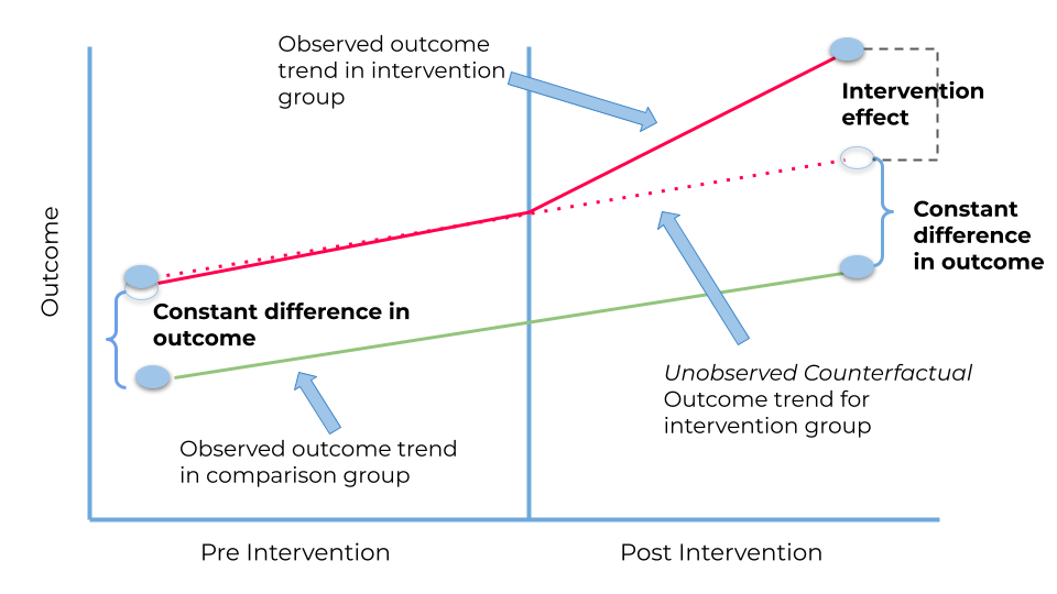
The difference-in-differences method controls for baseline differences between the groups, and presumes ‘parallel trends’ to extract the treatment effect.
As a quick refresher, the core assumption of diff-in-diff analysis is that treated and control groups follow the same trends, i.e., move parallel to one another, in the period prior to the intervention.
The final causal effect is given by the difference between two differences, as the name suggests:
(T2 — T1) — (C2 — C1)
T2: average treated group outcome in the endline period
T1: average treated group outcome in the baseline period
C2: average control group outcome in the endline period
C1: average control group outcome in the baseline period
The first difference (T2 — T1) controls for time-constant factors within the group that may be correlated with the outcome of interest. The second difference (C2 — C1) control for time-variant factors that both groups experience that may be correlated with the outcome of interest. What we are thus left with is the causal effect of the intervention.
Visualizing Difference-In-Differences using diff_plot
The graphical representation of this quasi-experimental method is accessible and intuitive, and is precisely what diff_plot seeks to generate.
diff_plot is a Stata module written by Kabira Namit that is tailored for the 2-by-2 case — or two periods (baseline and midline/ endline) and two groups (treated and control). It creates a line graph that illustrates the changes in the outcome variable of interest over time for the treated and untreated groups.
It has the additional useful option of being able to visualize the unobserved/counterfactual trajectory taken by the treated group in the absence of treatment. This is the “parallel trend line”, allowing us to unearth causality. The vertical distance between the parallel trend line and the observed trend line for the treated group (both in the endline period) is the intervention effect.
Syntax and Examples
diff_plot serves as an especially important instrument in the toolkits of NGOs and researchers. They need only specify the outcome variable and the binary time and group variables to obtain the required visualization. diff_plot also offers a host of customization options (noted in brackets below).
diff_plot varlist [if] [in], time(varname) group(varname) [drop_trend] [title(string)]
          [decimals(integer)] [scale] [graphopts(string)] [l1_opts(string)] [l2_opts(string)] [l3_opts(string)]
          [m1_opts(string)] [m2_opts(string)] [m3_opts(string)]
Given below are examples of the use of diff_plot, easily replicable using the provided webuse dataset. Please note that this program can be used in any Stata version (Stata 11 onwards) but it does require the elabel package to extract the labels of the time and group variables.
ssc install elabel, replace //installing elabel
ssc install diff_plot //installing diff_plot
(1) We begin with the most basic plot. Notedly, the subtitle captures the quantified intervention effect. The plot also contains the labels for the outcome time and group variables, all of which are extracted from the dataset by the program. The dashed line is the parallel trend line, which is essential for us to infer causality from the figure.
* Load the data
webuse bplong, clear

* Generate diff-in-diff plot
diff_plot bp, group(sex) time(when)
(2) If we find ourselves with a time variable that takes more than two values, we will have to retain just the two relevant ones in order to use diff_plot. The code provided below integrates this condition. We also impose the one-decimal-place condition for the labels.
*Load data
use https://www.stata-press.com/data/r17/hospdd.dta, clear

*Generate diff-in-diff plot
diff_plot satis if month == 4 | month == 7, group(procedure) time(month) decimals(1)
(3) diff_plot allows us to customize our graphs in other ways as well. The command provided below, for instance, places restrictions on the y-axis labels.
* Load the data
use "https://www.stata-press.com/data/r17/hospdd.dta", clear

*Generate a diff-in-diff plot
diff_plot satis if month == 4 | month == 7, group(procedure) time(month) graphopts(ylabel(3.3(1)4.3))
(4) Say we want to customize the trend lines. Here, we have adjusted the colours of the lines and labels, and, apart from adding a title, we have removed the subtitle option in case we don’t require the plot to display the intervention effect.
* Load the data
use "https://dss.princeton.edu/training/Panel101.dta", clear

* Create required binary time and group variables
gen time = 0
replace time = 1 if year >= 1994
gen treated = 0
replace treated = 1 if country > 4
replace y = y / 1000000

* Generate a diff-in-diff plot
diff_plot y, group(treated) time(time) title("Difference-in-Differences") graphopts(subtitle("")) ///
         l1_opts(lcolor(red)) l2_opts(lcolor(black)) l3_opts(lcolor(black)) ///
         m1_opts(mcolor(red) mlabcolor(red)) m2_opts(mcolor(black) mlabcolor(black)) m3_opts(mcolor(black) mlabcolor(black))
And there we have it folks! diff_plot is an accessible and straightforward solution to our diff-in-diff visualization problems since 2024.
About the Program Creator
For any further information or clarifications, please contact Kabira Namit at knamit@worldbank.org.
About the Author
Shritha Sampath is a student at the Bocconi University in Milan, Italy, where she is pursuing a Masters’ degree in Economic and Social Sciences.
