Designing for fashion
Recently I was approached by art director Miran Tomičić to design a wordmark for an upcoming fashion brand. I thought process is worth sharing and would make an interesting read.
Fashion world is packed with houses, brands and designers of all kinds, each of them naturally having their own wordmark/identity. When talking logotypes, it’s easy to get overwhelmed by the amount of different stuff that has already been done. However, part of my job is to dig into it and together with the client/art director come up with the solution that not only stands out, but it makes sense for the story business is trying to tell/sell.

When stepping into the project, it’s essential to get more familiar with the subject — google, books, magazines, you name it. Being aware of what already exists helps, but it’s crucial not to limit yourself to the things you see there. This, together with the brief is a solid foundation to start.
Brief
Two sisters are starting a fashion brand. Both born on an island in Adriatic, one is Croatian top model, always on the road, influenced by worlds fashion hot spots, while other sister spends more time with the family and is more locally oriented. Not to stretch things too much — two styles, two fashion tastes, two worlds coming together into a single business idea.
From that point on, it was clear it’s all about duality. Think London + New York vs. think small traditional island of Pag. Think glamour vs. think ethno. Still, there wasn’t any specific parameter I should stick to, so window of possibilities was entirely open.
To make things easier for both myself and art director on the project, I broke sketching down into 3 parts:


During the sketching process, I’m trying to put down anything that crosses my mind. I’m going rough and fast first, refining later. Many of shown examples were discarded the very moment they appeared on paper, but it’s hard to know what to eliminate without making it at first place. It really doesn’t cost more than couple of minutes.
Narrowing down
After evaluation, we picked best from each set of sketches and decided to explore those a little further. At this stage sketches are becoming more detailed, already revealing pros and cons for each solution:
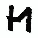
Direction 1

Input Double stroke shapes or ‘inlines’ they are producing were interesting enough to move on with, but it felt like strokes are all over the place, serifs were inconsistently applied and overall color was out of balance.

Output Separate sans serif shapes from serif shapes more clearly. Create sans serif skeleton and try to add just a hint of classical contrasted serif shapes around. Introduce more classy feel to it — more contrast, more space around letters.
Direction 2

Input Shapes are somewhat sharp and aggressive which makes it interesting. However, it lacks elegance and grace in it’s blackness. Let’s use black shapes as areas that are filled with lace pattern — traditional motif from island of Pag.

Output Raster density would have to change from small sizes to big ones. Applying it on fabric and unexpected material would ruin the idea completely. Not really. Maybe some other time.
Direction 3

Input Dots are symbolising needle going through the fabric, drops of water, salt, city lights — plenty of branding possibilities. But shapes themselves weren’t even close to attractive. Either increase or decrease amount of dots in order to get more legible image. Make it look more refined. Another potential problem with this direction was that Stella McCartney already uses dots in her logo as well.


Output All three versions look much better after facelifting, but none is strong enough to carry the brand. Here it was more likely to develop the idea of a ‘responsive’ logotype that changes density of dots as size is increasing/decreasing, but it still visually wasn’t on the spot. Apparently, it was time to say goodbye to the dotted fellas.
Extras
Just to be sure we’re not missing something important, I also created some quick digital prototypes of different inline/line work. Thanks to amazing RoboFont editor and it’s creator Frederik Berlaen, it’s a matter of seconds to test different effects on your vector drawings.

Fine-tuning
We finally agreed on Direction 1. Testing logo in various sizes, colors and mockups helped to detect shapes are a bit too dark overall and especially in smaller sizes, spacing could be more generous. Therefore, to open up some space inside the letters I made O wider, while P and R got their bowls slightly bigger. Letters also gained more space around them — an old trick to make letters look monumental that already Romans knew about.

When dealing with fine details it’s important to predict sizes shapes will appear in. Not all shapes work in all sizes — this has been proven by size specific designs already in 16th century by early punchcutters. Sometimes letters only need more space in smaller sizes to stay readable, but often details get lost. Knowing this wordmark will be scaled down in some applications, sharp endings were made flat. This small feature makes sure stroke tips don’t get faded out while they’re still percieved as sharp.

And here is the final wordmark already in use

Thank you for reading!
— Marko Hrastovec, June 2016

Published in The Agency- curated by Crew. Check us out to get started working with the best designers and developers on the web.
Over 10 million people have used products made on Crew. And over 3 million people have read our blog. Join them here.