17 Jan 2017 —Part 3 — Our name and visual identity

From The New Publishing to everyone!
Dear our readers
Here comes the part that we are the most anticipated about…
Our name and visual identity. :-)
We’d like to start with the name first, then we can move to the visuals.
The New Publishing — the publishing house in constant experimentation
We based the name on the previous one we used — Publishing house 2.0
But…why The New Publishing and not Publishing House 2.0?
Easily put, because the number “2.0” is hard to be placed as an address in today’s media — facebook, instagram, website (for example, you cannot have instagram.com/publishinghouse2.0 or www.publishinghouse2.0.com)
We have this problem once when we try to register our name with twitter, and we are forced to change our name to new_publishing. Together with the availability of the address thenewpublishing on facebook / instagram / website url / gmail, we then decided that it is the best name to use that can describe our project and intention.
Taking on that decision —we then initiated our online channels based on the names:
www.thenewpublishing.com | facebook.com/thenewpublishing | instagram.com/thenewpublishing | medium.com/@thenewpublishing
However, twitter and pinterest still doesn’t allow you to have more than 15 characters, so we have to stick with new_publishing:
twitter.com/new_publishing | pinterest.com/new_publishing
The Visual Identity
After deciding the name, we then head on to develop our visual identity ;-)
We have a very good conceptual materials to start with — risograph/public domain/layers overlay/online/social media/new/experiments — which are the things that made up our project. Basically, these are the keywords that our visual identity has to represent.

Then, after several days of design, development, a reference sharing though our pinterest mood board, we finally came down to our final publishing house identity.

After several experiments we found that the digital glitch effect provides greatly the feeling of digital, and can be applied to any elements and make them interesting (and of course, unique).

Treating the image/illustration in single color with overlay reminds us of the prints produced by risograph machine — the printing technique of our publishing house.

The colors are based on the available risograph colors at Print Club Torino — shocking pink, and blue — which are the colors that we will use to print our first edition. Also, this visuals can also be easily produced by risograph.

We want to keep the logo of our publishing house clean and simple, yet still represents our identity. We then apply the glitch effect to our name typed in the font that we’ve always used in previous experiments —Roboto Mono.


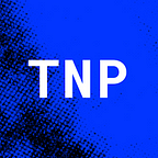
Since we are living in the age of social media, we also designed another version of our logo for it. It is a development of our previous/temporary logo — the bold P standing clear in the clean background.

The font we used as the main font for our visual identity is Roboto Mono, a font developed by Christian Robertson in addition to Roboto font family, which is open for public use in Google Fonts Platform.
Highlights in fluor orange and shocking pink color can be used to overlay the important information. This is the effect also greatly inspired by the technique of risograph.


The book also reflects the visual identity of the publishing house by the same graphic direction. Since the book that is going to be published from our publishing house are going to be divided into little books (based on chapters), the colors used to print the cover can also have different shades — a technique also allowed by the risograph.

In addition to the main graphic treatments of our visual identity, we also came up with the idea of using typegraphic symbols as a decorative elements for our visual identity (if in anycase we need them).
Thanks alot to everyone for reading. :-)
We hope that this recap is going to help you (and us) to get a more clearer picture of our project — where we are now, and where we’re going.
So, stay tuned for further updates…because more things are coming (especially in the upcoming days)!
And as always, any questions, comments, suggestions, etc. are more than welcome — just leave us a comment down below or contact us directly at thenewpublishing@gmail.com
Big hug again from us, The New Publishing team :-)
N. + S.