Web Application Design Ideas: Playful & User-friendly — vol. 235
Discover playful and user-friendly dashboards that combine fun elements with easy navigation. These dashboards, crafted by playful web app design teams, are both enjoyable and straightforward.
Appearance settings — Untitled UI
👨🎨 Jordan Hughes®

This dashboard exemplifies a modern, user-friendly design with its clean, dark-themed interface that is easy on the eyes and perfect for extended use.
Playful aspect is subtly introduced through the use of colorful accents and interactive toggles that enhance visual engagement without overwhelming the user.
Notably, the customization options for themes and table views are presented in a straightforward manner, emphasizing usability and personalization.
Bankly — Digital Banking Web App
👨🎨 Arounda UI/UX
👥 Arounda

The “Bankly” dashboard presents a sleek, futuristic interface with a gradient background that adds depth and a modern feel, conducive to a visually engaging experience.
Use of large, bold typography for key figures, combined with soft, neon highlights on cards and graphs, strikes a balance between sophistication and playfulness.
Its streamlined design prioritizes clarity and ease of navigation, reflecting a user-friendly approach to presenting financial data.
Web Chat UI
👨🎨 Ronas IT | UI/UX Team

This chat application dashboard boasts a harmonious color palette that combines professionalism with a hint of playfulness, evident in the vibrant profile images and subtle use of color for notification badges.
Clean, rounded design elements and spacious layout contribute to a friendly user experience, emphasizing comfort and ease of interaction.
Sidebar navigation is efficiently organized, encouraging intuitive user flow, while the central chat area and detailed group info panel are well-sectioned, making information consumption effortless and engaging.
CryptoHub — Web 3.0 Dashboard
👨🎨 Arounda UI/UX
👥 Arounda

The “CryptoHub” dashboard design is an exemplary blend of minimalism and functionality, with a clean, airy layout that enhances user readability and interaction.
Playful elements emerge through the use of subtle gradients and soft shadows, giving depth to buttons and charts without sacrificing the overall sleek and modern aesthetic.
User-friendly design is evident in the clear typographic hierarchy and well-organized sections, which make navigation and data comprehension intuitive, even for those new to cryptocurrency.
Flight booking app for premium air travel | Lazarev.
👨🎨 Lazarev. UX/UI
👥 Lazarev.

The flight information dashboard is a model of clarity and user engagement, employing a clean and straightforward design that prioritizes information accessibility.
The playful dimension is introduced through the use of colorful icons and interactive sliders, which add a dynamic and friendly touch to the experience.
Furthermore, the cost-benefit graph provides an intuitive and innovative way to visualize flight options, enhancing decision-making with an interactive, data-driven approach.
AI assistant. Smart Home App
👨🎨 Voypost

The AI assistant dashboard employs a monochrome color scheme with neon accents, creating a high-contrast, futuristic interface that is both stylish and functional.
Rounded corners and soft gradient buttons infuse a sense of playfulness, while the clean, organized layout with clear, concise prompts ensures a seamless user experience.
Dashboard’s intuitive conversation design, with easily accessible recent requests and suggested actions, exemplifies a user-friendly approach tailored for efficient interaction.
Medical Dashboard CRM
👨🎨 Nayeem Azraf
👥 Artiflow
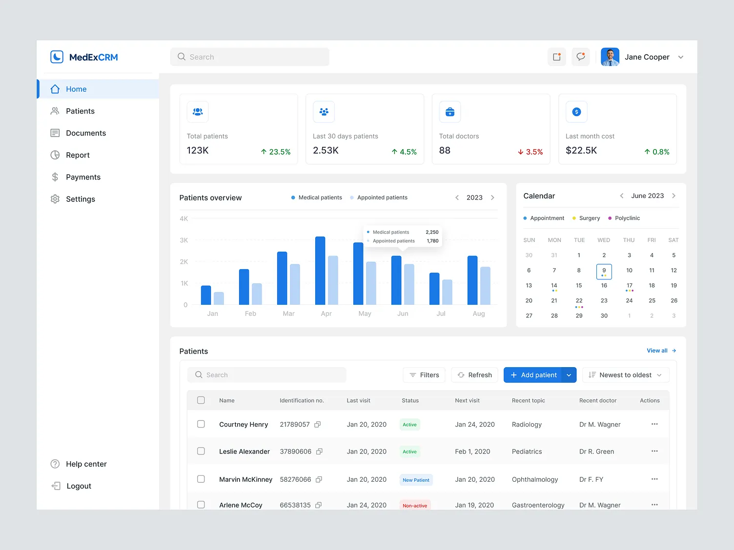
The MedExCRM dashboard showcases a crisp, professional design with a clean, light color palette that emphasizes readability and ease of use.
UI is straightforward, employing clear data visualizations and a structured layout, which makes navigation and interpretation of medical data efficient.
While the design leans more towards the formal side, the subtle use of color in the icons and graphs provides just enough visual interest to keep the user engaged without detracting from the dashboard’s practicality.
Fintech SaaS Modal pt.2
👨🎨 Monty Hayton

The financial dashboard sports a sleek, dark mode interface that offers a modern and sophisticated look, ensuring high contrast and readability with its judicious use of vibrant blue accents for primary actions.
User-friendly elements are highlighted through the clear delineation of sections and an intuitive layout that logically guides the user through the payment process.
Playful aspect is subtly present in the toggle switches, providing a smooth, almost tactile interaction that enhances the overall user experience.
Course Dashboard
👨🎨 Adit Rizki

The STAX educational dashboard boasts an electrifying aesthetic with a dynamic, neon-infused background that gives it a vibrant, engaging character.
Card-based layout for course progress is user-friendly, offering a clear, at-a-glance view of the learner’s achievements, while the sidebar navigation is neatly organized for easy access.
The design artfully balances a futuristic feel with practical functionality, ensuring a stimulating yet efficient user learning journey.
Trading position
👨🎨 Renat Muratshin

The trading position dashboard utilizes a clean and minimalistic design, ensuring that financial information is presented clearly and without distraction.
Use of a limited color palette with blue accents aids in directing attention to important actions like ‘Close position’, enhancing the user-friendly aspect.
While the design remains professional and straightforward, the playful factor is subtly introduced with the inclusion of a graph within the compact space, providing a quick visual reference in an otherwise data-heavy environment.
FundVibe — Finance Management Dashboard
👨🎨 Muhammad Fairuz Bahrain

The “FundVibe” financial dashboard flaunts a pastel color palette that exudes a friendly and inviting atmosphere, which contrasts with the typically stark finance apps.
Key information is presented through well-spaced, card-like modules, making navigation and comprehension swift and effortless.
The playful touch is evident in the engaging icons and soft roundness of the UI components, which together create a relaxed, approachable environment for users to manage their finances.
Leaderboard for a Fitness web app
👨🎨 Chike Ezeiru

The “Fitblohon” leaderboard dashboard employs a vibrant, game-like design, leveraging character avatars and a podium display to inject fun into fitness tracking.
Playful color palette and badge system encourage user engagement, while the straightforward layout with clear data representation and easy-to-follow progress indicators exemplifies user-friendly design.
The overall approach effectively gamifies the experience, making health and fitness progress both visually appealing and motivating.
Video Editing Web App
👨🎨 Igor Savelev

The design tool dashboard presents a clean, airy interface, facilitating a focused and efficient creative process.
The playful and user-friendly design shines through the accessible color palette and gradient options on the sidebar, inviting experimentation without clutter.
The timeline at the bottom adds a layer of interactivity, indicative of a non-linear, user-controlled navigation through the creative stages, which is both intuitive and engaging.
Smart Vaults & Loans Web3 React Admin UI Dashboard Template
👨🎨 Extej Design Agency

The SmartVaults dashboard showcases an elegant, sophisticated design that exudes luxury, with its dark theme and gold accents enhancing the perception of high value associated with financial applications.
It employs a playful yet refined approach with animated icons and illustrations that add a dynamic feel.
Dashboard’s user-friendly aspect is evident in its clear categorization of financial services and the straightforward presentation of balances and history, promoting ease of use and efficient navigation.
QuickBooks — Finance Management Software
👨🎨 Mary S.
👥 RonDesignLab ⭐️

The “Cash Management” dashboard utilizes a striking contrast between the dark background and luminous charting, which not only draws the eye but also makes the data pop with a playful neon glow.
Interface is user-friendly, with a clear hierarchy and segmented control for easy data filtering.
Graphical representations are both informative and visually appealing, ensuring that the important financial metrics stand out and invite interaction.
Event / Conference Dashboard
👨🎨 Hadi Altaf 🐲

The event management dashboard offers a refreshing take with its card-based layout set against a blurred natural backdrop, giving a sense of calm and openness.
Playful use of rounded corners, drop shadows, and personal avatars adds a friendly, informal touch to the interface.
This design successfully creates an inviting, user-friendly environment that simplifies the complexity of event planning into an enjoyable, visually-guided experience.
Foundation® — Dashboard Builder 2.0
👨🎨 Tran Mau Tri Tam ✪

The content creator dashboard is a testament to minimalist design, employing a soft color palette and spacious layout for an uncluttered, user-friendly experience.
Its playful essence is captured through whimsical graphics and a fluid, colorful blob on the ‘New author profile setup’ card, which adds a touch of liveliness.
The dashboard strikes a balance between simplicity and functionality, offering easy-to-read metrics that are both informative and aesthetically pleasing.
Food User Dashboard Home page
👨🎨 Sk Abuhena Mostafa Kamal

The “Savory Dashboard Design” for a food platform features a lively and appetizing interface with a vivid, warm color scheme that enhances the visual appeal of the dishes.
Its playful character is emphasized by the rounded, soft-edged cards and engaging icons that invite user interaction.
The dashboard is intuitively organized, with a clear and friendly user journey from recipe discovery to order tracking, which makes for a seamless and delightful culinary exploration experience.
Bizma — Business Management App
👨🎨 PD Loop

The “Bizmax Inc.” dashboard displays a polished and professional interface with a cohesive color scheme that’s both appealing and functional.
Its playful character is subtle, conveyed through the use of gentle curves and soft shadows, which add depth and a friendly touch to the experience.
The clean and structured layout, combined with iconography and data visualization, achieves a user-friendly environment that makes business analytics and task management both accessible and engaging.
CRM Control over workers
👨🎨 Ihor Gordenkov

The construction project dashboard sports a high-contrast, dark theme that brings its colorful data visualizations and status indicators to the forefront, offering clarity and focus.
Its playful approach is reflected in the dynamic project progress bars and lively icons that make tracking work both intuitive and visually stimulating.
Dashboard cleverly marries functionality with a modern aesthetic, presenting complex project information in a digestible and engaging format.
Movie theater dashboard ui | dark
👨🎨 Mixer

The MOVIO cinema dashboard offers a sleek, modern interface with a sophisticated dark mode that enhances visual data representation, making it easy on the eyes and particularly effective in low-light environments.
Playfulness is introduced through the use of vibrant orange accents that animate elements like the movie theater seating chart, while user-friendly design shines in the well-organized presentation of schedules, income, and customer satisfaction metrics, all of which are crucial for quick and efficient management of a cinema’s daily operations.
Car dashboard touchscreen interface
👨🎨 Ligaya L.

The vehicle dashboard interface combines a sleek, futuristic aesthetic with high usability, employing a dark color scheme that allows the vibrant details to stand out, reducing glare for drivers.
It’s playful in its visual design, with dynamic shapes and modern typography that bring a sense of sophistication and excitement to the driving experience.
The layout is particularly user-friendly, with clear, concise information blocks for speed, battery life, and navigation, ensuring that essential details are readily accessible at a glance.
Freelancemate Web App — Dark Mode
👨🎨 Reza M. R.

The “Freelance Mate” dashboard features a dark theme that exudes professionalism while the pops of purple and chart animations add a playful twist.
User-friendly elements include the clear segmentation of financial statistics and transaction details, which are presented in an easily digestible format.
The dashboard is designed to prioritize the user experience, ensuring that freelancers can track their business metrics with ease and a touch of visual delight.
Analytic Dashboard Charts Graphics
👨🎨 Dmytro Shopinskyi
👥 Visarium

The “ANALCRITIC” dashboard features a sophisticated dark mode interface, complemented by soft neon accents that offer a contemporary and user-friendly visual experience.
Playful aspect is subtly introduced through the use of circular data visualizations and colorful icons that provide a dynamic contrast against the dark background.
The dashboard’s design facilitates an intuitive navigation with a clear, concise layout, making complex analytics straightforward and visually engaging for the user.
Code to image (web app)
👨🎨 Sam Marxz

The code editor interface adopts a clean, dark theme that is both modern and easy on the eyes, offering a user-friendly environment for developers.
Playful, contrasting color highlights within the code box and on the interface buttons bring a sense of creativity and fun to the coding experience.
This design cleverly balances the need for a focused coding space with subtle visual delights that enhance the overall usability and aesthetic appeal.
Sphere UI: Charts (UI KIT)
👨🎨 THE18.DESIGN

The “Sphere UI” dashboard is a prime example of a modern, data-centric design that remains playful through the use of vivid green accents and varied chart styles, which add a dynamic and engaging quality to data visualization.
Layout is crisp and user-friendly, with a clear navigational sidebar and well-organized information hierarchy that allows for quick and easy interpretation of complex data sets.
This dashboard effectively combines functionality with a fresh aesthetic to make business analytics approachable and interesting.
Marketing Analytics Dashboard UI
👨🎨 Bogdan Nikitin
👥 NIKITIN

The dashboard presents a bold, high-contrast color scheme that is visually striking, with a well-considered layout that prioritizes ease of access to key performance metrics.
Playfulness is incorporated through colorful graph elements and interactive project timelines, which break the monotony of traditional data presentation.
The design is refreshingly modern, ensuring that the user experience is engaging without sacrificing clarity and simplicity in data navigation.
