Neumorphism and what it means
UI design history — understanding what Neumorphism is
Today we will be doing a deep dive into a certain aspect of UI design history — understanding what Neumorphism is, learning about an Indian company that adopted Neumorphism before Apple advertised it to the world, and whether Neumorphism is really worth it. Jump in.
A short history of User Interface design
If you were to look at the journey of most artforms, almost all of it began with artists trying to recreate real objects as accurately as possible. Old paintings or sculptures do their best to represent the real world shapes and proportions. However, over time different styles emerged. From a medium that only tried to represent or capture reality, art became a medium to showcase or express ideas which actually don’t exist as well. Different times had different styles gaining a lot of traction. These transitions were spread over a few hundred years or decades.
A very similar parallel can be drawn with the journey of digital design. But, this happened within a much shorter time frame, and with changes that were far more frequent. I think they’re because of three factors:
- Access to design tools to a much larger population
- People getting bored frequently
- Companies looking to differentiate often
Design or art has gone from being a niche to an everyday commodity now. It’s part of everything around us. Almost everyone understands and appreciates good design. With the advent of digital consumer goods (viz. Apple iPhone 1st Gen and its peers) more people have started to understand what good design means and how it affects their lives.
Today, we will be looking at one specific aspect of this digital design journey, the User Interface (UI). User Interface includes icons, layouts, and the general aesthetic guidelines used.
Make it real even if it’s fake
Have a look at the first iPhone screen for iOS 1 below:
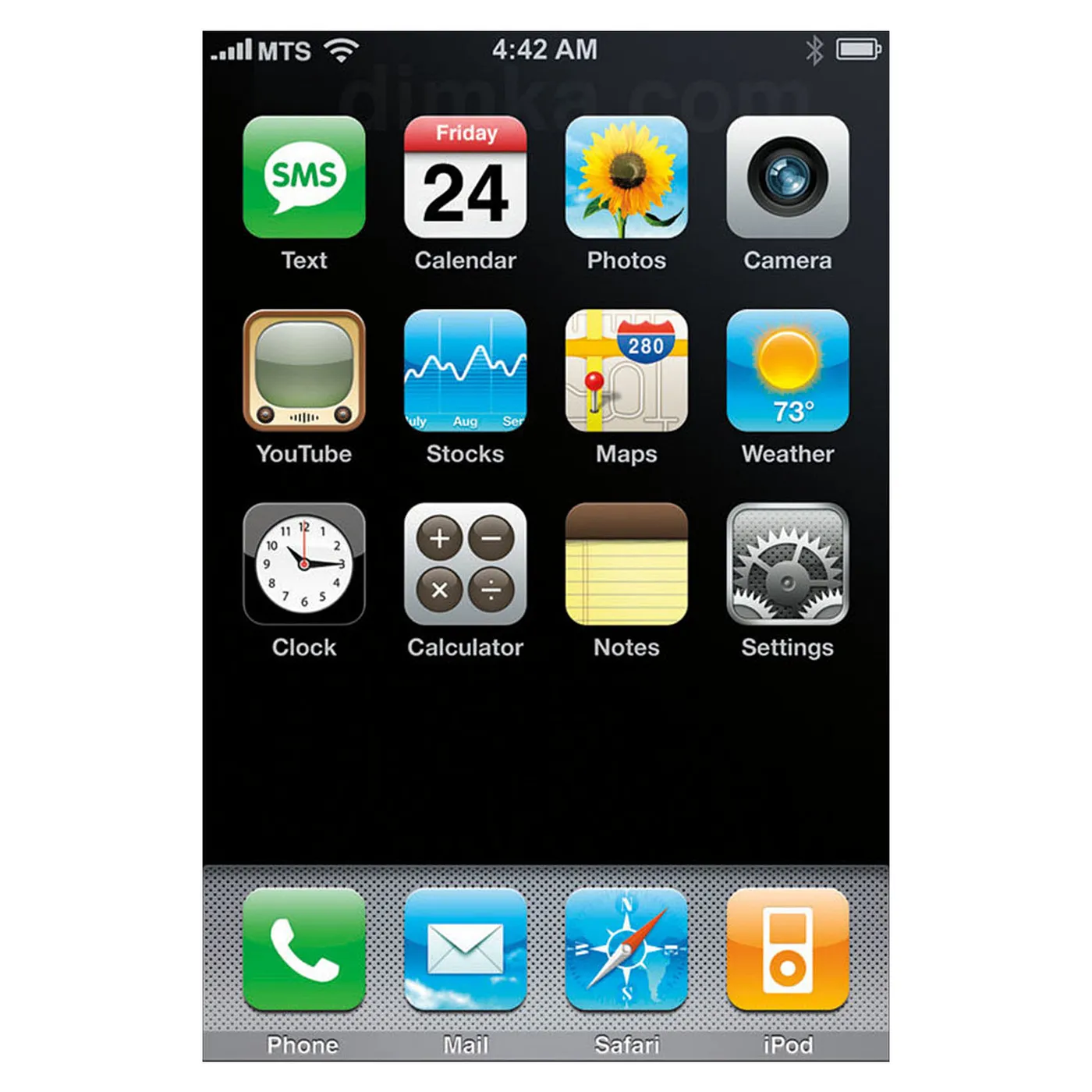
Barring a few icons, one can see how the icons and text actually try to represent the real world versions of the idea. Take the Camera App Icon or Settings Icon for reference. If you observe carefully, you can see how the app icons have a lot of shadows, close-to-the-real world colors, and light angles. If you take a look at Photos or Mail icons, they’ve used pictures. The YouTube icon, while not representing a real world object’s form, tries to carry those characteristics with color and lighting.
Another important design element to note is the use of light, if observed carefully one can see every icon looks as if the light source is placed above it at an angle, thus, dropping shadows at the bottom. This was considered the high point of digital design for User Interfaces back then. All of what we saw above was broadly called Skeuomorphism.
Moving onto simpler times
Fast forward to a few years later, all the major tech companies started promoting Flat Design. Flat design essentially removed all the strict rules of representing the real world from User Interfaces and propagated the get-across-the-idea-first mentality.
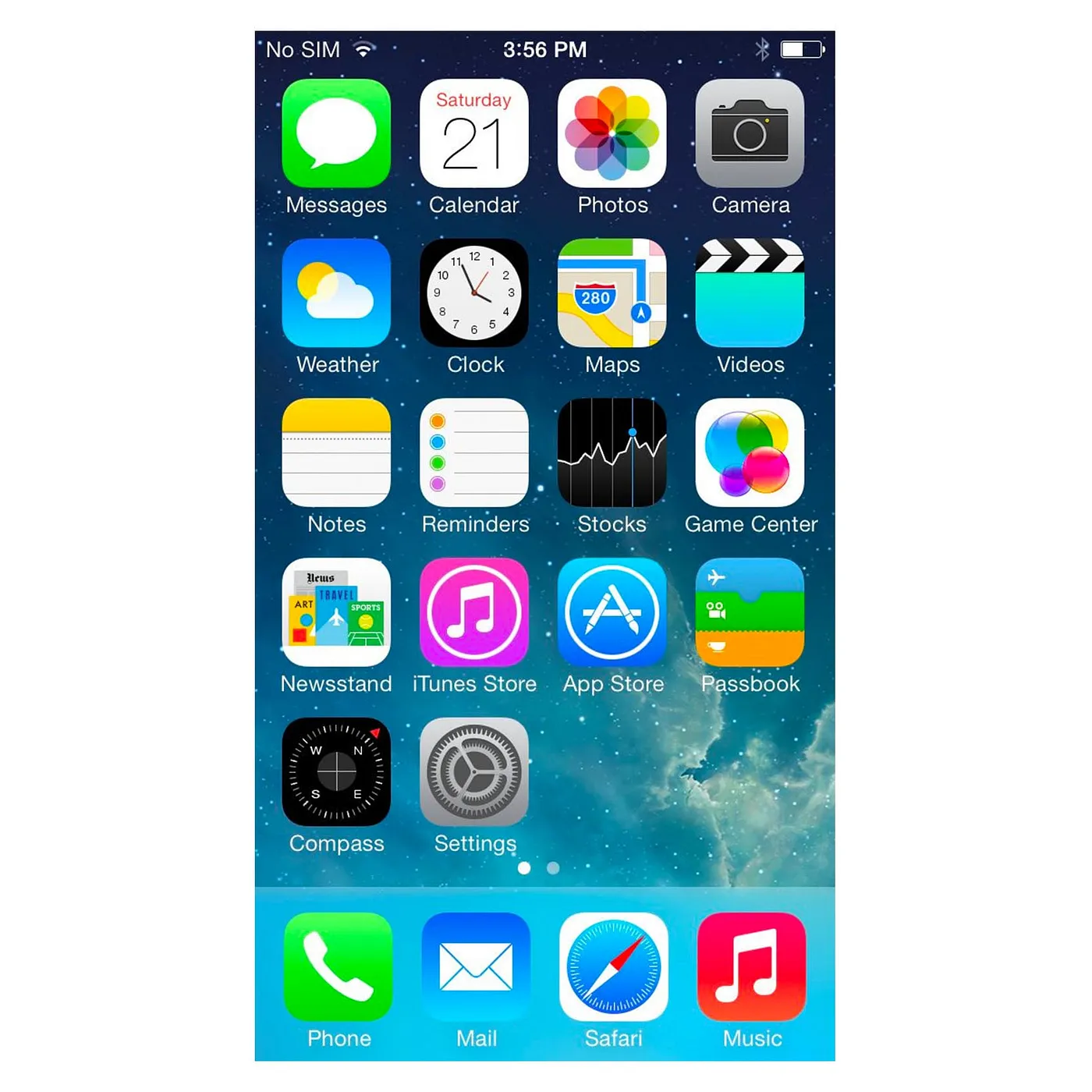
This was the result. The starkest differences can be seen in Settings and Camera App Icons.
To summarize, the major design changes were:
- Lack of elaborate shadows or lighting highlights
- Absence of tiny details which Skeuomorphism had
- Drastic reduction in the number of colors used
- More freedom on using the colors
This marked the end of Skeuomorphism. Designers were happy with spending less effort to put across an idea. Consumers were fine too, because it was new. Flat Design made design accessible to a lot more people. Simpler design techniques meant a gentler learning curve. And, thus, more designers entered the market.
Perhaps one of the most polarising design decisions due to a result of this transition was the Instagram rebranding. Remember the old Instagram logo?

A neat example of Skeuomorphism to Flat Design transition.
Flat design made it easy to create coherent brand identities; creating families of design elements, which Skeuomorphism didn’t allow for. A good example of this would be Instagram’s design change itself:

Apps like Layout and Boomerang came a little later than the Instagram app, thus, they had a bit of the flat style design form. But, after the main Instagram app icon moved to a flat style, all the apps looked like they were part of the same company.
This style lasted almost for a decade without any alternative. And in July of 2020, Apple decided to make a new style mainstream at their WWDC. Neumorphism.
About Neumorphism
Neumorphism (Neo Skeuomorphism) lies somewhere between Skeuomorphism and Flat Design. In Neumorphism, the UI is designed by tracking the movement of light in a 3D space.
A few common identifiers of Neumorphism:
- The UI imitates the look of a smooth surface
- Buttons are embedded into the UI, either they’re embossed or debossed
- There’s a strict color system adherence; in many cases the buttons have the same color of that of the background
The image below should clarify the differences from Skeuomorphism and Flat Design.

Neumorphism’s goal is to replicate the real world with respect to light. So, a lot of attention is paid to the direction of light, highlights, and shadows.
An example of a Neumorphic UI:

If executed successfully, the user will feel like he or she is interacting with a surface rather than with a screen.
Enter Apple
At the WWDC, developers and designers alike noted Apple’s design language changing to Neumorphism. It was clearly seen in the refreshed UI on the new macOS, Big Sur. Let’s see that with a few examples.

Catalina is the current macOS. It’s interesting to see how Apple is trying to make each icon look like a surface with elements protruding in or out of it. The differences can be seen clearly in the Safari Browser Icons or App Store icons. Looking forward to how Apple is planning to apply these principles across the UI of the new macOS and iOS.
Found this lovely image on Twitter.

But, to remind you, Apple didn’t start the Neumorphic design style. In fact, it has been making it to the news from various designers across the world for a while now. Just that there was no big company adopting it.
One of the early adopters I know of, who’s done a system-wide implementation of the Neumorphism is a Indian tech startup called Cred.
For those who don’t know Cred, it’s a members only app that manages credit cards, payments, and offers rewards for the same. You can learn more about Cred on their site : www.cred.club
Cred was ahead of the curve
Sometime around mid-April Cred decided to launch its updated UI experience called Copper. Copper was just the name of their design language based on the principles of Neumorphism. Similar to how Google calls their version of flat design, material design.
Let’s have a look at the Cred UI:


Demerits of Neumorphism
Even with Apple’s backing of this new design style, many are still confused about Neumorphism. And, for good reason.
- The reason Flat Design was widely celebrated is because it was simpler and easier to create. Designers were able to spend more time building features and focusing on building the experience than the elements.
- Flat design, with its wide color schemes and borders offered a lot of clarity. But, Neumorphism focuses on blending elements with the background as much as possible.
- Since Neumorphism primarily plays with shadows, if used wrongly or erroneously, it can make little to no impact on the user interface design. You can see that in the images above that its presence, at times, was immaterial.
- The skills required for neumorphism are quite high. Thus, adoption could be slow and low.
Concluding note
While I cannot be absolutely certain that Neumorphism will be a success, it is definitely going to make some waves. People are always looking for something new in UI design, and this is it for now.