Retail Experience of an Electric Vehicle
Vehicle Data Visualised at an Experience Centre, Bangalore
Story
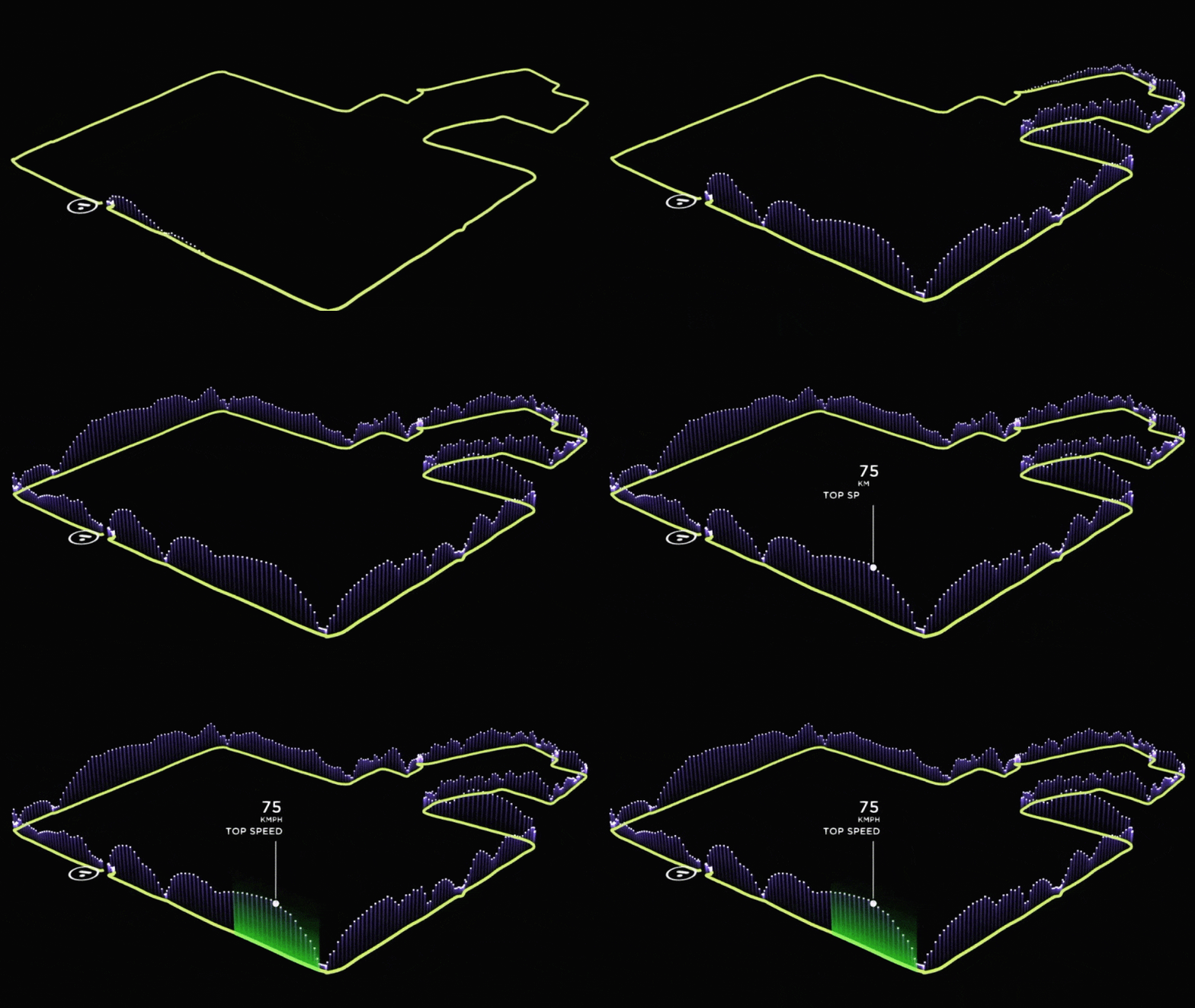
Shashank goes to Ather’s Showroom and wants to test the ride of its new S340 Electric Vehicle. He is already blown by its specs and performance. He rides back to the showroom, parks the vehicle and is asked if he would like to see his Ride visualised. He comes to this screen (picture above) which essentially gives him an overview of how he rode the bike, where he accelerated to top speed and in which spots Vehicle’s efficiency peaked, all drawn out on the map of Bangalore. After he has viewed his ride on the map, with top speed and other analytics, he switches to the next screen which shows up his Riding behaviour in terms of the G forces felt by him while accelerating and while on turns.
Concept
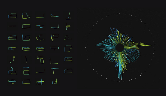
Our concept was to humanise technology, make Data a storytelling medium, for the viewers to see their Data in a new light. With the aid of Computer graphics, we intended to gamify the data experience. By using procedural way of making objects in a three dimensional space, we aimed to captivate the person’s attention to a new form that he could pan, zoom or spin. We knew we wanted to have fun with software art and leverage from the parametric control it gives.
Process
As data scientists everyday we try to bring out inferences with an algorithm to understand what’s happening in this real world. We strived further to make use of the same algorithmic nature of these systems which generate over 20k numbers every minute of the test-ride and, with a right perspective towards these numbers we were able to visualise them into patterns we as humans can very easily understand and appreciate the information which adds to intelligence of S340.
The aim was to build a screen capable of showing information from the test-ride in realtime to every user. We deployed this software at the Experience center where it’s notified of any newly completed testRides which gets initialised from various stats of the ride finally making it available for the user to choose from.

Data Processing
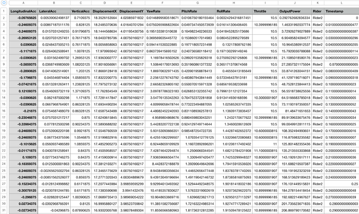
Initialisation of every test-ride involves parsing several data files. Since its an Electric Vehicle, we were crunching rows and columns of Speed, Throttle, Lateral and Longitudinal Acceleration, and many more parameters into a data structure for playback of points shown on a map and later, as a signature unique to every ride. Majority of the computations happens in this stage where we need to usually apply CPU intensive algorithms to quickly process all the data points for task such as:
- Downsampling to a lower frequency while skipping over values when user is stationary.
- Determining start of the ride and relatively mapping rest of the ride into Displacement along X and Y planes.
- Min-Max-Average and Absolute Max values for parameters such as Vehicle Displacement, Speed, Acceleration and Roll.
- Calculating location and index of events such as Top-speed and Efficiency.
- Normalisation and Discretisation of Acceleration Vector(2D) and Roll values for modelling GG-Forces.
Thus creating an original data structure which is in fact applicable to any type of vehicle data.
Data as a Visual Language
We had to further process it live, as certain inaccuracies were still noticeable when rendered. So, we now needed to make it more visually appealing .We wrote few more algorithms to process it further by making use of B-Spline Curves. B-splines can be used for curve-fitting and numerical differentiation of experimental data. This time it’s just not with 6 points rather on a few thousands downsampled points (at just 1 Hz) and it was totally worth implementing B-Splines!


It’s really fun and interesting to observe the data points in a 3d space, it essentially opens up a completely new dimension for making data visualisation very immersive and this coupled with the dimension of time (while riding), we recreated the experience in the showroom by bringing in a lot of smooth 3D animations from the test-ride. In fact simply by calculating the difference between two GPS points we can get the direction(yaw angle) and this information can be used to even guide the camera movement.
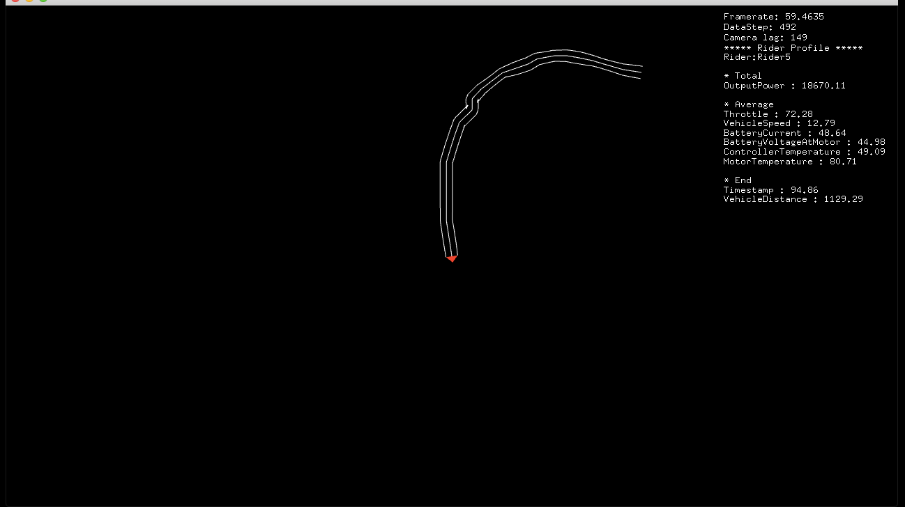

There were timed animations for the UI elements such as indicating start with an icon at the Ather showroom, then rider details such as name were shown, along with a summary of total ride time and distance covered in a scrolling fashion. The project itself was neatly organised for synchronising the animations on the screen with the visualisation.
Beauty of Computer Graphics
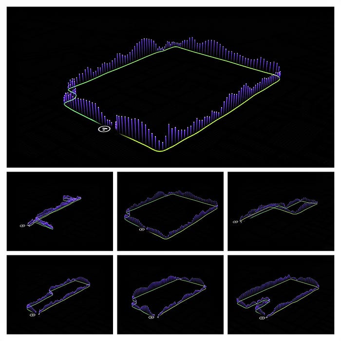
Meanwhile in the 3D world , we loaded the map which was centered at the Ather showroom with its GPS coordinates and here comes the fun part, with every frame we mapped GPS values of the test-ride with the map. Since we are in the 3D world, we can procedurally place few points forming a geometry which gets rendered real time essentially forming a traced path on the map. Map was stylised with a black background, and dim lights to only highlight the test-ride. A Top view of the different user paths are shown below(left) on a map with roads highlighted. Once this path is completely traced it triggers next set of animations which slowly pans the camera upto 45° pitch angle to show a bird’s eye of the track. Voila!! Magic of a virtual camera!
Now we can play with any data animation associated with the track information, like in this case, speed data which is represented by the vertical lines . These are achieved by animating particles which are emitted vertically up at a speed equal to the scooter speed at each vertex of the path geometry from start to finish.

We had an interesting time building up the project and to see it till completion, while making sure our users get a right picture. Although, it’s a different approach from the usual bars and graphs, it was really nice to see their reactions for the Aha moments they could share as a story.
Also, what did the users learn about the scooter and thier riding behaviour? We will be sharing our observations and more particle experiments in a follow up article. Hope you like our attempt at this.


