Case Study: Creating a new web presence for LGBTI+ Gozo

The Maltese LGBTI+ organisation LGBTI+ Gozo had approached me to create a new website that reflected its new strategy. The following is the case study detailing the process that I undertook to reach the end result.
My Role
For this project I was a one-man UX team responsible for Research, Interface Design, User Experience, Development and Testing. A shoutout to the rest of the executive team and members who provided invaluable feedback during different stages of the process.
The Problem
The organisation wished to have a fresher more uniform look online (tackled in the bonus section below). Furthermore, a new website was also requested. It was felt that the website the organisation had at the time was not attracting enough visitors since the organisation's Facebook page had superseded it.
The older website was primarily designed as a blog, with the blog posts feature being seldomly used. Separate pages and sections were included for membership, campaigns, contact and events. Moving from a blog website to an organisation website demanded that it needed a redesign from the ground up and to be re-built anew.
For this project, I undertook an iterative design approach so that I could build on layer by layer.
Empathise
The new website will serve to be more of an information hub then the main online hub of the organisation — that was shifted to the Facebook page (as per the organisation’s wish). Therefore if events and latest updates are posted on Facebook and Instagram, what are the essential elements that a user would look for on an organisation’s website?
For this stage I utilised job stories in order to understand the user context and further understand their motivation and desired outcome.
- When browsing an organisation website
I want to easily know who the executive team is
so that I can know who is behind it. - When deciding to join an organisation
I want to find an appropriate online form
so that I can easily apply to the organisation. - When donating to an organisation
I want to find an online donation system
so that I can donate efficiently from anywhere. - When browsing an organisation website
I want to know what it stands for
So that I can determine if it’s for me. - When contacting an organisation
I want to easily find their contact information online
So that I can initiate contact efficiently.
Ideation and Testing
Utilising the above job stories for reference, together with an experienced based design mindset, I sketched out a preliminary home page idea.

In this case, the main page contained a hero area displaying a welcome message together with a motto, a mission statement underneath and an application form at the bottom.
The blog, campaign and events sections were removed since these were to be handled by the organisation’s social media presence on Facebook and Instagram as per the new strategy which was created as part of this exercise.
At this stage, I presented my preliminary designs to the team and a number of the organisation’s members. They were asked to demonstrate how they would use the website and where they would go to acquire any of the information they would require. The following were various comments that were taken on board:
- More prominence should be given to the team.
- A donation system should be added (at this stage I added this as a job story).
- The front page could be a one-stop-shop.
- Organisation information such as the official registration number should be included on the homepage.
With the above in mind, I decided to shift various elements to the home page.
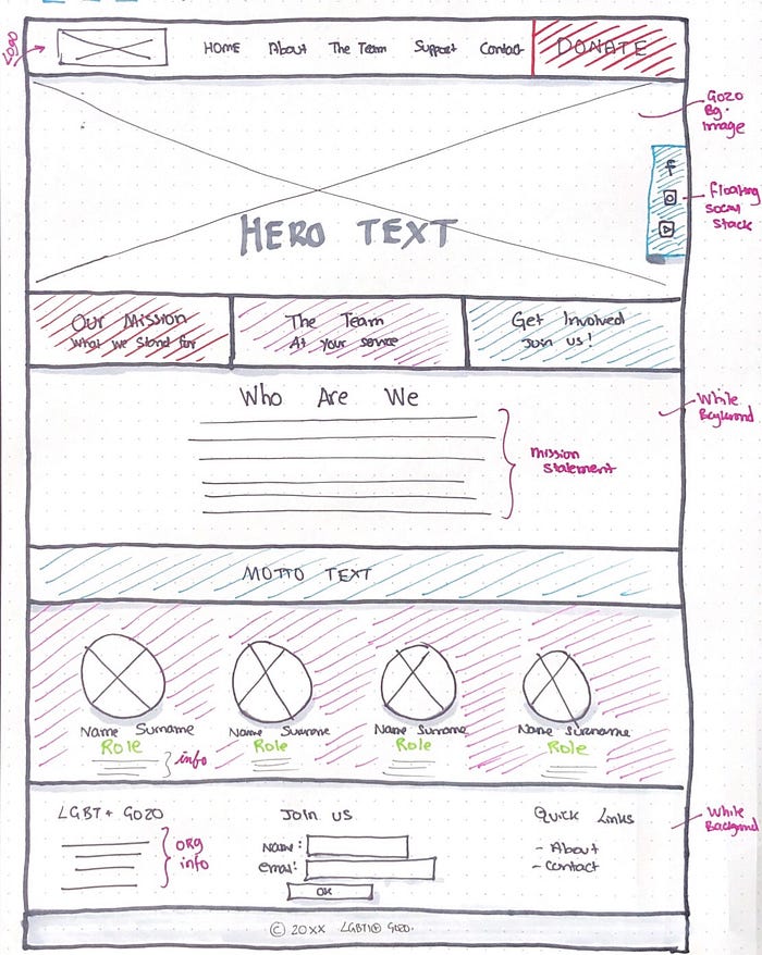
- The team section was shifted under the mission statement with the motto above to create a content break.
- A tri-coloumned colour coded tab section was added under the hero banner with anchor links to the various elements on the homepage in order to create a one-stop-shop feel. Colours were taken from the logo for consistency, red: mission, purple: team, involvement: blue.
- The social links were placed as a hovering element on the right-hand side of the site. A prominent donation button signified as important through the use of the red colour was added in place of the original social icons.
- Quicklinks and organisation information was added in the form area at the very bottom.
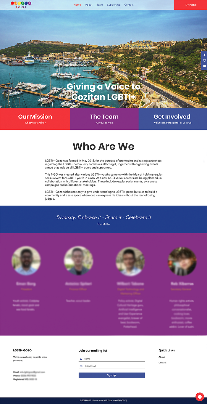
The above changes made it easier for the user to find what they need quicker due to the placement of the most imporatnt elements on the front page and the shortening of steps to reach the desired information (eg: finding the team no longer requires an extra click to go to a separate page). A more streamlined userflow was achieved.
Conclusion and Takeaways
This project presented the challenge of transforming the old modus operandi of operating exclusively on a blogging platform to moving to a more ‘corporate’ organisation website. I was able to overcome the initial hesitation of the team by explaining the benefits of having such a system of operation, where events may be disseminated more efficiently through social media and the more corporate elements left for the website. This updated look and feel to the online presence of the organisation would attract the audience that they were looking for, including corporate entities.
After getting the go-ahead, the next challenge was empathising with what the users want. During this process I learnt quite a lot about listening to the various point of views of the team and the members alike. There were various elements, such as the donation system which did not immediately come to my mind in my initial designs. Taking a step back and looking at the project from a different perspective led me to create the additional job stories which really aided me throughout the second iteration of the project. Following the announcement of the new website, I saw a surge of visitors on the website together with additional regular visits on the site. I was also quite happy that one user contacted me to point out some minor oversights on the website, such as an irregular logo position bug and a missing textual detail. This really showed that the organisation’s members took ownership of the website following the refresh it deserved.
BONUS: Creating the new brand guidelines
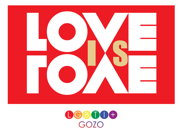
Before tackling the website, I also revamped the social media identity of the organisation. Whilst retaining the same logo, I felt that a consistent look should be adhered to for event posters and other published material. At the time, the organisation was creating posters of all shapes, sizes and designs in order to promote its events. This inconsistent look did not aid users in recognising that an event was being organised by LGBTI+ Gozo until the logo was seen somewhere on the banner. I believed that having a standard template would create an identifiable banner system which users can become familiar with and recognise as belonging to LGBTI+ Gozo just by glancing for a second.
The point of departure for designing the new branding was the pre-existing logo. Each circle’s colour was extracted to represent a department or element of the organisation.
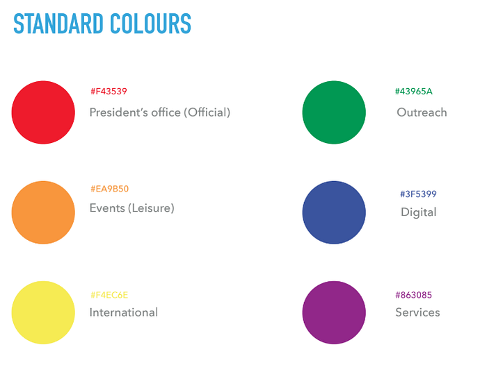
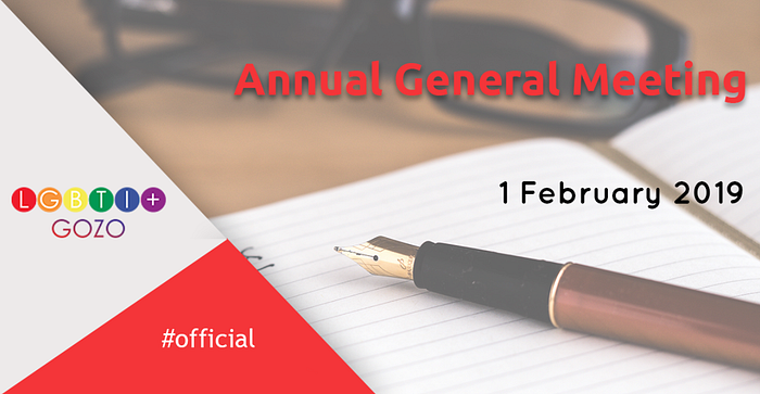
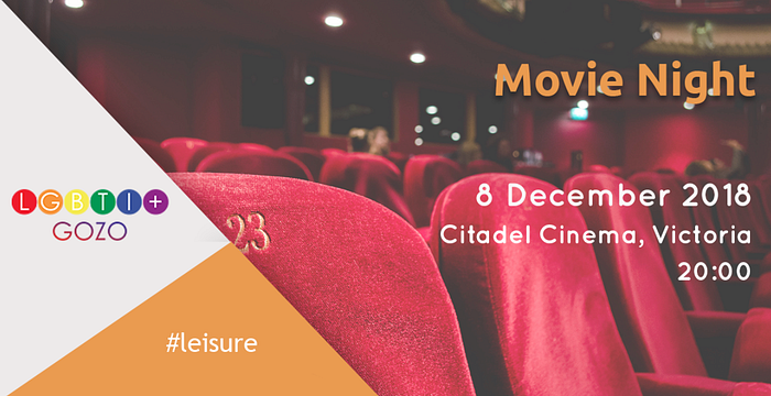
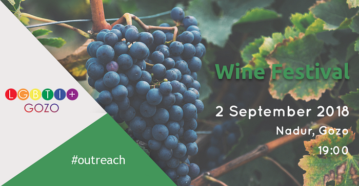
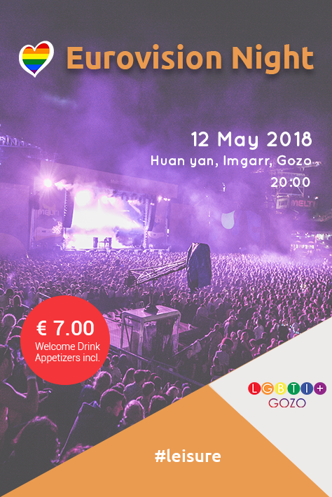
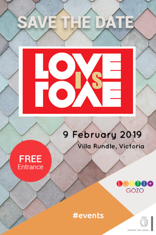
Each colour would be used as an accent for the event posters in order to immediately signify the type of event it is. For example, a beach party would be marked as orange (#leisure), a call for a general meeting would be red (#official), a drop-in support service would be purple (#services), a trip abroad yellow (#international), whilst a recruitment exercise with informative talks would be green (#outreach).
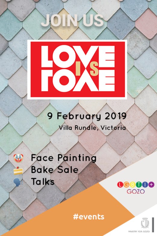
Two main banner types were created, an enlongated horizontal leaderboard banner (ie: Facebook cover photo style) and a full event poster (half-page ad style).
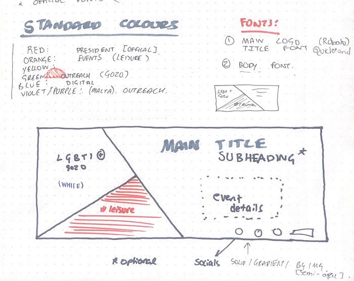
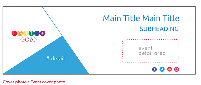
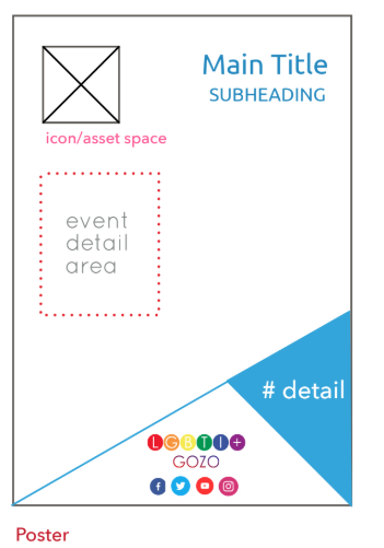
The above designs offer a clear and consise representation of the event and what is to be expected:
- Prominent logo in a fixed position to highlight organsisation.
- Accent colour with #tag to signify the event type.
- Background image related to the event.
- Clear title, subtitle and practical information without too much clutter.
Different readable and clear typefaces were chosen for every layer of information.
Sample posters
Campaign Logos
Campaign logos have their own character yet they retain a number of familiar elements from the guidelines such as the use of colour. Furthermore the logo is included at a smaller scale at the bottom in order to create brand linkage.
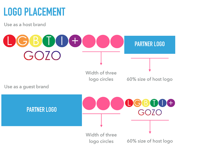
Logo placement
Logo placement was also specified for a number of different instances. The following is a sample for when the logo is placed next to another logo as botyh host or guest.
Reflection
Overall, through the utilisation of the new brand guidelines, for both the visual elements presented above and the new website, a more corporate an uniform feel was achieved by the organisation. Quite so, as the mantra I included on the first page of the guidelines says:
RESPECTING THE OLD IDENTITY AS WE LOOK AHEAD TO THE FUTURE
Disclaimer: At the time of development I served as the ‘Digital Technology and Marketing Officer’ of the above organisation.

