UX Vibes#1 Google Podcast

UX Vibes#1 is gonna talk about Google Podcast.
As more and more people listen podcasts, Google also released a podcast application on June 18, 2018 for android. It looks familiar to any others, you can search for new podcasts, download them, and easily play and stop them.


These pictures are the introductions from Google Play. It designed with Material Design Language. Simple, clear user interface, make you easily understand how to interactive with it.
Alright, let’s dive into the UX vibes.

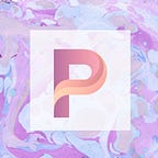
1. The logo is the concept of sounds.
The is the logo of Google Podcast.
You might think:
what does the logo relate to UX?
Okay.
First, it is the concept of sounds.
Second, the colours are same with the “Google” logo: blue, red, yellow, and green.
When I first time met it, I was thinking about “It’s a new Google App? It’s about music or sound?” After used it, “That’s what I am thinking.” I said.
And this is UX Vibes should consider about.
The logo is corresponding to it looks like, so you don’t have to think too much to recall what it is. People will remember it even just glancing as well.
That’s exactly good UX design.
2. Think what happen even when you pausing the podcast.

Let’s think about what happened when you paused a podcast last time.
Maybe you gotta do anything important at that time. So you paused it. After you came back, did you take any action on your podcast app?
I do.
I playbacked a few seconds of it, because I forgot what I was listening on.
And, Google got it.
Once you paused over 1 min, it’ll playback 10secs automatically. Let you review the contents you were listening on. It’s so smooth even I didn’t find out previously.
This little UX improvement will make users save a few seconds. They don’t need to unlock the screen, playback few seconds, and keep playing anymore.
The UX Vibes is showing here.
-
-
-
-
3. Smoothly listening experience on multiple devices.

The most advantage on Google Podcast is integrated with Google Assistant, you can search and play podcast just by saying ”Hey Google, …”.
Also, like Youtube, the progress will be saved automatically. You can smoothly resume it at the same progress on the different device. Google will sync all of it.
But…
This UX design is so hard to achieve unless you have so many products like Google. Google Home, Chromecast, Google Assistance…etc, integrating with various services and devices, controlling just by saying or clicking.
4. Little thing will make UX better.
A straw shows which way the wind blows.

This “Play” icon shows the progress of podcast playing .
You can see the icon which the arrow point at in the picture.
The icon shows the progress where you listened last time.
Imagine you are going to work, getting on the train just now. And opening up the Google Podcast, you can easily choose the podcasts you haven’t finish by a glimpse.
Is it sweet? right?
Little thing achieved theUX Vibes.
-
-
-
-
-
-
-
-
UX Vibes is everywhere.
The UX Vibes#1 talked about the normal definition of UX/UI. It’s about an app design. In the future, I’ll analyse more and more example for you.
-
Alright,
We just finished the 1st UX Vibes trip.
What do you think? Does anything you haven’t notice?
Have any good ideas or examples want to share with us?
Comment below, let me know what you are thinking about!