Tracking Bitcoin Whales using blockchain data
👨👩👧👦 UTXO set = ppl = different ppls
Before we begin, I just wanted to emphasise how important it is to look at on-chain data from the perspective of “a network of different sorts of people”… To look at it as a market with different market participants; and to realise that the UTXO set holds all the information about all people participating in this market.
WHOLE BITCOIN NETWORK©
Conceptually, the UTXO set is the latest, most up to date representation of the WHOLE BITCOIN NETWORK©.
In this WHOLE BITCOIN NETWORK
- someone has held bitcoin for 10 years, like Satoshi who has probably intentionally got rid of all access to all bitcoins that belong to him (about 1.5million of them)
- someone has a balance of 10BTC that he has accumulated over 3 years between 2019 and 2022
- and someone just recieved a transfer of 56,000 BTC to a fresh wallet in the last block that was mined (probably a new cold storage wallet of an exchange)
These “someones” are going to be the ones that we will be analysing, in batch. And also, these “someones” can be split into different market participant cohorts.
💡 Wallets that have a shit ton of BTC are called “Whales” for example. Other categories of “guys” include HODLers, traders, retail players, exchanges, miners, etc.
Our job is to try to quantify metrics about their behaviour.
For example we can map some whales 😉 and find out at what prices did they acquire BTC that they are currently holding.
Lets do that actually 😄
🐋 Intro to large wallet inflows
Other names that this chart has (internally within Whalemap) are Bubbles, Whale Bubbles, Map of Unspent Bitcoins. In fact, the latter was the first ever name of this chart.
What information does the Bubble chart show?
❗️ In simple terms, the question that is answered by this chart is where do big guys buy bitcoin?
💡 In more complex terms, the bubble chart is the *latest representation* (or “map”) of prices at which various cohorts of market participants received Bitcoin that they are currently hodling. The more Bitcoin was received at a particular date and price, the larger the bubble.
So if we wanted to check, “Hmm, I wonder…. Big guys that hold a lot of bitcoin right now… When did THEY buy bitcoin? Maybe they were super smart and bought Bitcoins only at bottoms in price?” — The bubble chart will give us the answer.
For example, if we categorised whales as wallets that hold 10,000+ Bitcoin, there would be 111 wallets on the blockchain that hold that much. But these wallets got their $$$ (their BTC) at some time in the past, right?
Yes.
When?
For example wallet #1: he got all his 100,000+ Bitcoin on 20 Dec 2017. Meh, what a loser.
Wallet #2 has been bae, he got all his, say 300,000 Bitcoin on 20 Dec 2018. Wow what a difference does a year make!
And both wallets #3 and #4 got all their Bitcoin 3 days ago.
If we check our bubble map we would see that there are 3 bubbles:

❗️Now, to get the full hang of what the bubble chart means we need to understand what is meant by *latest representation* that I mentioned previously.
The Latest here means that this map changes every block, because market participants change what they are holding every block as well.
So if we check the above bubble map in a month time, the loser and the bae might still be holding their Bitcoin, but the “3/4 days ago persons”might have moved and split all their funds into smaller wallets, meaning the whale bubble chart will no longer have 3 bubbles but only 2.
P.S. Now, if in 2 months time someone would get enough funds to upgrade to a WHALE 10,000+ cohort and we check the bubble chart on the same date this guy got his $$$, we will see a 3rd bubble come back and appear at the end of the chart (like in the example above)
I can’t stress it enough, that the point of all our analytics (Whalemap analytics) is to answer simple questions like this, where sometimes, answering them gets us mega super actionable information that we can use to trade.
For example, Whale bubbles, which show where big market participants buy bitcoin, also, coincidently show the most important price levels for Bitcoin.
🙂🙃 Whale bubbles are so powerful that they can find the exact locations where Bitcoin’s price will bounce. Keep in mind, that millions of people participate in trading, the market is a living complex organism, but still, Whale bubbles are able to find these important price levels despite all this chaos (sometimes accurate to the dollar)
📙 How do you trade whale bubbles if they are so powerful?
Here is an example. It comes from our Whale bubble video tutorial here
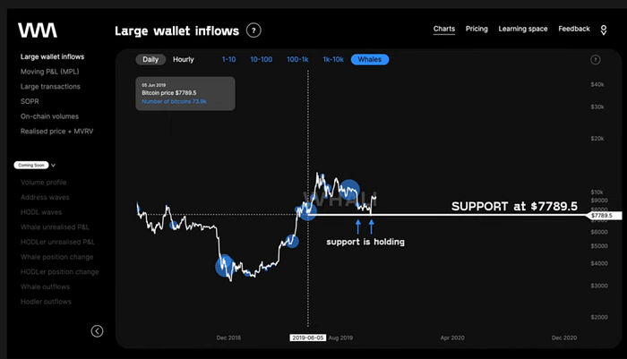
On the picture below we can see that a massive Whale bubble resides at the location of the cursor. This bubble represents some wallet on the blockchain, that acquired 73,900BTC, on 5th July 2019, when Bitcoin’s price was $7789. This means this whale wallet got

worth of BTC back then. This is a lot of money, that belongs to a wallet who is obviously smart, because its rich (we will have more retarded assumptions like this in the future so brace yourself). Hence we might assume this is an important price for Bitcoin.
💡 Prices at which whale wallets acquire (receive) Bitcoin show important price levels where Bitcoin’s price will bounce in the future (more on “bouncing” soon)

In this particular example, if you draw a horizontal line from this whale bubble you will see that when BTC’s price fell, it bounced upwards from this line at $7789 [screenshot #2 below].
Hence the price level where the bubble appeared was indeed important, and indeed affected Bitcoin’s price action.

💡 The bounce level was a support in this case because the bounce level was below.
N.B. When this chart’s idea came originally spawned, the hypothesis was that “big whale players somehow affect Bitcoin’s price in some way”. Indeed the hypothesis was correct. This is the process of how new charts can be created: ask a simple question, get data for it, check if results are useful for trading and if yes, boom you have a new Whalemap chart.
📘 Lets go through a trade that we could have done
Imagine the following timeline 👇
— August 2021 (2 months since the whale bubble appeared) and you have logged in to whalemap.io. You then go to our whale bubbles chart… What you see, is the screenshot #1 (where the price is above and has not yet reached $7789). You then
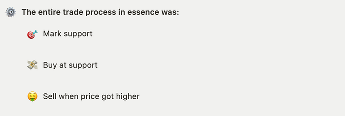
- Mark $7789 as an important “support”
- Set buy orders at $7789 (screenshot #3 below)
- You then wait

— October 2021 (4 months since the whale bubble appeared)
Price finally fell and reached your buy orders. They were filled and now you own Bitcoin that you purchased at $7789. Bear in mind you don’t do anything here as all your buy orders were filled automatically. Alternatively, you could have set alerts for when BTC’s price reaches $7789 and reassess the situation if the alarm went off, and purchased BTC manually if you wished.
— November 2021 (5 months since the whale bubble appeared)
Its been a month and price has bounced! Support at $7789 held up, price went up and now you sell to take a profit. This is represented in screenshot #2.

🔄 Bubbles act as resistance too
In the previous example, we saw that bubbles act as support (i.e. if bubble is below current price, when Bitcoin’s price gets to the price at which bubble resides, it will bounce upwards from the bubble price level)
However, what happens if the bubble is above current price?
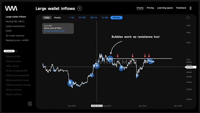
Well, if you go to screenshot #2. Can you notice a big blue bubble that is above the bubble that we marked previously?

Can you guess what’s going to happen to Bitcoin’s price if/when it gets to the second bubble?
💡 Price will bounce. But this time downwards. Bubble will act as resistance. And here is real life price action of Bitcoin to prove it

❗️ Hence bubbles act as support and resistance for price action of Bitcoin.
To sum-up
In this part (make sure to check out part 1 and 2) we went over
— How the UTXO set can be thought of “a network of different sorts of people… Whales, retail, traders, miners, exchanges, etc”
— What information the whale bubble chart shows
— And an example of how whale bubbles can be used for trading
In part 4 we will go over
— More examples of where whale bubble predicted S/R for Bitcoin
— Other cohorts of bubbles
— Who are >10,000BTC wallets?
— And why do whale bubbles work?

