Pixels, a Labyrinth, and Family — Exploring the Identity of Blockchain Family
To grasp it, dissect into parts — our daily mantra in the office. When it comes to identity, it’s all about nailing the details and rocking a killer image. Take a cue from Apple’s iconic logo — it’s instantly etched in everyone’s minds. It’s where visual images pack a punch, sometimes making us forget that Apple is just a fruit too.

Now, let’s talk about Blockchain Family, the company we created an identity for. Their goal was clear: capture their philosophy, values, and unique features. When it comes to developing DeFi-products, there are so many layers to consider. We wanted to showcase their tech prowess and the user-friendly approach they take in product development. We aimed to tie it all together, creating a meaningful and cohesive image. Oh, and we also wanted some puzzles and nods close to the team. So, we combined several elements: a modular grid, blockchain vibes, a touch of labyrinth, some pixels, and a hint of retro charm. And guess what? We’ll spill the beans on how Tetris fits into all of this. Let’s dig deeper.
The modular grid is where it all begins
Designers instantly know what it means, but for everyone else, let us break it down: the modular grid is based on simple geometric shapes, like building blocks, all the same size and neatly arranged. It makes things easier to understand, strikes a balance, and saves time — ultimately speeding up the process.
Take a look at the BF logo — it’s as if it’s crafted using a modular grid, with blocks coming together to form a cohesive whole, just like the very essence of blockchain.
In a way, it’s a nod to the fact that BF acts as a modular grid for its clients — an experienced DeFi product developer who who lets users to launch their web3 projects faster as well as launched countless projects in the exciting world of NFT marketplaces, crypto wallets, and much more.
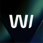
“It’s not just a logo, it’s a whole exciting maze!”
You say it, and you’re absolutely right. The logo’s letters, B and F, are covered in labyrinth as the heart of the idea is how products are developed. For the web3 world, it may seem complex, and some may question why bother exploring it at all. But the Blockchain Family team is one of those who can explain it in simple terms, making processes transparent. They want to ensure that users don’t get lost in the twists and turns, just like navigating the halls of IKEA. They want the texts to be understandable not only to users but also to their [insert-name] relatives who may be unfamiliar with blockchain.
So, it’s not just a logo — it’s an invitation to navigate the labyrinth of the web3 world with ease and clarity, brought to you by the Blockchain Family team.
Pixels — not just for gaming fun
Come on, we’ve all been there: spending hours on the couch, playing that addictive Tetris and snake game that not only devoured pixels but also tested our nerves. It was tough, but oh-so-enthralling, just like launching a brand new product.
We didn’t forget to give a shout-out to that iconic game in the logo, and there was a good reason for it: Blockchain Family is not only about blockchain solutions, but they also dabble in the exciting world of GameFi. So, we merged the logo’s blocks, representing the essence of blockchain, into a chain that resembles playful pixels, Tetris cubes, and that nostalgic snake game we all loved. It’s a blend of tech-savviness, simplicity, and a sprinkle of nostalgia, all wrapped up in a trendy and modern package.
What brings blockchain and family together?
Naming matters, so we kept this in mind while creating an identity. Both blockchain and family are made up of unchangeable blocks, forming a unified whole. It reflects an important value of the BF team: their approach to work and their tight-knit bond.
Everything is connected, that’s why we’ve expanded
We didn’t stop at Blockchain Family — we extended this identity and its hidden meanings to all BF’s products. Take a look at the logos of Evername, and Tokstock. They all embody the same spirit: pixels, grids, and gamification, coming together as one big family chain. And let me tell you, it’s not just a regular family — it’s a vibrant community where clients and partners are like dear friends.
* * *
So, there was our journey where we embarked on designing a logo. It’s all about delving into the qualities we want to convey, shaping our unique tone of voice, creating brand concept, and crafting the perfect visual representation. It’s a subtle art, packed with layers of meaning, but the end result is simply amazing.
So, why are we mentioning all this? Well, because you’ve come to the right place for a wonder-identity. We’re here to deliver an outstanding brand that truly stands out.
Ready for an exciting adventure?