Cruising Through Atlas

The end of Atlas Stage is here (May — June 2019). We had the opportunity to further develop and refine the visual aspects of Ducorp and its sub-brands. It can be said that here again without the synergy and hard work of the team we would not have met our deadlines.
Right from the beginning of May, it was very important for us to understand who we are. The Core Values and Mission of Ducorp have been refined by Nanda and James. The moment that these were reviewed/redefined, the fundamental reason why Ducorp exists was made more digestible for the understanding of the reason of why we are in business.
We exist to serve the community at large, based on the powerful motto and conviction of “TRUTH FIRST!”. Each of our businesses must carry the same ideology; starting from DUCORP (the holding company) to its other ventures and future endeavors.
TRUTH FIRST is the foundation of the whole communication strategy of DUCORP. In that perspective, all the graphic attributes of the Ducorp Group of companies are developed according to that fundamental belief.
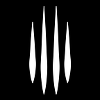
As people go through our brand touch points, they will notice that we stick to a very angular visual approach. The reason behind this design decision is very simple; straight lines and angular shapes are aggressive, direct to the point just like our Jag; which symbolizes the single-minded spirit of this mystical and fierce feline. We exist to meet our objectives, whatever the difficulties and at any cost based on TRUTH FIRST!
For Atlas, the following design tasks have been carried out to build the identity of Ducorp and its subsidiaries.
- The Jag

The JAG is our mascot. It shares a very intrinsic value with Ducorp; all its muscles are geared for hunting, that is its main objective in life. To illustrate that quality, an abstract representation of our jaguar coming out of the darkness and ready to pounce has been developed to match that philosophy of “TRUTH FIRST”. The visual of the JAG has been carefully crafted so that people feel all the weight of how focused we are on our objectives. The chosen colors depict Ducorp’s philosophical world. We are not here to wait for things to happen or to come to us. We exist to be loud.
2. The brand identity of Ducorp

The Ducorp Identity is very simple as it will remain silent. We intentionally made the choice of using a typeface as logotype.
3. The brand identity of Ducorp XTM | XTM+ | ACADEMY | VENTURES

The JAG is the mascot logo of the XTM brand signature. This street undertone stylized representation of a jaguar’s head has been developed based on the values and mission of XTM which is deeply related to the Ducorp mother brand. XTM is the execution arm of Ducorp. It is at the forefront of our communication strategy. XTM encapsulates XTM+, ACADEMY, and VENTURES.
4. The Ducorp Website (DUCORP, XTM, XTM+, ACADEMY, VENTURES)
We have chosen to go mobile first!
Very good idea?
Yes?
No! Not from the graphic designer’s point of view…;0).
How can we creatively create interaction in a so small allocated space? A desktop version would have been much easier and surely a better playground.
(i) Ducorp

To live up to the challenge, to be different, to break the rules… good or not good, we created a mural for the Ducorp website to explain our fundamental philosophy in the most diluted way for each and everybody understand our mindset.
(ii) XTM

XTM is purposely colorful to express how diverse and loud we are. It englobes our talents, our communication strategy, and business endeavors. Here again, we dare to be different and not to be corporate at all!
(iii) XTM+

XTM+ is our media company. It is our main brand touch point. This particular website regroups all our digital communication materials disseminated across the web on the different popular social media platforms we live on. This simple design solution maintains the brand identity of Ducorp thought its colors, graphics style, and typography to ensure brand recognition.
(iv) Academy

The purpose of the Academy website is to allow viewers to discover XTM people through a short description of who they are and what they believe in. Ducorp believes that it is important to put its people at the forefront. Here again, the design solution remains simple and ensure brand recognition through the use of colors and graphic style.
(v) XTM Ventures


The Ventures web page has been designed to help people understand what are our interested business endeavors. The basic concept of this website is to show that through our other brands have their own identity but live through the same values as Ducorp mother brand. Different visual identities that live within Ducorp’s world.
5. Ducorp Academy

It is very important for each person joining the team to understand our culture. To facilitate this phase, we have very carefully crafted an academy pack to explain the reason why of Ducorp, its values and objectives. The so-called pack comprises of an Academy Book, Ducorp Brand Booklet, XTM Book (Comma — Written by Nanda Pavaday), Ducorp XTM Brand Identity Guidelines, Ducorp Brand Book and the Plant Guide Book.
6. Maitre De Poonith Identity

Maitre De Poonith is our first opportunity to create an audience / a community around a product through social media platforms. As we progressed in this endeavour we managed to create an identity for him and improve the visuals from episode to episode. Of course, we stuck to the graphic style and colors of Ducorp to ensure brand recognition within the spirit of our mother brand.
7. Satoshi’s Lounge Mobile App Interface Design

Satoshi’s Lounge is our exclusive blockchain club. For that purpose we have developed a mobile application for this particular audience. The whole design solution communicates a high-end look and feel through the use of colours and graphic style, for the convenience of the club members who will have access to an intuitive IU/UX app design.
8. Reviewed Identity and Brand Guidelines


Through Atlas, changes have not only been made to Ducorp and XTM Logos. Atlas has been an opportunity for us to review the logos of FindRate and Shoppers Club. Of course, once you change something from the top… everything underneath requires some updates.
9. JFC FOR XTM

JFC FOR XTM is our clothing line brand. Our first creation is based on our motto “TRUTH FIRST” in a more street undertone which translates into “F.JAG.CK FAKE”. Yes, we dare to say it loud and clear! We dare to wear it! “F.JAC.CK FAKE” is our way to say stop to the fake world, fake politically correct, fake relationships, well anything which you may find FAKE. Would you dare to say “F.JAC.CK FAKE”?
Atlas has been a great opportunity for us all to further develop what we have started in the Geronimo stage. As we progress towards Trident, we are bound to improve and adapt the different identities we have created and reviewed till now based on the market responses as we start to implement our communication strategies on the different platforms available to reach out to our audiences.
With love, JFC
XTM; 2019.