The Zendesk Triple Diamond
Visualizing the product design process
It’s common to think of the user experience as the designers’ sole responsibility, but in reality there are many different points of influence. As designers, we don’t hold a monopoly on thinking about the humans who use and buy our software.
As designers, we don’t hold a monopoly on thinking about the humans who use and buy our software.
Cross-functional collaboration is very important to how we build products at Zendesk. Product Managers and engineers are encouraged to take part in research, define requirements, brainstorm and validate solutions. You’ll often find our engineers taking part in user interviews and synthesizing research alongside the designers and product managers.
Beyond the people who design and build Zendesk, every release is supported by teams like Localization, Go-to-market, Documentation, Customer Advocacy, etc.
We wanted a simple graphical way to describe the process that ties all of these teams together.
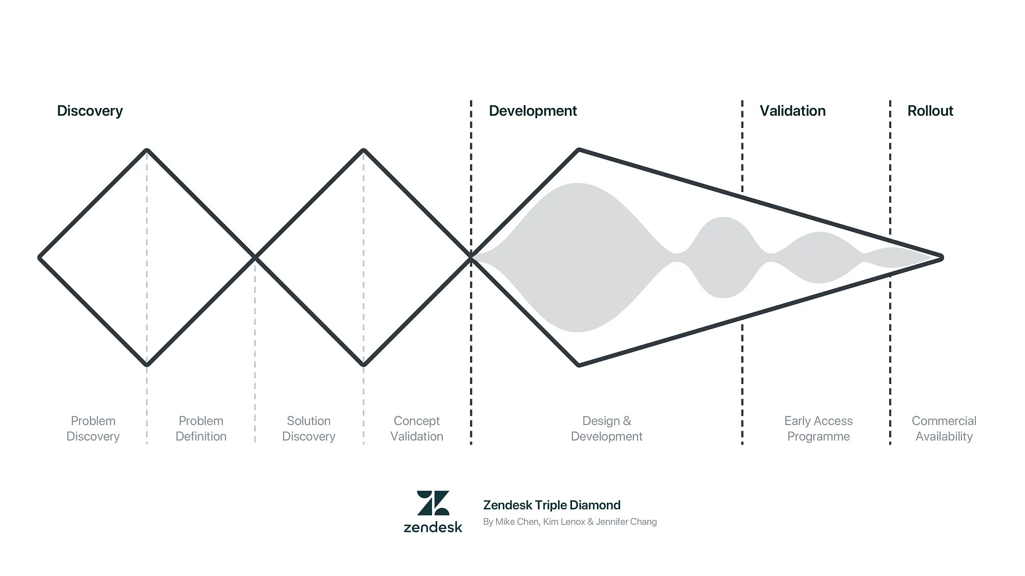
Building on the Double Diamond
When it was time to formalize our process, the first point of reference was the Double Diamond process popularized by the British Design Council in 2005.
The diamonds are useful in helping people understand the divergence and convergence at the core of discovery solutions to customer problems. We go wide, then decide.
This visualization suggests we have a finalized solution when we get to the end of the process. In our experience, it often creates the expectation that at a certain point, designs are completed and handed off for implementation by engineers. It doesn’t seem quite right for an in-house design team like ours.

We started thinking about how we could make something that represents how Zendesk works. It began as a series of late night calls (due to time differences) with Kim Lenox, our VP of Product Design. We geeked out big time on design processes. 😂
In our conversations, we kept coming back to this: The Double Diamond is too design-centric. The main milestones are:
- Initial insight
- Plan
- Ship
For us, “Ship” is oversimplified. In the process of getting products and features ready for public consumption, we have a few other internal milestones:
4. Code complete. Localization starts, acceptance testing complete, documentation starts, etc
5. Early access program. Closed and open Betas, security reviews, etc
6. Limited availability. Commercially available to a subset of customers, internal training starts for sales, Zendesk support agents, etc
7. General availability. All customers can use the product or feature.
8. Public launch. We start to market the new product or feature.
There’s a lot of work done by many different teams to get things ready. We looked for a visual way to capture this, and we eventually came up with the idea of adding a third diamond.


After some explorations, we opened it up for discussion with our global design team. With a distributed team, this was challenging to coordinate but we pulled it off with the help of one designer in each region to host a virtual workshop. (Thanks Dovile Janule for the idea!)

Designers, engineers and PMs were asked to stress test the process and give feedback. We then synthesized the findings and shared it out to our stakeholders.

Final output: the Triple Diamond
With the Triple Diamond, we treat our designs like a concept that’s gone through internal validation with stakeholders and external validation with customers. It’s not a hand-off. We’re confident it’s the right solution at this point, but it needs further refinement.

The third diamond marks the start of the iterative Agile cycle. We treat the design concept as an initial plan we’re refining and filling in more details at each sprint as we discover more. That’s when engineers are investigating the technical solution while designers are creating prototypes and conducting usability tests. Research and design should happen throughout the cycle.
Moving along the process, uncertainty decreases over time and we’re honing in on the right solution. Throughout, we’re learning about how customers are responding to our product, and we tweak accordingly.
We embrace change throughout the process. To be practical, the flexibility for change decreases over time as more code gets committed. We can do bigger tweaks at the early stages, but towards the end, it’s about the 5% optimizations. Having the expectations stated up front helps to make the software development process smoother.
How we use it at Zendesk
We use the visualization in many different ways. First and foremost, it serves as a common language to talk about our work. We have an internal wiki page that clearly defines the different phases of our software development life cycle, so that when we talk about different milestones along the process, we all know what that means. That helps with collaboration across time zones, collaborators from different backgrounds, and it reduces friction for our internationally distributed team.
Here are more common use cases:
- Onboarding new hires
- We use it in our design critiques to show how mature the designs are. This helps to frame the feedback we ask for.
- Explaining research activities and their goals. e.g. Problem discovery vs concept validation
- Status updates for bigger projects

This probably isn’t going to work for you…
… Because every team has its own unique challenges and goals, so it’s up to you to create something that’s tailored for your team. Use it as a frame of reference as you build out your own processes. Earlier in my career, I imitated without adding my own twist, and wondered why it didn’t work — Don’t make the same mistake. As a certain famous martial artist once said, absorb what is useful, reject what is useless, and add what is specifically your own.
Good luck!
Resources
- Download vectors of the diagrams (Please attribute) — Clean |Annotated|Design process|Design process (greyscale)
- Internal wiki page — Product Development Milestones

Check out design.zendesk.com for more thought leadership, design process, and other creative musings.
Follow us: Team Instagram | Team Dribbble
