5.1) App Screen 2 “View Expense” for Expense Tracker
This week we look forward to designing the screen 2 of our application. Last week we started with the development phase of the application i.e., the screen 1 which provided the functionality to add expense.
This screen mainly consists of the functionality to view expense and other minor app related functions which are included in the floating action bar provided at the bottom of the page.
Let’s have a look at various aspects of this screen.
1. View Expense
After you login to the app, you can view this screen. Initially when there are no expenses to be viewed, the screen looks something like this:

After you add some expenses you will be able to see various expenses. The image for which is shown below.

Here as you can notice, each expense is separated by a subtle line. Each expense contains its name, date and time of the expense, the amount in Rs. to the right and finally the category which is shown using a circular icon to the left. The category initials are shown in the circular icon. One important thing to notice here is, the expenses are arranged in ascending order of time-stamp.
2. Floating Action Bar
The second functionality that has been added to this screen is a floating action bar which essentially lets you select any one of the three actions namely Add a new expense, View analytics and Logout.

A. Add a new Expense
This action button lets you add a new expense and thus redirects you to the Add Expense screen.
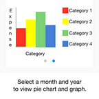
B. View Analytics
This action button lets you view analytics by redirecting you to the View Analytics screen.
C. Logout
As the name suggests, this action button logs the user out of the current user session.
You can try out our latest app here: ExTra Expense Tracker APK
Changes
In this section we discuss the changes we made to our app with reference to the prototype that was made earlier.
- In the prototype, we had tabs for navigating to different parts of the app. The three tabs were View Analytics, Expense and Logout.This has been removed and replaced by a floating action button with the exact same functionality. The floating action button, initially in the prototype, had only one function that is to add expense but now has additional functions to view analytics as well as logout. This change was made so as to devote more space to view expenses and to make the design minimalistic.
- The prototype had a section at the bottom to add monthly budget but it has since been removed as the functionality which we thought of was beyond the scope of the three screens.
These are the changes that we made. We have also just listed them in the prototype blog for reference.
Here is the link to updated blog: 1.2) App wireframe/prototype for Expense Tracker
That’s it for screen 2 of our app. Now we move on to the development of the third and the final screen of the app which is View Analytics.
-Akash Dabhi and Vinit Neogi