1.2) App wireframe/prototype for Expense Tracker
Hello, welcome back readers! This is the next blogpost for our first week task of creating a wireframe/prototype for our Expense Tracker app. If you haven’t already read our first post about the three screen app idea, then here you go Three Screen Idea.
Design is an important aspect of any project or task. Hence it is rightly said by Saul Bass,
“Design is thinking made visual”.
Designing the visual aspect of an idea is very important as it allows you to set a blueprint for your final work product. It defines the capabilities and limitations around which you try to build your project.
(You might be thinking, enough of these old school definitions, please get to the business!)
First things first, lets start by defining two terms prototype and wireframe.
What is a wireframe?
A wireframe is a static, low-fidelity representation of your product, and in the world of web and mobile design, a basic guideline of your website or app — the skeletal framework — for both designers and developers to follow. However, depending on who you talk to, i.e. designers vs. developers, you’re bound to get a different answer as to what a wireframe is. For instance, developers tend to use wireframes to better understand the core functionality of a website or app, whereas designers may use them to show the navigation flow between site screens. (courtesy: justinmind.com)

What is a prototype?
A prototype is a mid-to-high-fidelity design model of the final UI of your website of mobile product. As well as offering a more detailed look at the visual attributes of your design, prototypes usually include the first user interaction. Sure, you can add some, albeit very limited, interaction in clickable wireframes — where you can click elements on the screen — but with prototypes, you can demonstrate and validate the complete functionality of the design by adding events, animations, variables and advanced interactions. The general idea of a high-fidelity prototype is to represent as close to the final product as possible. (courtesy: justinmind.com)

For designing our app prototype, we were recommended to use Proto.io. Obviously developing an app (like a professional organization) for the first time, we felt excited. As we had never heard of Proto.io, we decided to give it a try and explored some of its basic and advanced functions. Oh did I tell you, we were given a full 30 day free trial of Proto.io by Hasura. Proto.io is, I must tell you, a very intuitive and feature rich tool you can use to create a prototype. We were awestruck by the quality of emulation it can perform! You can create different screens with many actions, buttons, different types of containers, horizontal and vertical scrolling and so on. It also helped us create real transitions effects which we see in most of the apps.
Here are a few links to our prototypes
Link to our Proto.io prototype: Expense Tracker Prototype
Now coming to the main screens of our application:
- View Expense Screen

The first main screen of the application allows the user to view all his previous expenses.These results contain the reason for the expense, date and time for expense and the expense amount. Also, the user can set his monthly budget from this screen. In addition to this, there is a floating action button which redirects the user to the “Add Expense” page.
Edit: Changes in View Expense Screen
1. The tabs have been removed and the same functionality is added in the floating action bar.
2. Set budget section has been removed.
The detailed changes along with reasons have been mentioned in the following blog: 5.1) App Screen 2 “View Expense” for Expense Tracker
2. Add Expense Screen

On opening the Add Expense screen, the user is presented with various options to add the expense amount, select expense date and time, select category of expense (such as travel, shopping, utility bills, restaurants, etc). Also the user can add specific notes for the partition expense and add some tags for easy searching and retrieval.
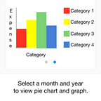
3. View Analytics Screen


On the View Analytics screen, the user can select the month and the year for which he wants to see the analytics. The analytics for the selected criteria are provided in 2 forms:
- Pie Charts
- Bar Graphs
The various categories are represented in the analytics results by different colours.
Edit: Changes in View Analytics Screen
1. The scroll functionality to view graphs has been removed and replaced by options to select graph type.
2. The ability to select month and year has been removed.
3. The legends in the graph have been removed.
The detailed changes along with reasons have been mentioned in the following blog: 6.1) App Screen 3 “View Analytics” for Expense Tracker
The next phase in the internship is setting up local development.
-Akash Dabhi and Vinit Neogi