Tableau: Modified pie charts
Having in mind this famous quote
Friends don’t let friends use pie charts.
in this post the modified ways of how to use pie charts in more efficient and nicer way will be presented. In both examples we use two pie charts with dual axis option in order to have overlapping. Reports are created in Tableau v9 with data based on Tableau Sample-Superstore.
Let’s start with first example.
1. Donut
Very popular way of presenting two info on one chart. In the middle of donut it is somehow common to present total number, which is sum of donut’s parts.

With opening new workbook and choosing Category and Sales, and then clicking on Show me -> pie charts, we get pie chart presented on the left side.
In order to have overlap of two pi charts, we have to specify Y-axis (Rows). I usually write number zero in rows, and duplicate it (holding key ctrl).
Clicking with right click on the y-axis of the second pie chart and then choosing Dual axis we get total overlap of these two corresponding pie charts, what will help us to make desired donut.

Clicking on SUM(0)(2) in Marks panel, moving Sum(Sales) from Size and making smaller size of second pie chart clicking on Size, moving Category from Color and color the whole pie chart with white color, we will get the donut which we intended to create. Playing with sizes of both pie charts, adding labels on both pie charts and changing the format of these labels, we can get something like this:

2. Pie chart with subcategories
Using the example from above, we will delete the white pie chart in order to keep just colored one.
In this example we want that inner pie chart consists of categories (dimension Category):
- Furniture
- Office Supplies
- Technology
In order to have second pie chart which will be our outer pie chart, we have to duplicate y-axis again. Putting Sub-Category instead of Category on the Color, we get multicolor outer pie chart.
Since our final version wants to be sth like this chart:


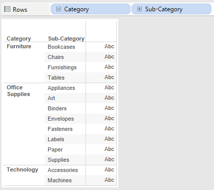
we have to create new sheet with the listed categories and sub-categories which will help us a lot to match category color with corresponding sub-category color.
The only thing what we have to do to make it possible is to order the sub-categories in the Color panel in the same way like in our “helping” sheet (see picture).
After that we have to assign some variations of colors: e.g. for Furniture category, all corresponding sub-categories have to be chosen from blue panel (from light to dark blue) — in the same way for other categories.
With hovering the mouse on the chart is really easy to see the total number of Sales for some category as well as the Sales for corresponding subcategories.
www.linkedin.com/pulse/tableau-modified-pie-charts-leon-agatic
Tableau original workbook (downloadable)
Found this post useful? Kindly tap the ❤ button below! :)
About The Author
Leon Agatic is a Tableau Enthusiast. You can connect with him on Medium, Twitter, LinkedIn and Reddit.
View my verified achievements from Tableau: https://www.youracclaim.com/users/leon-agatic
*Wanna hire me? Contact me on LinkedIn!
Readers also interested in … Diverging bar chart, Tableau 4 quadrants
